DRCOG Lettering Campaign
Client: The Denver Regional Council of Governments (DRCOG)
Agency: Cactus
Services: Lettering
ECD: Sammie O’Sullivan
AD/Senior Design: Adam Vicarel
Lettering: Carly Salzman
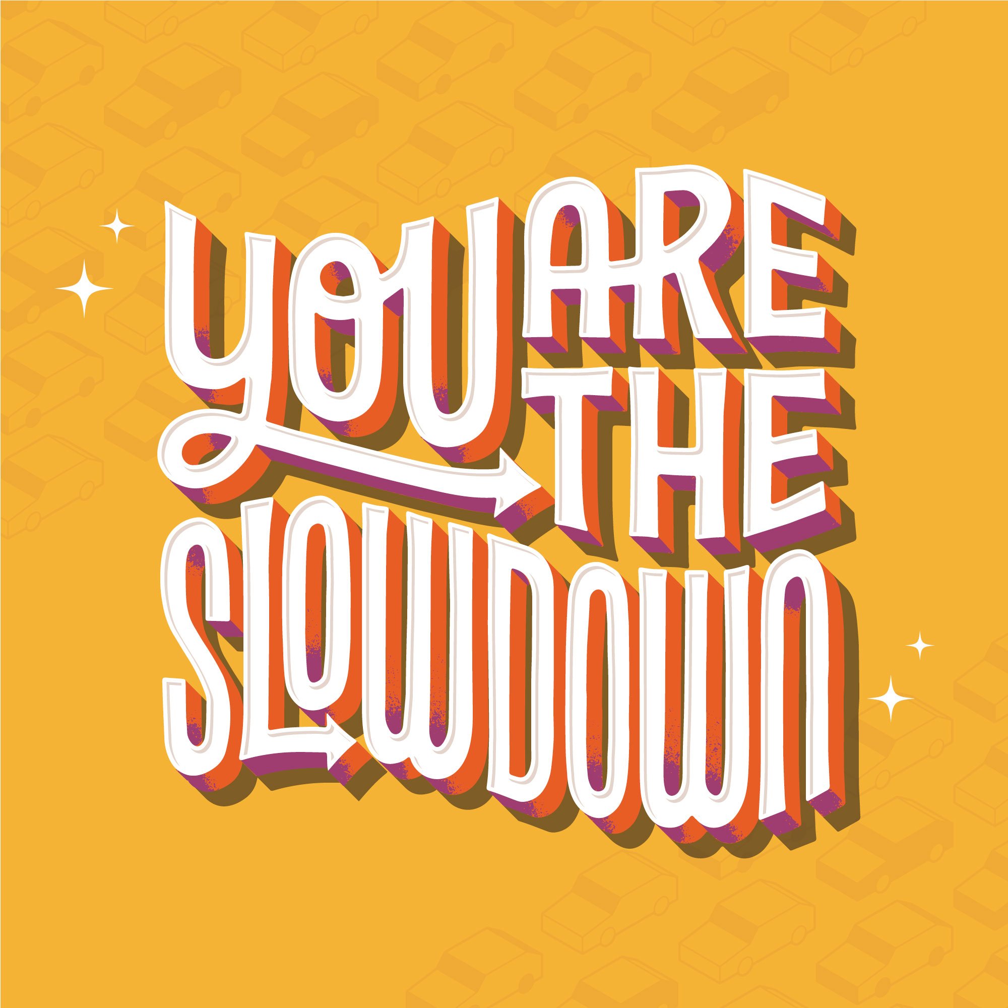
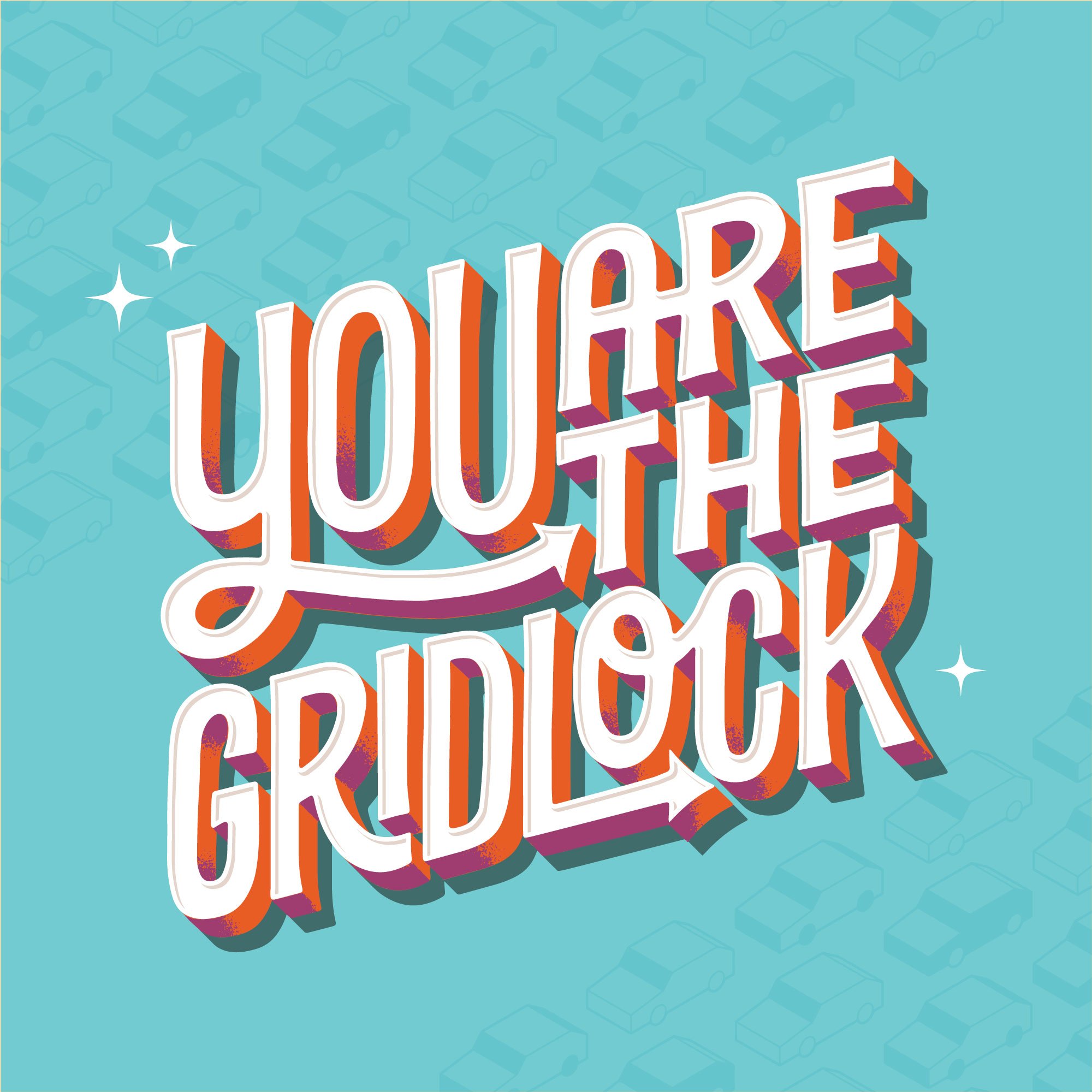
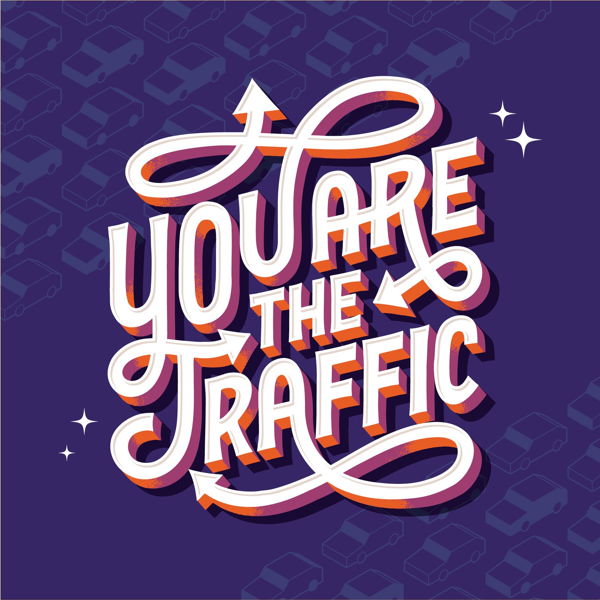
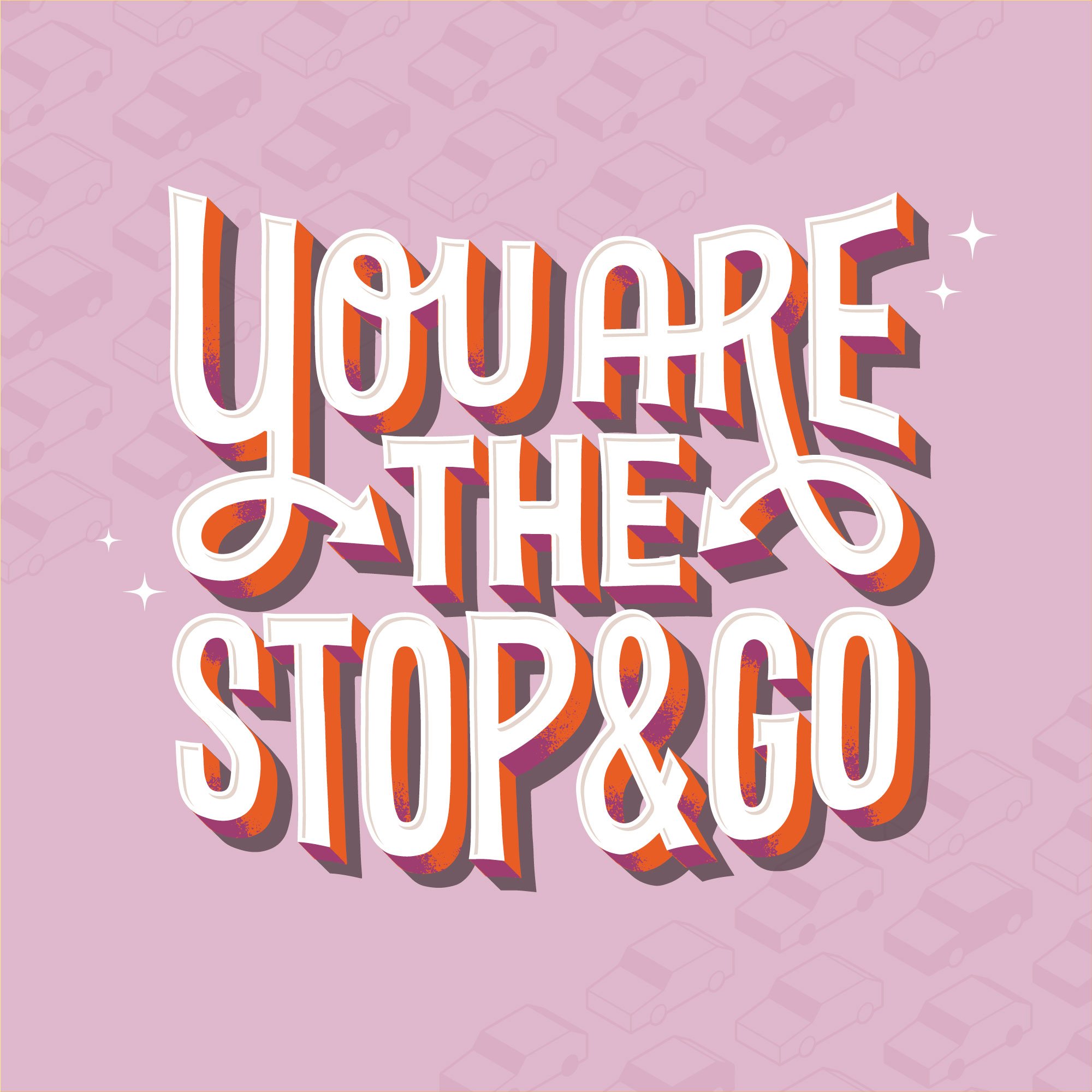
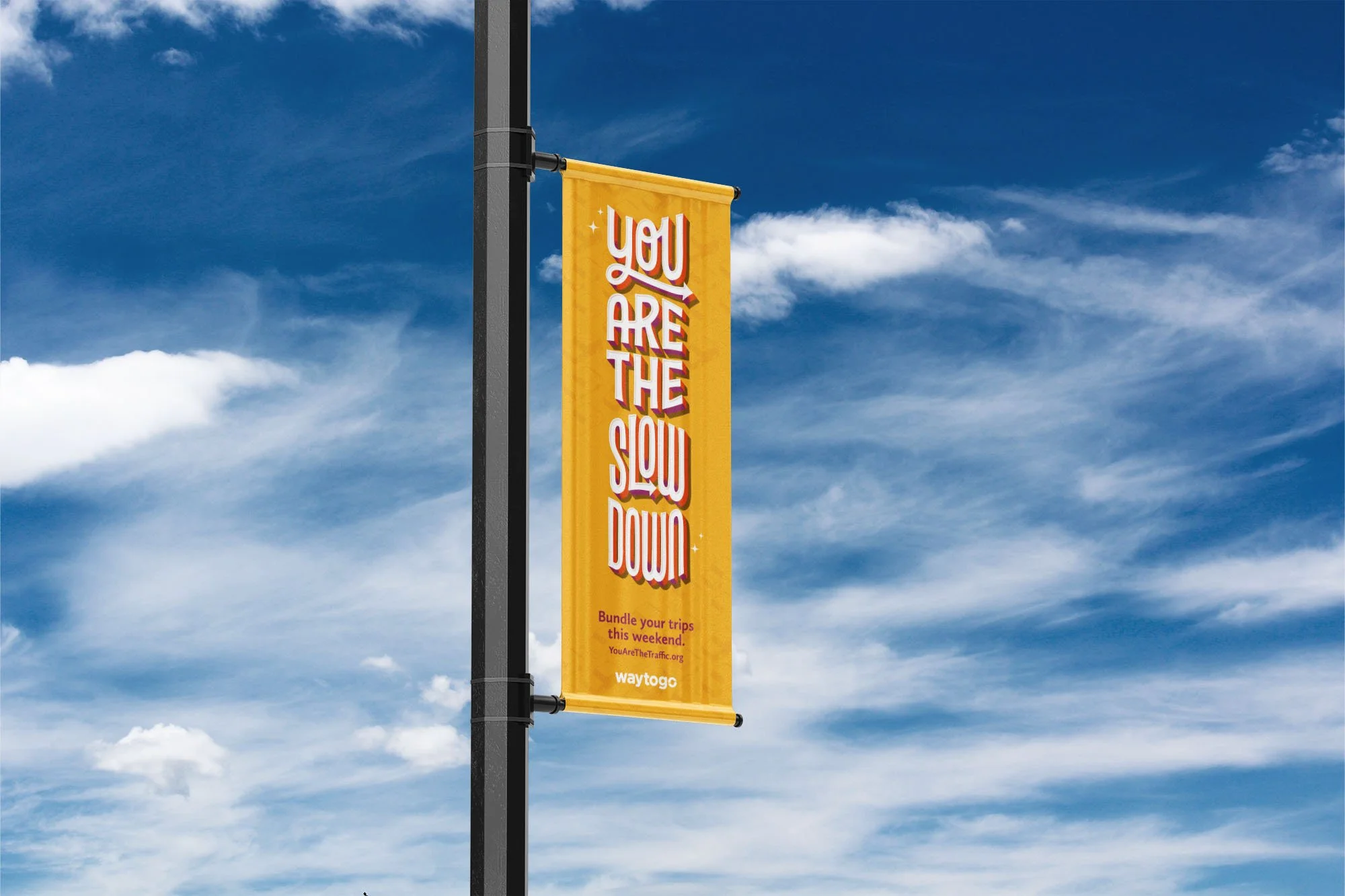
Using bright and approachable lettering to emphasize the importance of public and self-propelled transportation.
The Opportunity:
We've all been stuck in soul-sucking, time-wasting traffic. Blaming the other drivers around us, deeming them the reason we're late to work, missing our appointments, or not yet on the slopes. It's hard to admit but we are just as much a part of the problem as they are—we are the traffic.
The Solution:
We created a blunt-but-cute lettering series for The Denver Regional Council of Governments (DRCOG) campaign calling for greater use of public transportation, walking, and ride-shares. The lettering lockups are bold, legible, fun, and most importantly, they’re modular. These compositions were created in a way that allowed easy alteration to meet the many aspect ratio demands of commercial advertising: billboards, digital ads, print, and display ads.