DreamBooks Co. Brand Refresh
Client: DreamBooks Co.
Services: Visual Identity Refresh, Illustration, Art Direction
Credits: Art Direction & Principle Design: Adam Vicarel
Designer & Illustrator: Matt Narca
Design Support: Caroline Adams
Enlivening a neighborhood bookstore with approachable character.
THE OPPORTUNITY
The DreamBooks brand had been incrementally pieced together over the years. Without a strong brand position or clear art direction guidelines, DreamBooks became fragmented across assets and styles, resulting in a lack of cohesion across brand communications.
THE SOLUTION
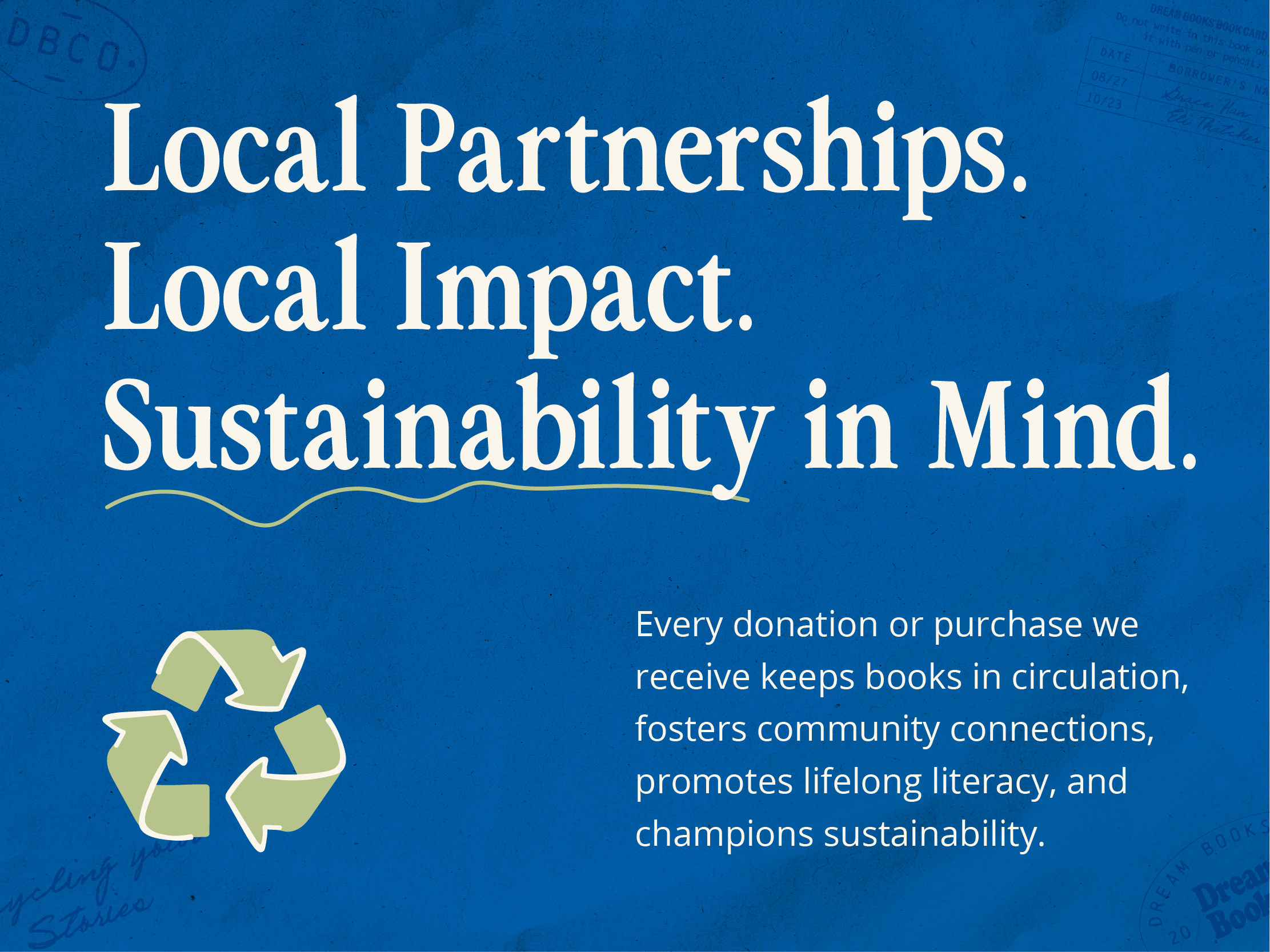
The DreamBooks team noted that used bookstore websites often feel impersonal and sterile. They frequently lack the warmth, discovery, and sense of community that make a local bookstore feel special.
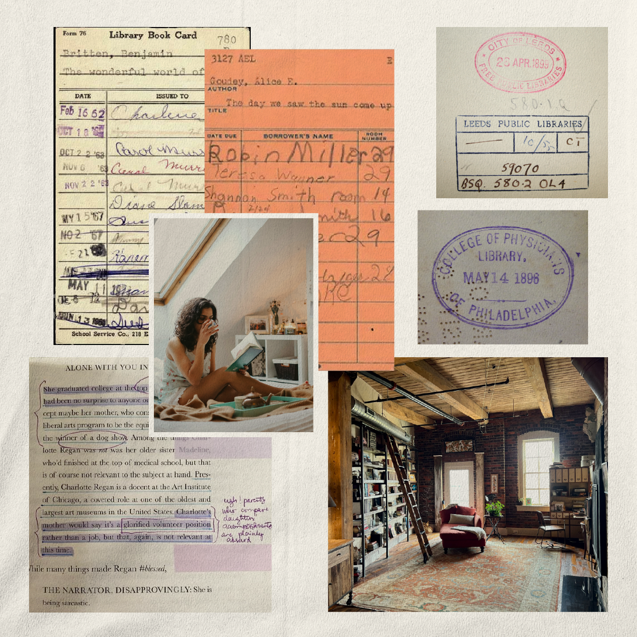
Through research, we identified an opportunity for the DreamBooks visual system to differentiate by communicating the warmth, tactility, and experience of a used bookstore. Drawing inspiration from well-loved books, page annotations, and marginal notes, we created a design system that uses texture, illustration, and stamps to deliver a “real used bookstore experience,” even in digital applications.
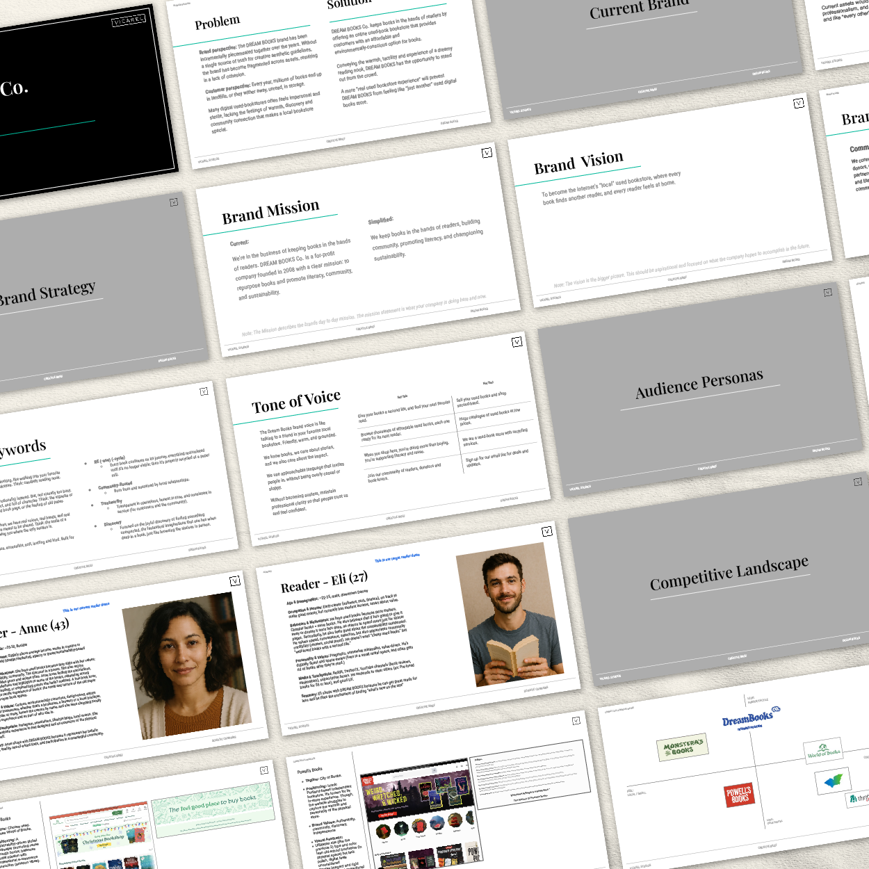
Design Strategy
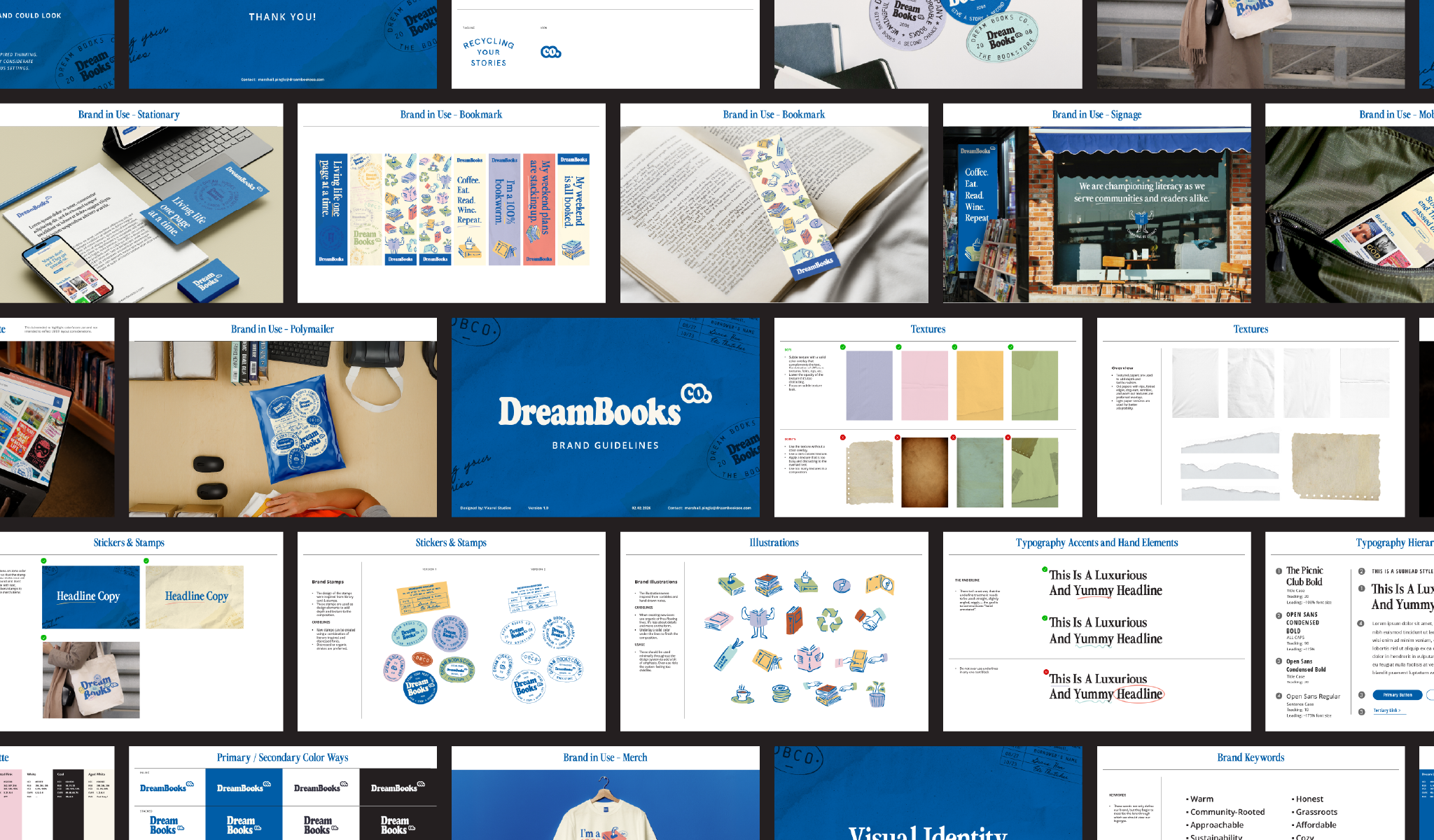
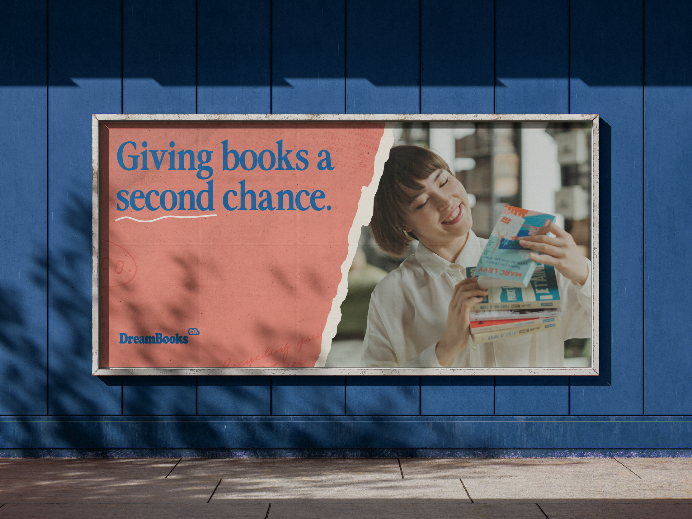
The design system needed to serve two distinct audiences: book buyers and book donors. Digital applications leaned cleaner and more refined to communicate trust and legitimacy, and that was balanced with tactile elements that subtly nod to the coziness of a used bookstore. This positioned DreamBooks within a familiar competitive landscape, but did so with added warmth.
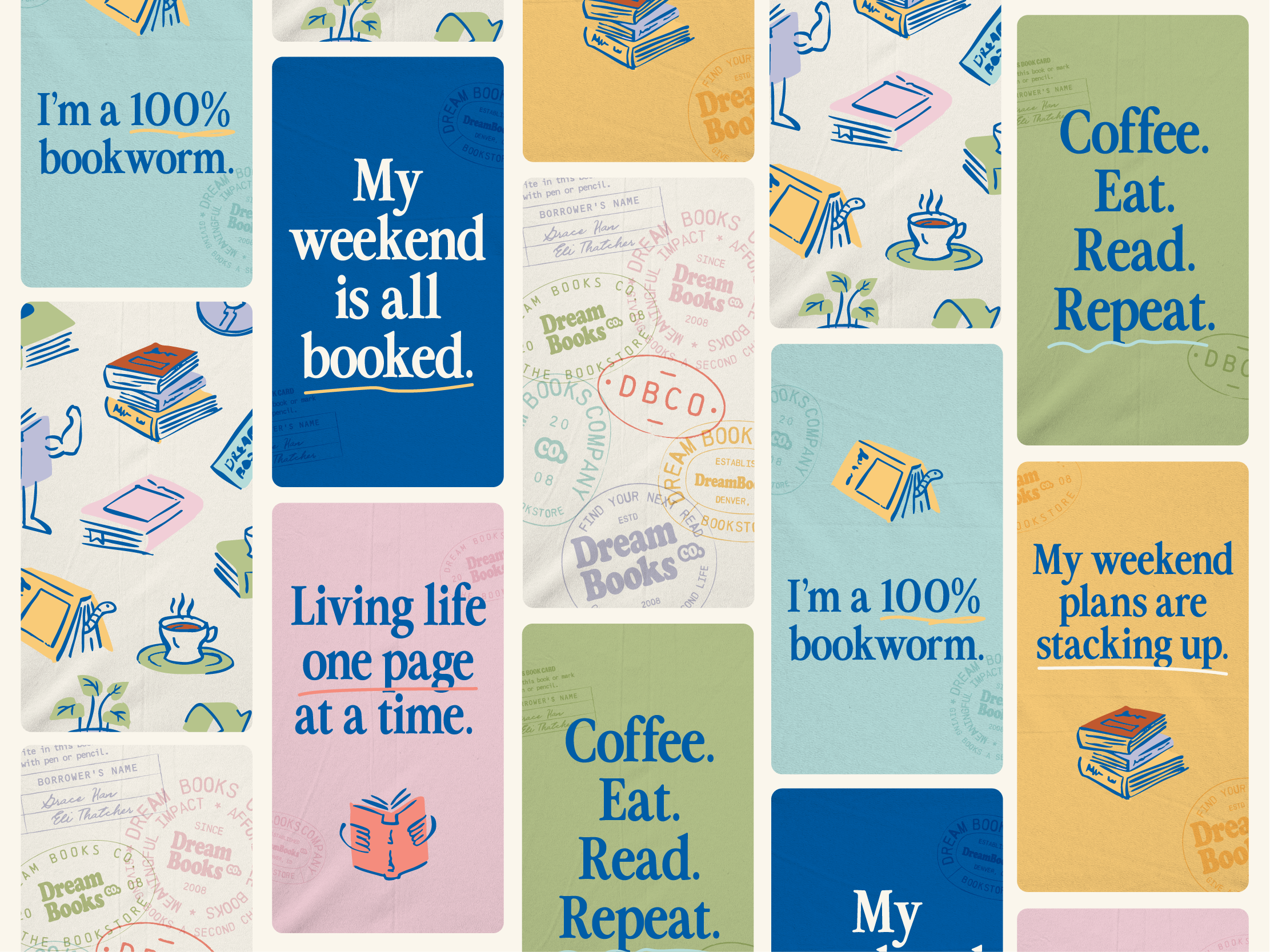
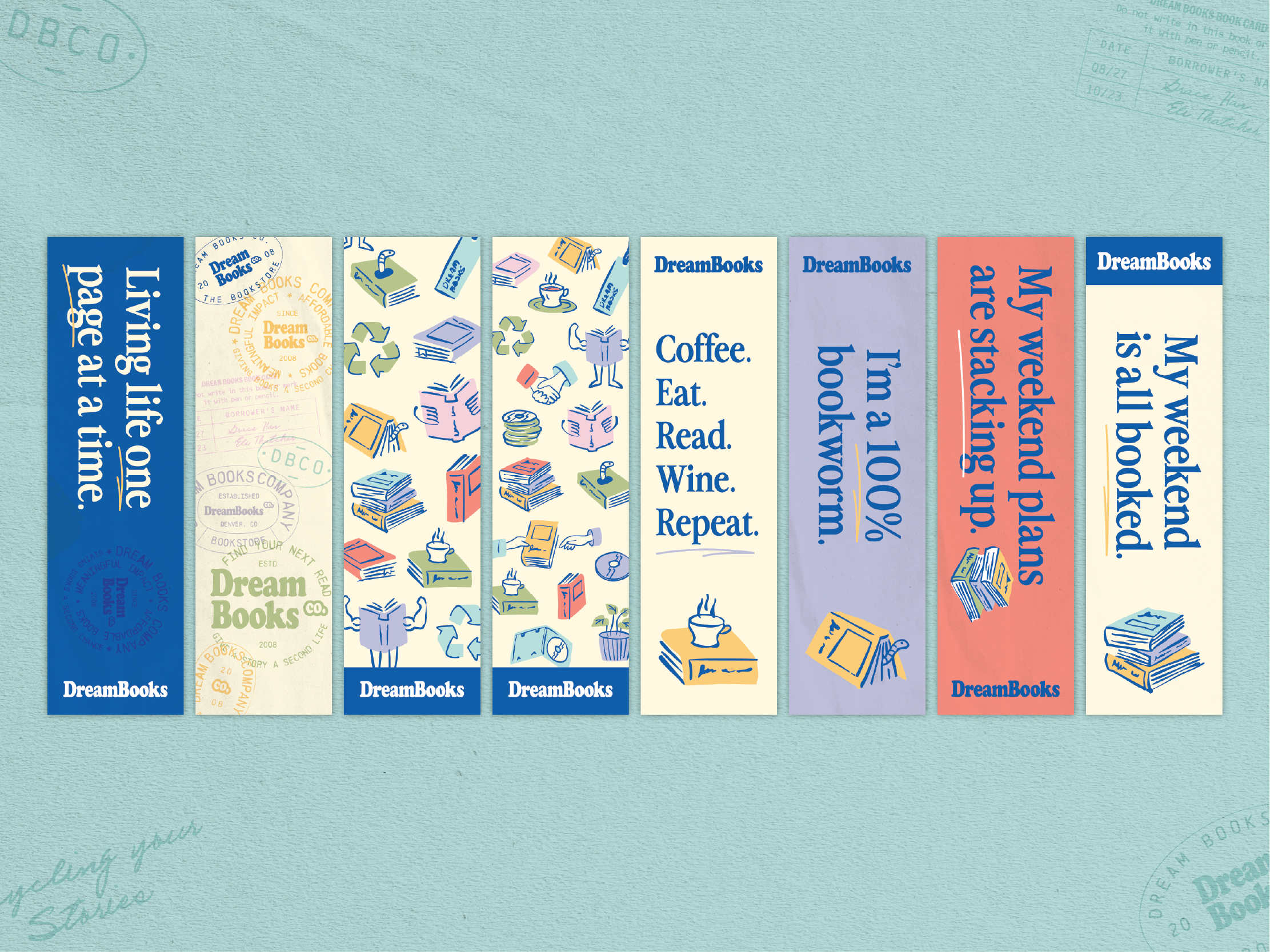
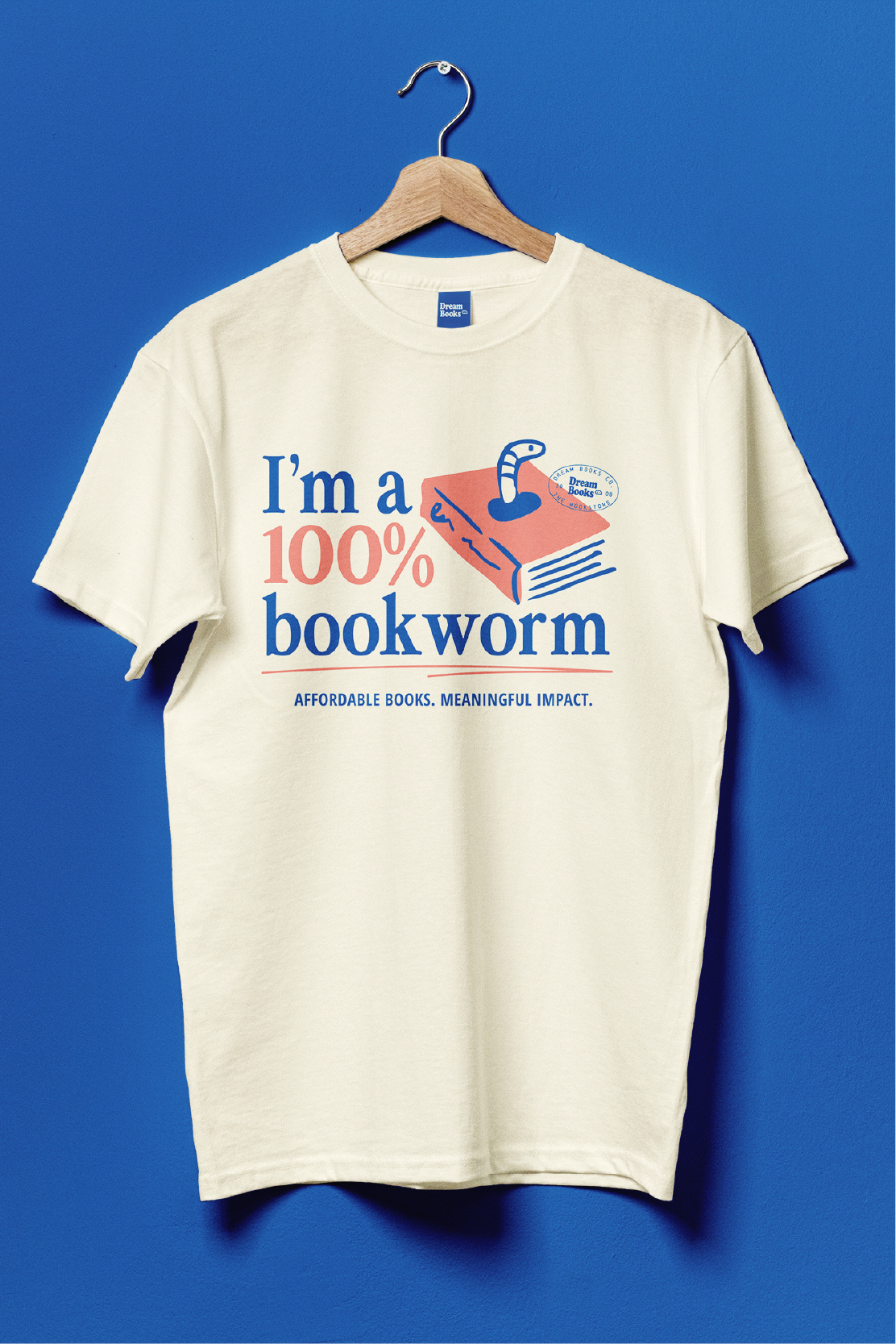
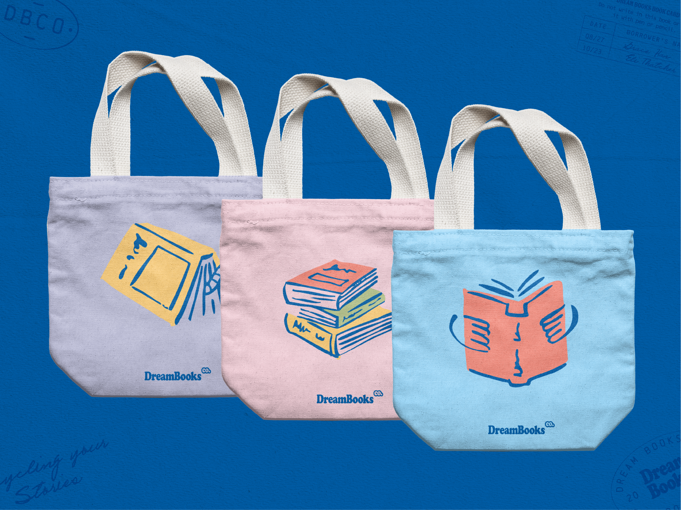
The physical collateral system which is more often experienced by buyers leaned further into an expressive personality. These touch points are more whimsical and emotionally engaging, creating a stronger connection with the customer.
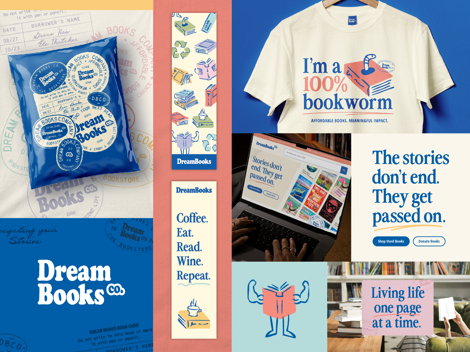
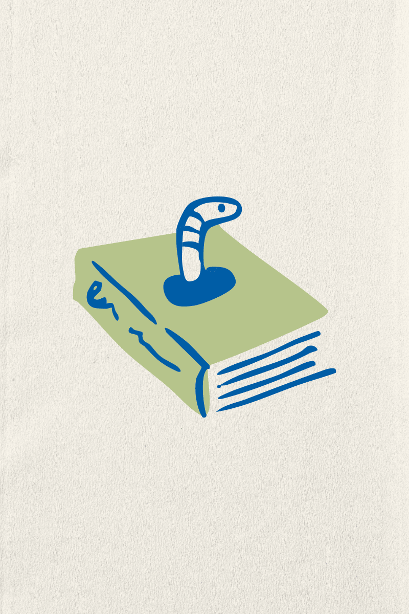
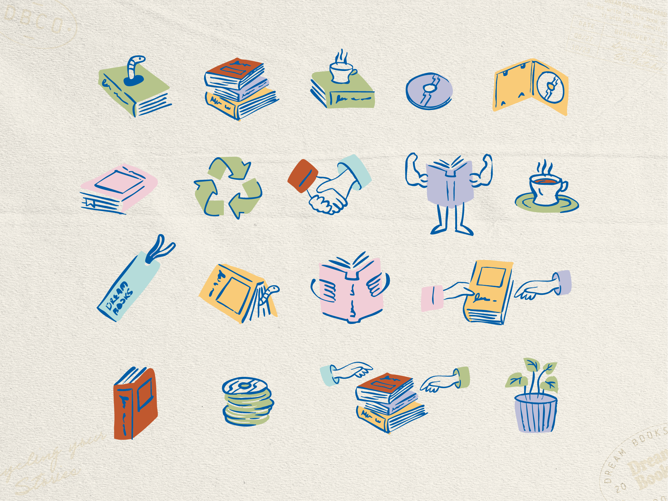
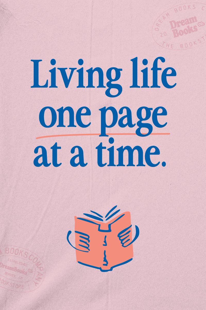
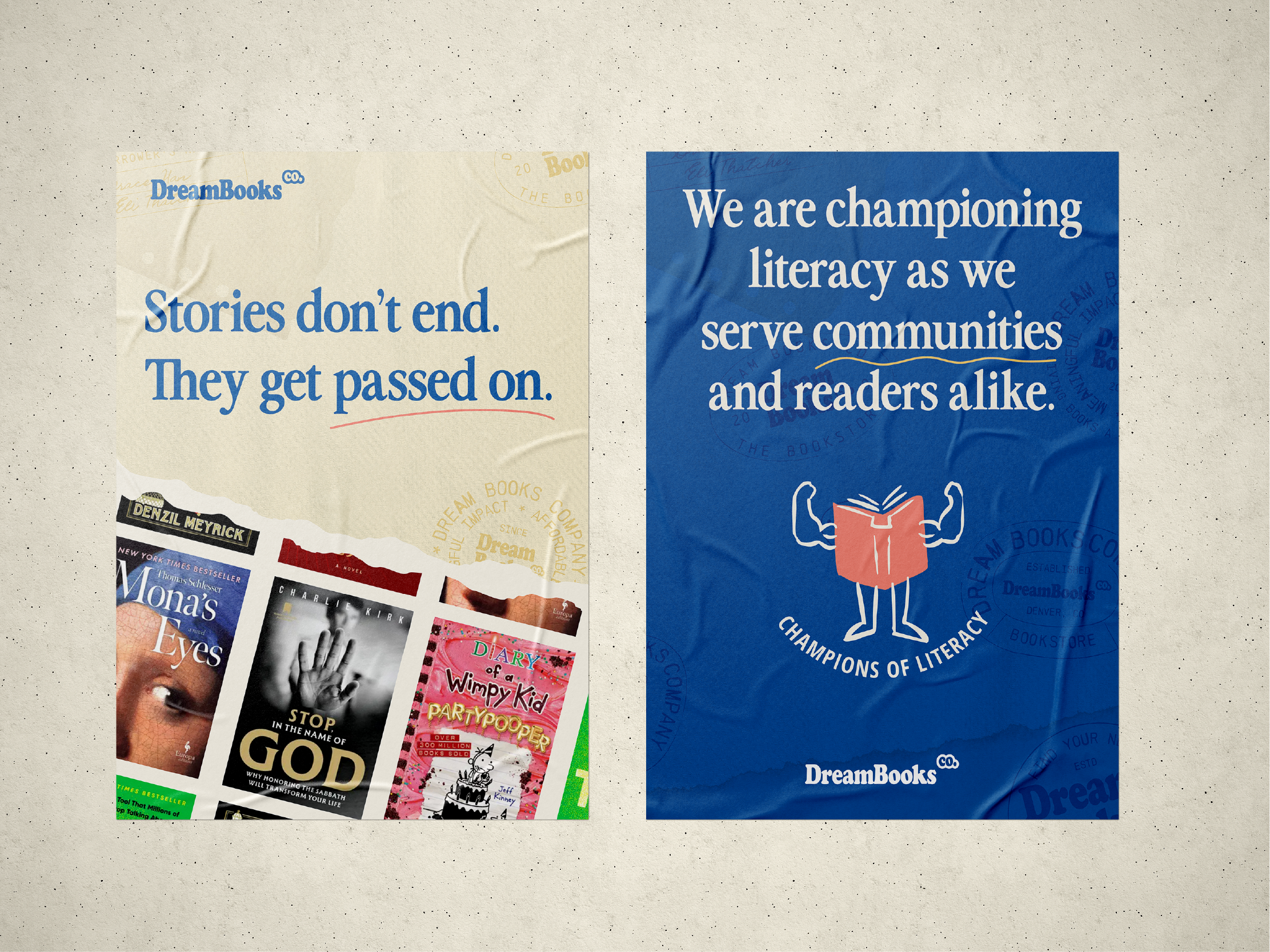
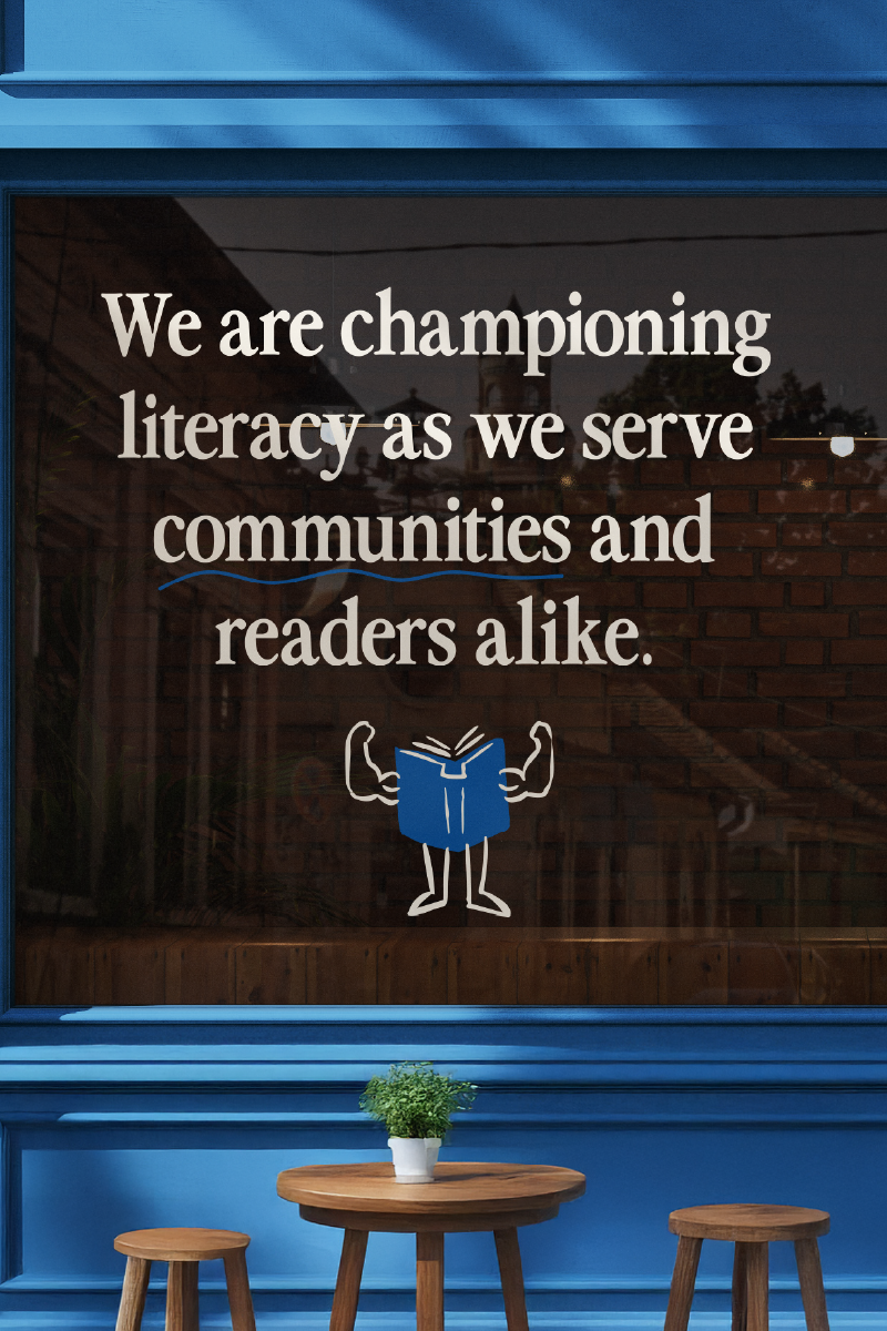
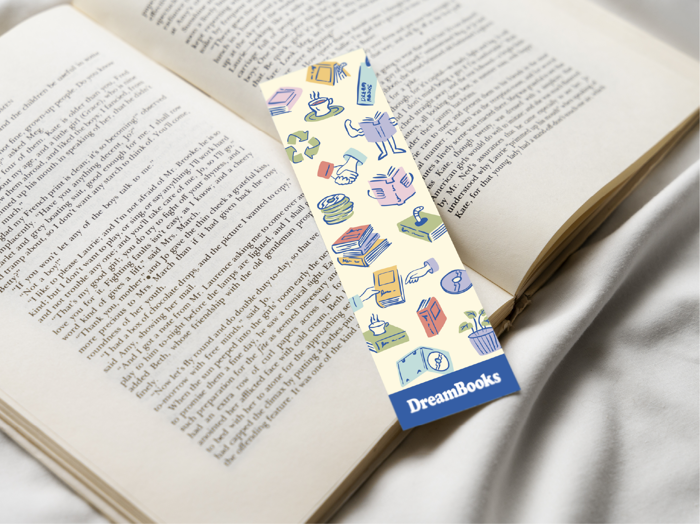
Illustrations
The illustration style draws from informal scribbles, hand-drawn notes, and annotations found in used books. These illustrations are inherently approachable and they add a sense of warmth to the identity. Many of these elements were based on reader behaviors, spaces, or terms, making them feel personal and relatable.
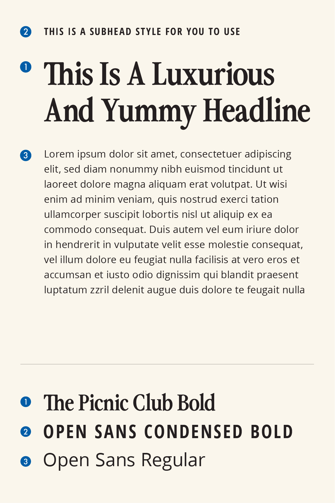
Typography System
The typography system balances traditional serif type with an open, geometric sans serif. Inspired by type styles found in old books, the styles selected have a slightly contemporary edge to feel relevant for today’s audience.
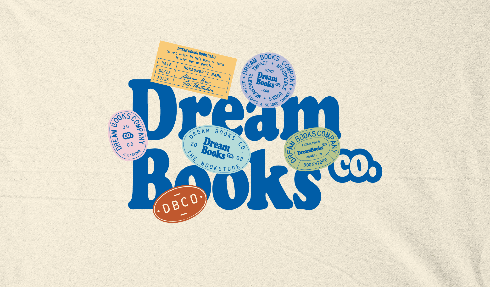
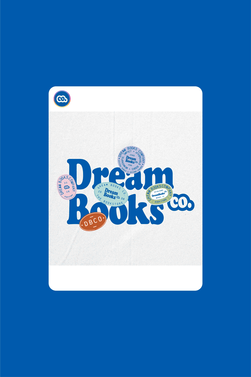
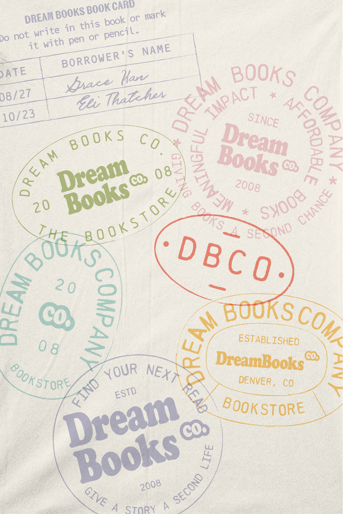
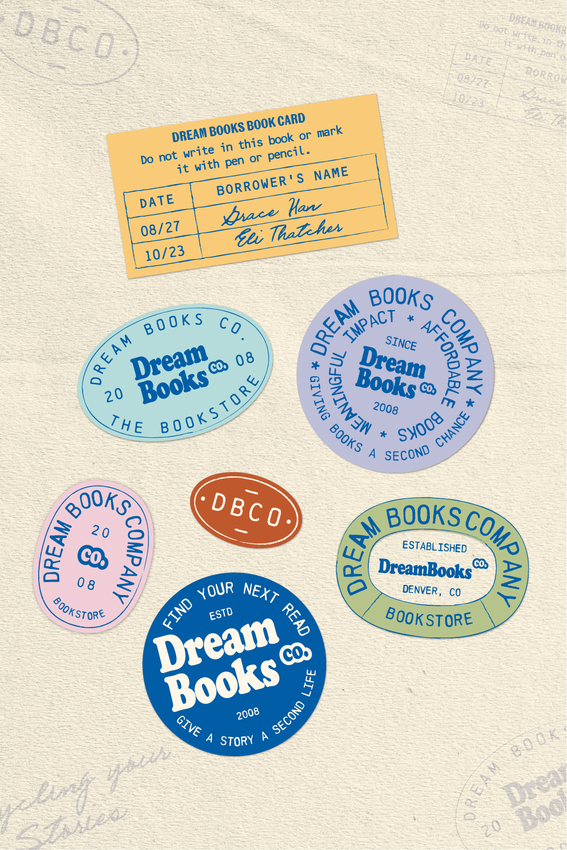
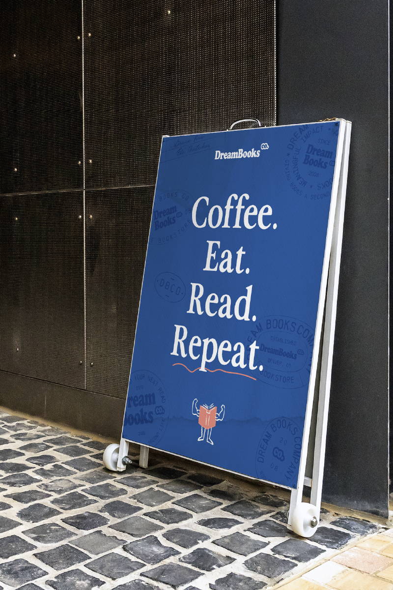
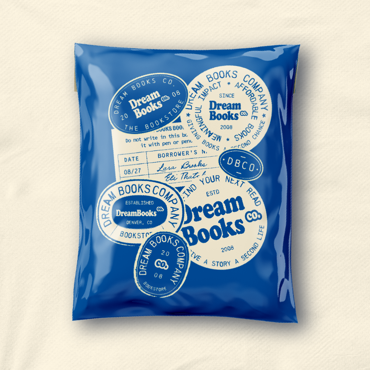
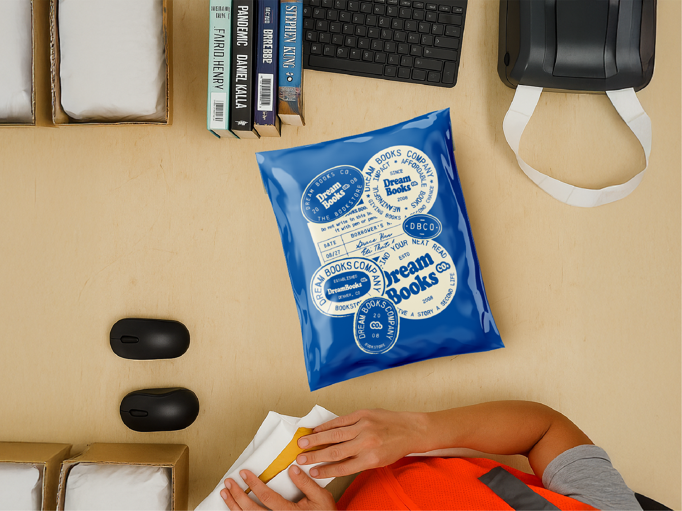
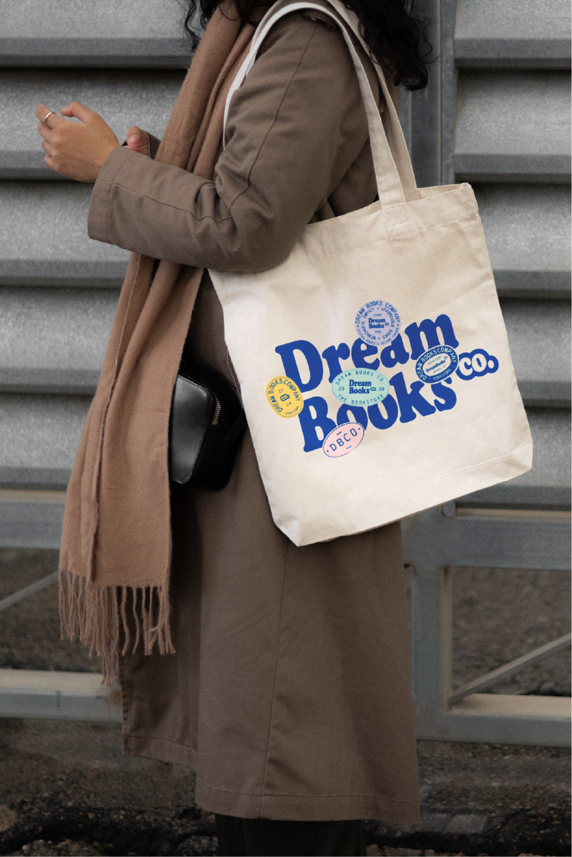
Stamps and Stickers
The stamp and sticker system is inspired by the stamps found in old library cards. These elements add depth and texture while evoking nostalgia and a sense of community, subtly building trust in the brand.
Collateral Art Direction and Design
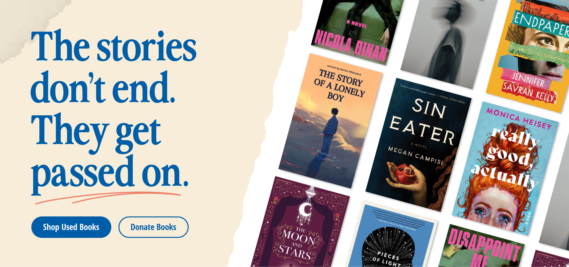
The collateral art direction and design is where it all comes to life. Illustrations, typography, and stamp elements layer together to create familiarity and depth—even within digital applications.
The system carries a soft, approachable aesthetic that feels both familiar and trustworthy, and functions seamlessly across digital and physical touchpoints.
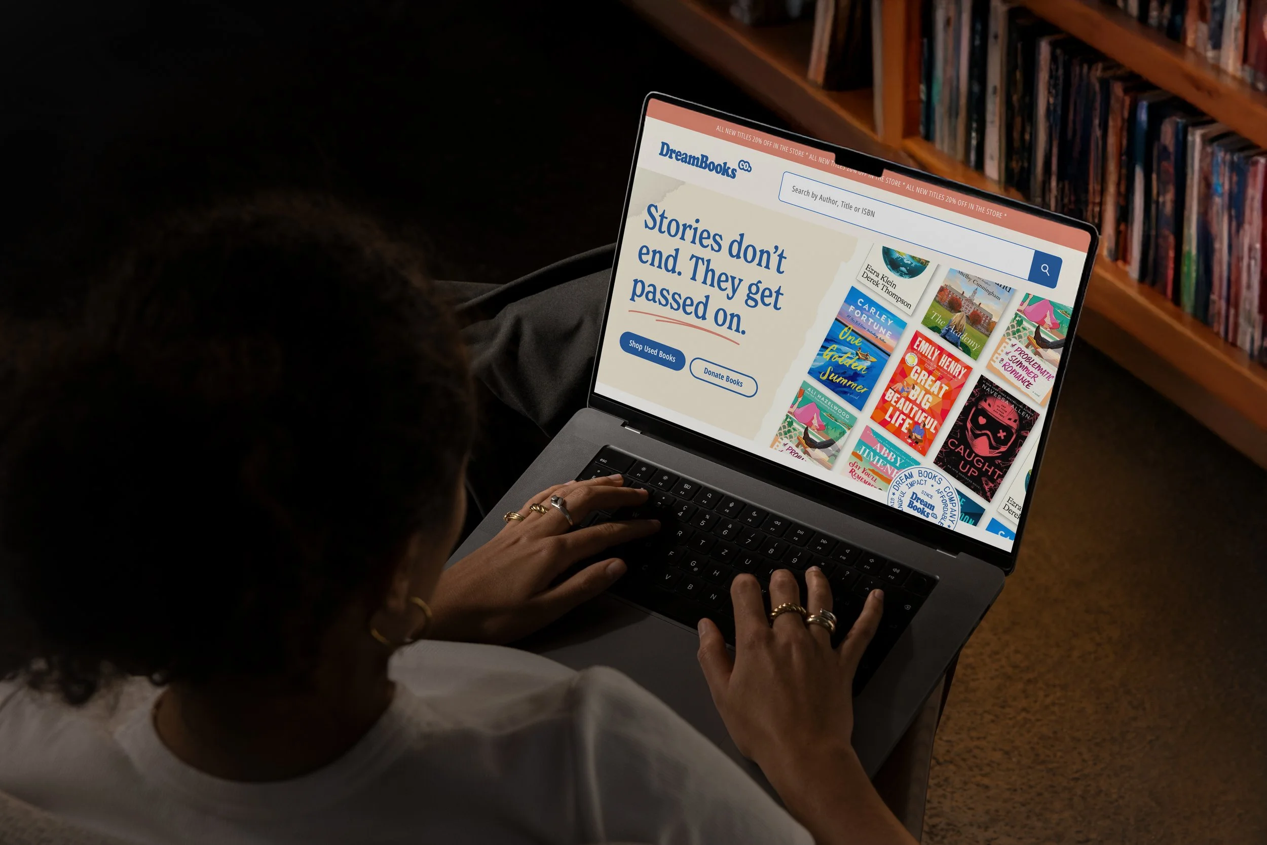
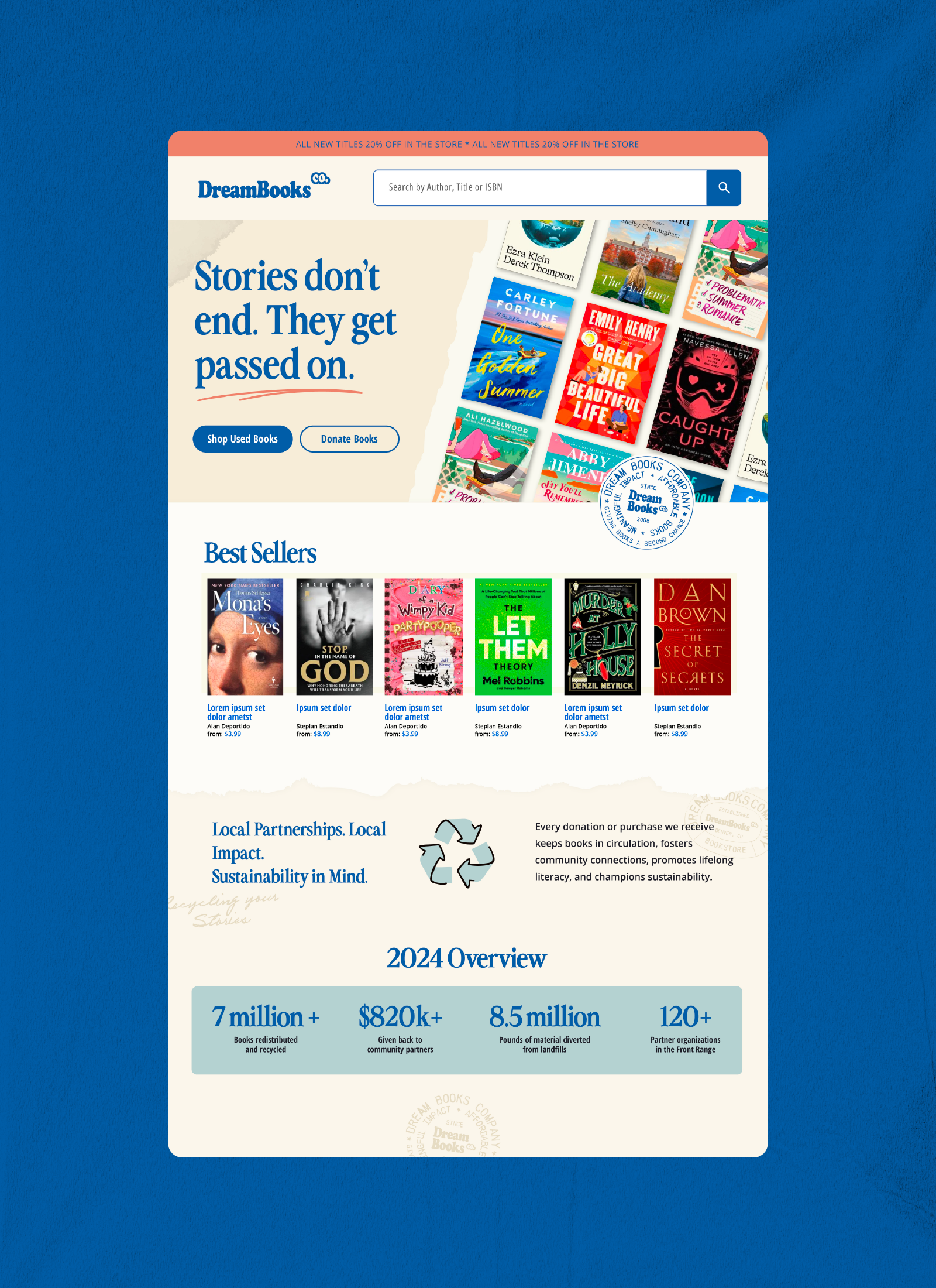
Digital Design
While physical collateral allows for more expressive play, the digital experience needed to balance warmth with trust. While there is room for playful digital applications, the core digital experience leans confident and clear, aligning with user expectations for a best-in-class online bookstore.
The DreamBooks website serves as both the point of purchase and a resource for donors and local organizations. In contrast to more sterile competitors, the experience prioritizes clarity, ease of navigation, but does so with a more approachable UI that feels both functional and human.