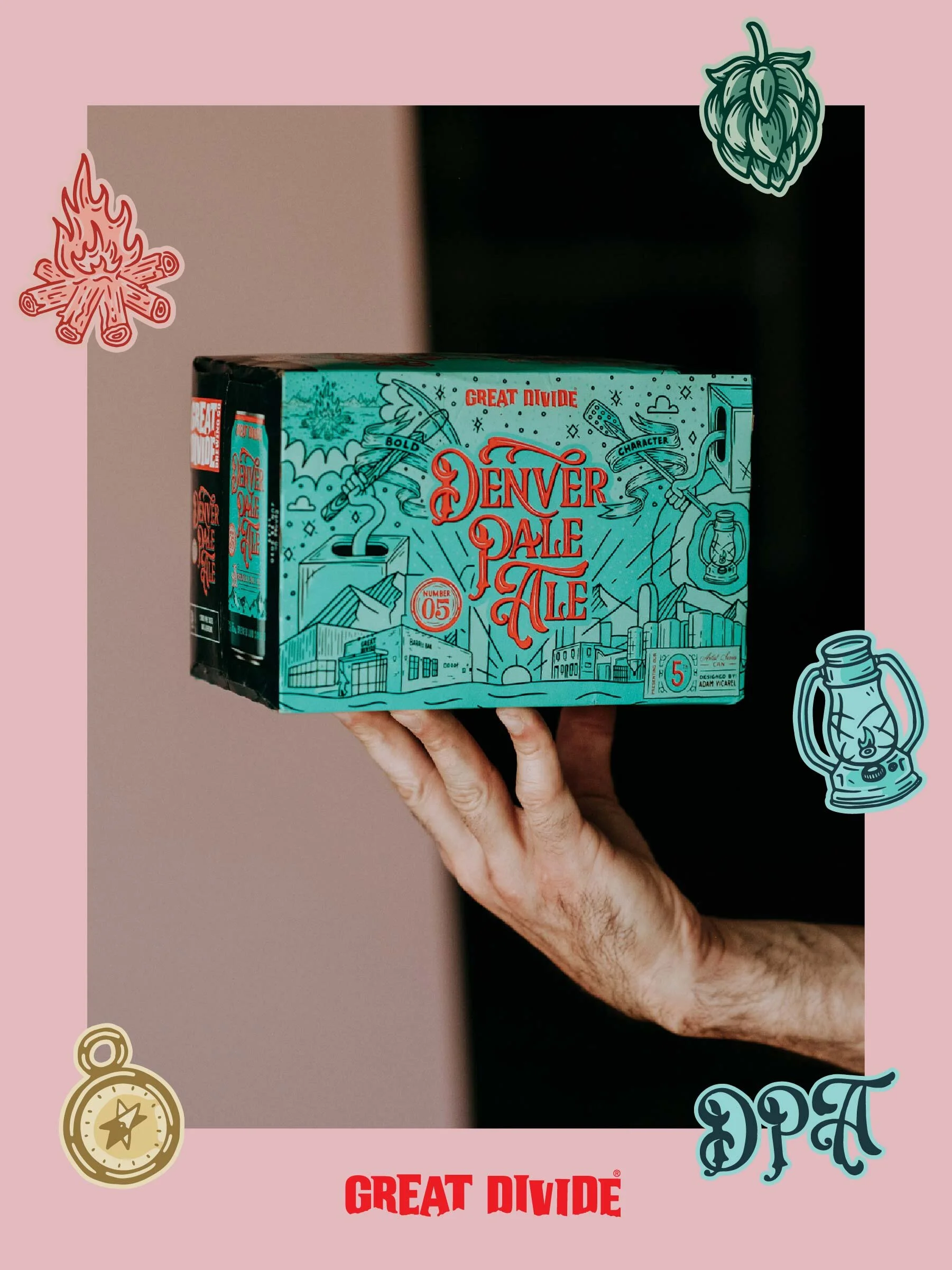
Great Divide Brewing Artist Series Can
Client: Great Divide Brewing
Role: Art Direction, Lettering, Illustration, Package Design
Agency: Grit
Photography: Luke Gottlieb
Video: Kyle Kennedy
Featured: The Dieline blog
Illustrating Denver’s history for the packaging of a local best-selling beer.
Every year Great Divide teams up with a different artist to turn their iconic pale ale can into a work of art.
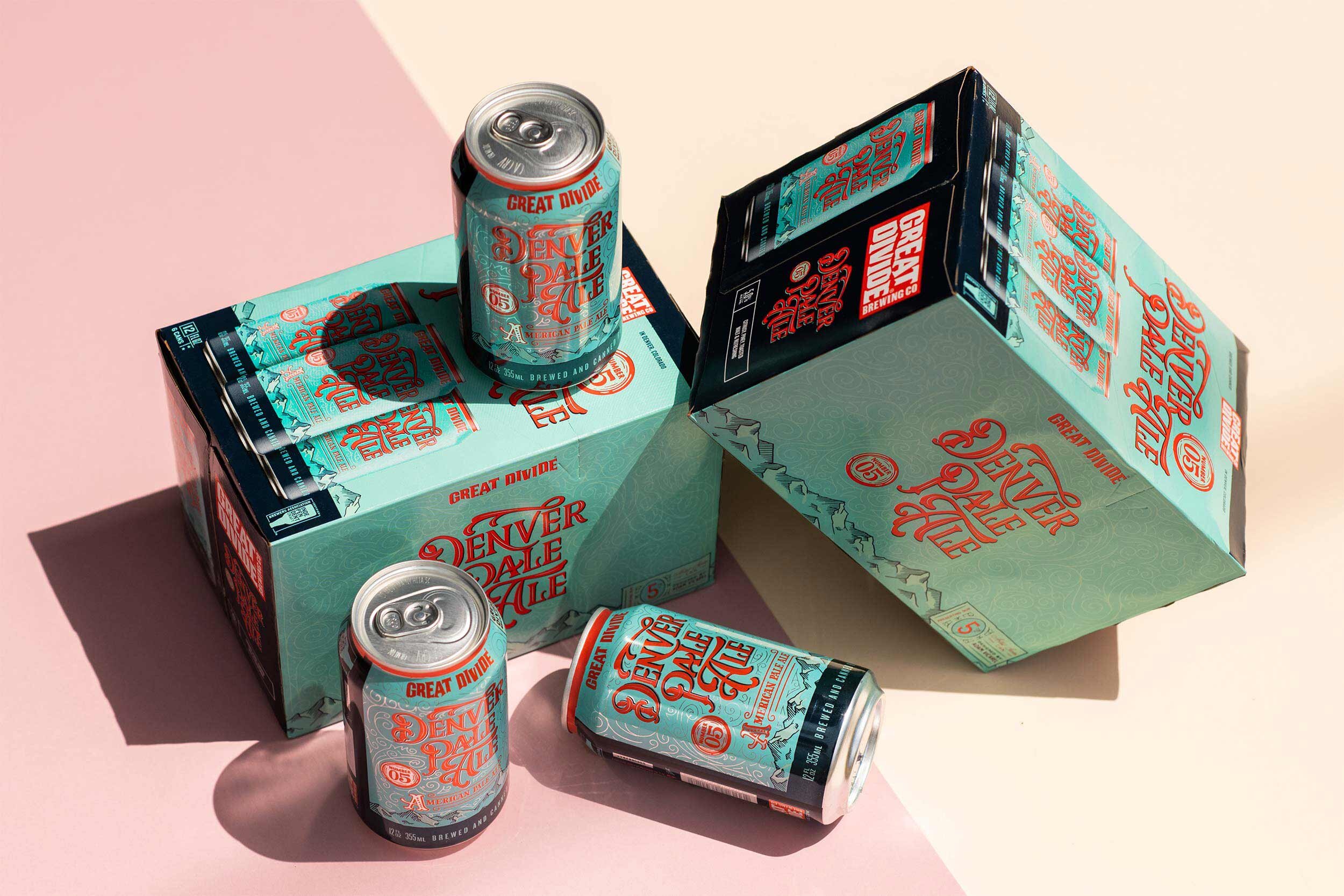
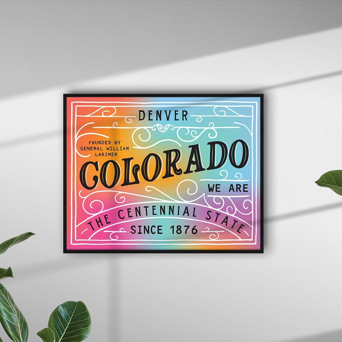
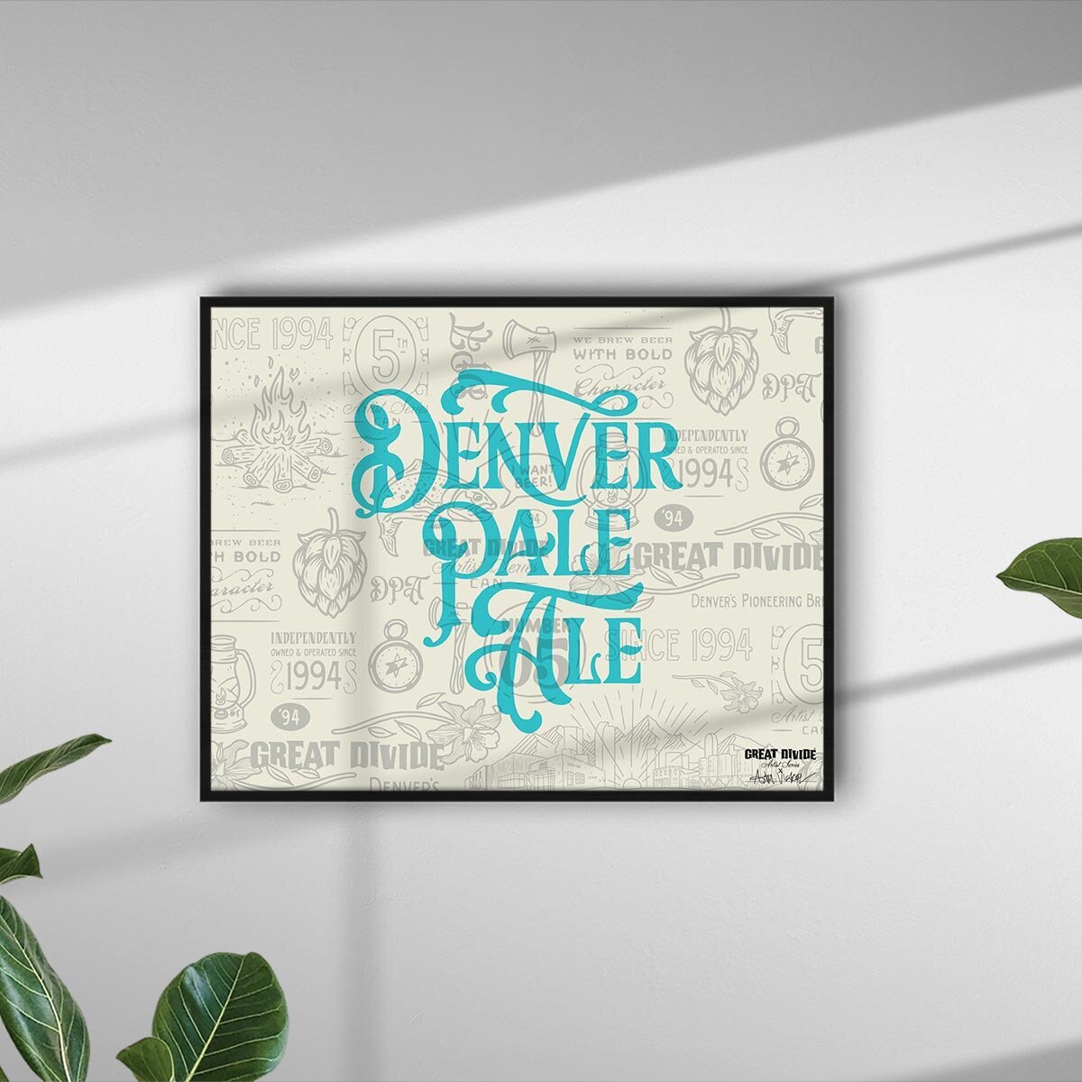
Capturing the juxtaposition of the Pike’s Peak Gold Rush (Denver's founding years) against current, modern-day Denver, this can tells the story of Denver, Colorado, old and new.
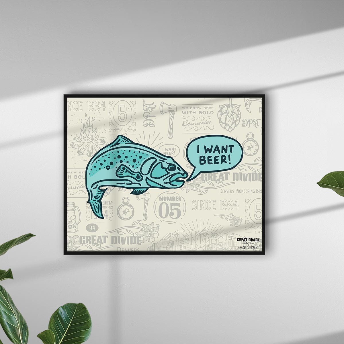
Founded in 1858, Denver's early years fell in the middle of the Victorian Era—a period characterized by elaborate and embellished typography. To capture modern-day Denver we took a more casual approach to illustrating classic "Denver stuff" such as mountains, the skyline, trees, and camping gear. The monoline illustration style is intentionally whimsical, and the density of these elements helps balance out the ornate and information-heavy designs on the front and sides of the can.
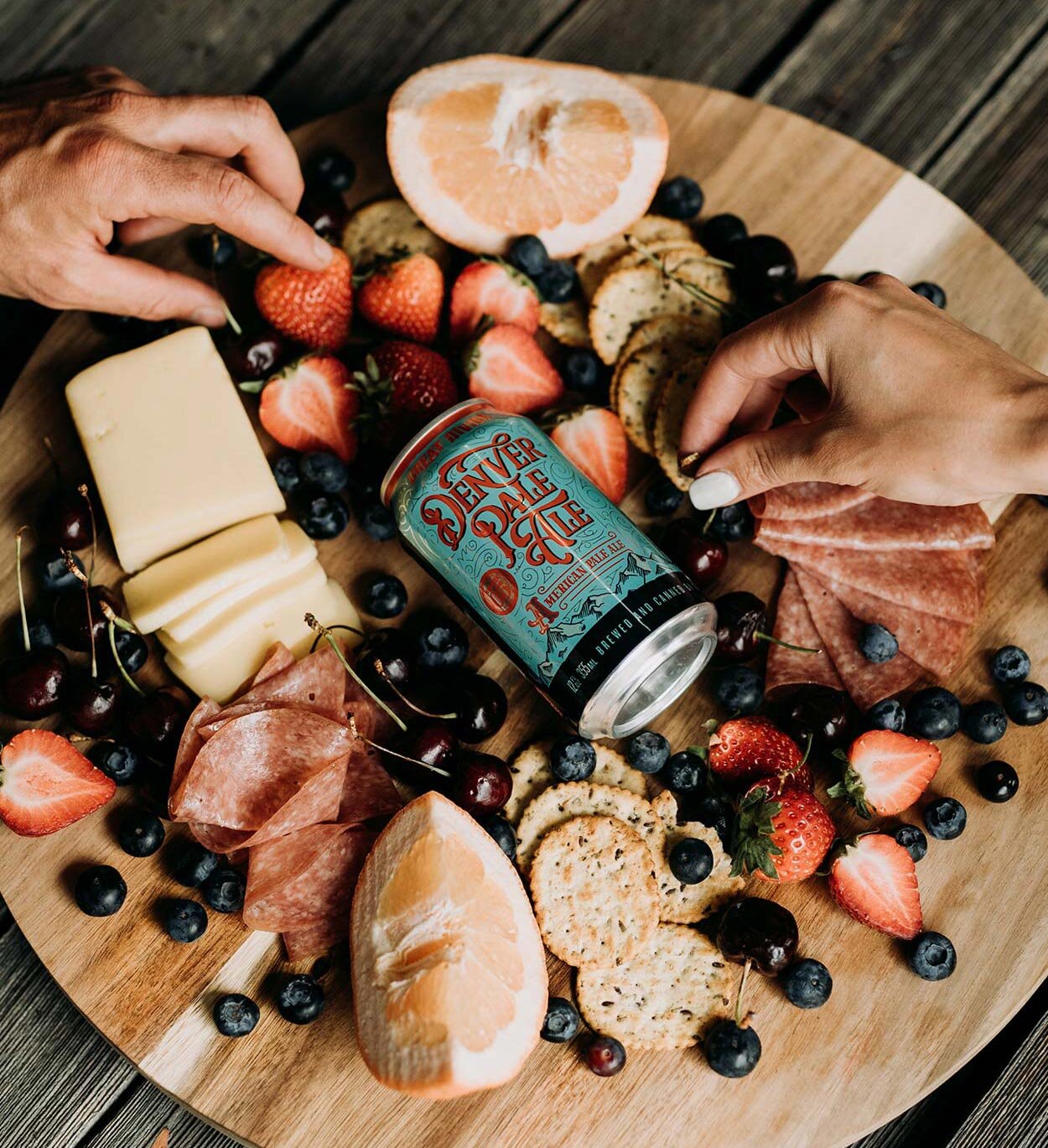
The bright color palette not only helps position this classic pale ale as an easy pool-side sipper, but also helps these cans stand out on shelf.


Melding the ideas of historical Denver and modern Denver, the combination of victorian-inspired typography, modern illustrations, and a poppy, summer color palette enabled us to create a packaging solution that spans 160+years of history.


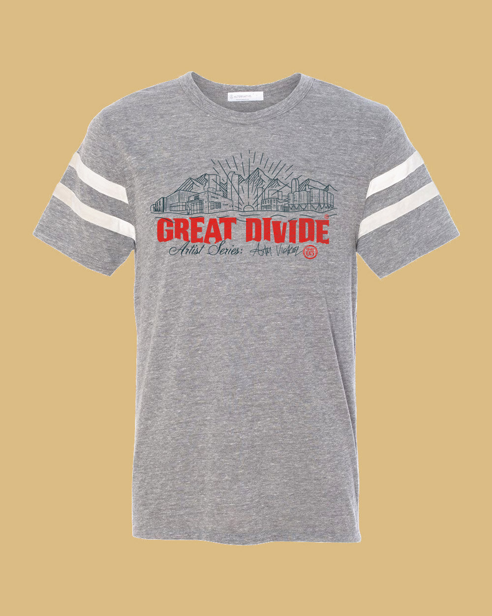
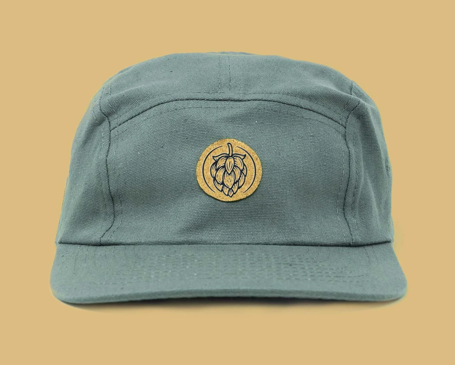
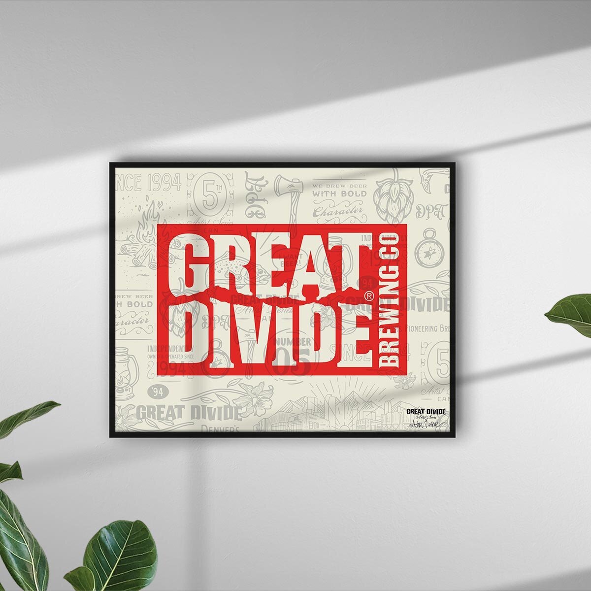
As with many of our brand-focused projects, we prioritized creating a system of responsive and scalable graphics that could be pulled out individually to create swag, prints, and other profitable merchandise for Great Divide Brewing.


Similar to the beer can design, the art prints were also inspired by the Denver Gold Rush and Victorian-era theme
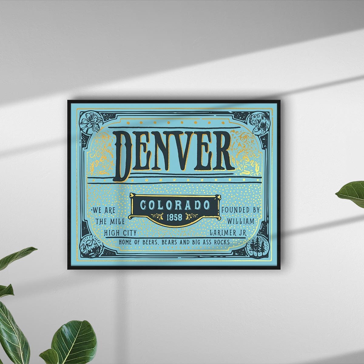
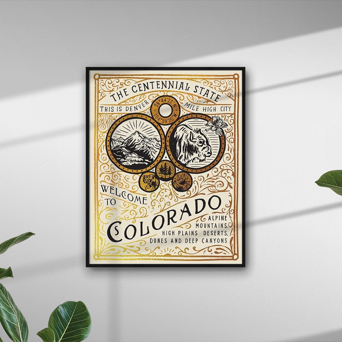

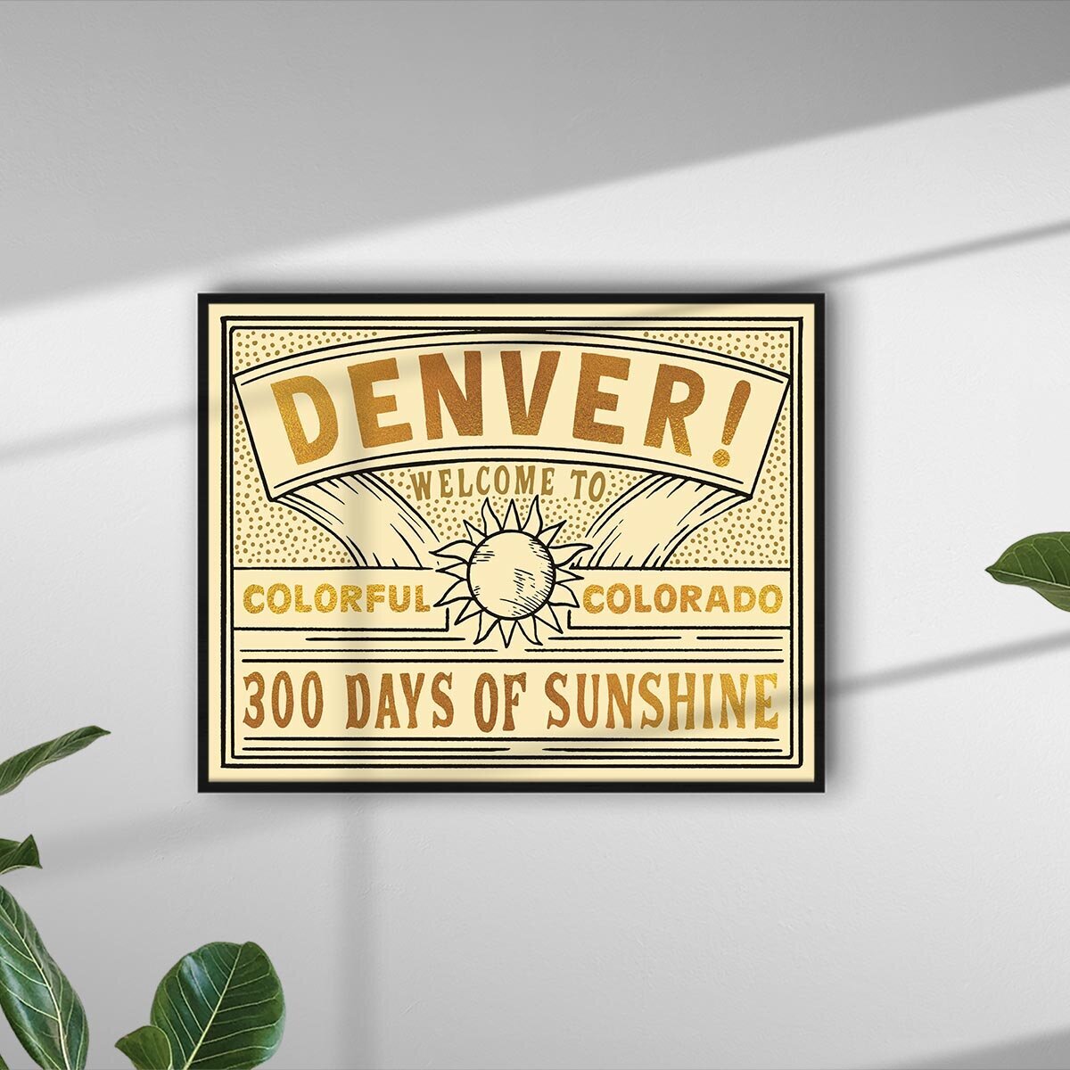
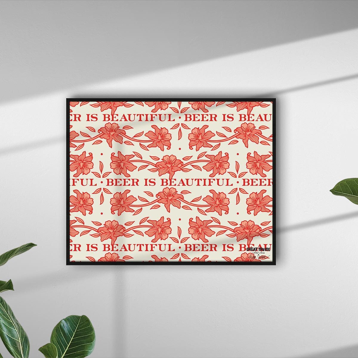
All of these prints, and more, available for purchase in the Vicarel Studios shop.