New Belgium Brewing | Blackberry Felix
Services: Design, Lettering, Social Media Marketing, Storytelling, Photography
Agency: Inkwell Media
Client: New Belgium Brewing
Crafting a label for one of largest independently owned breweries in America.
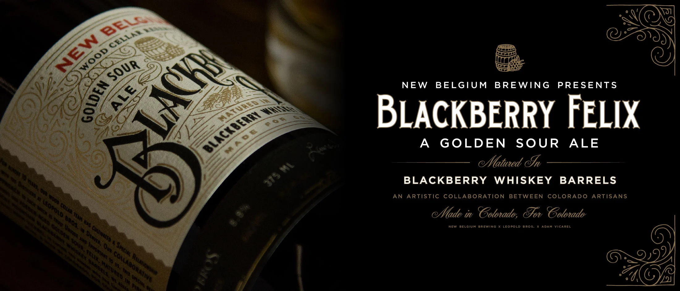
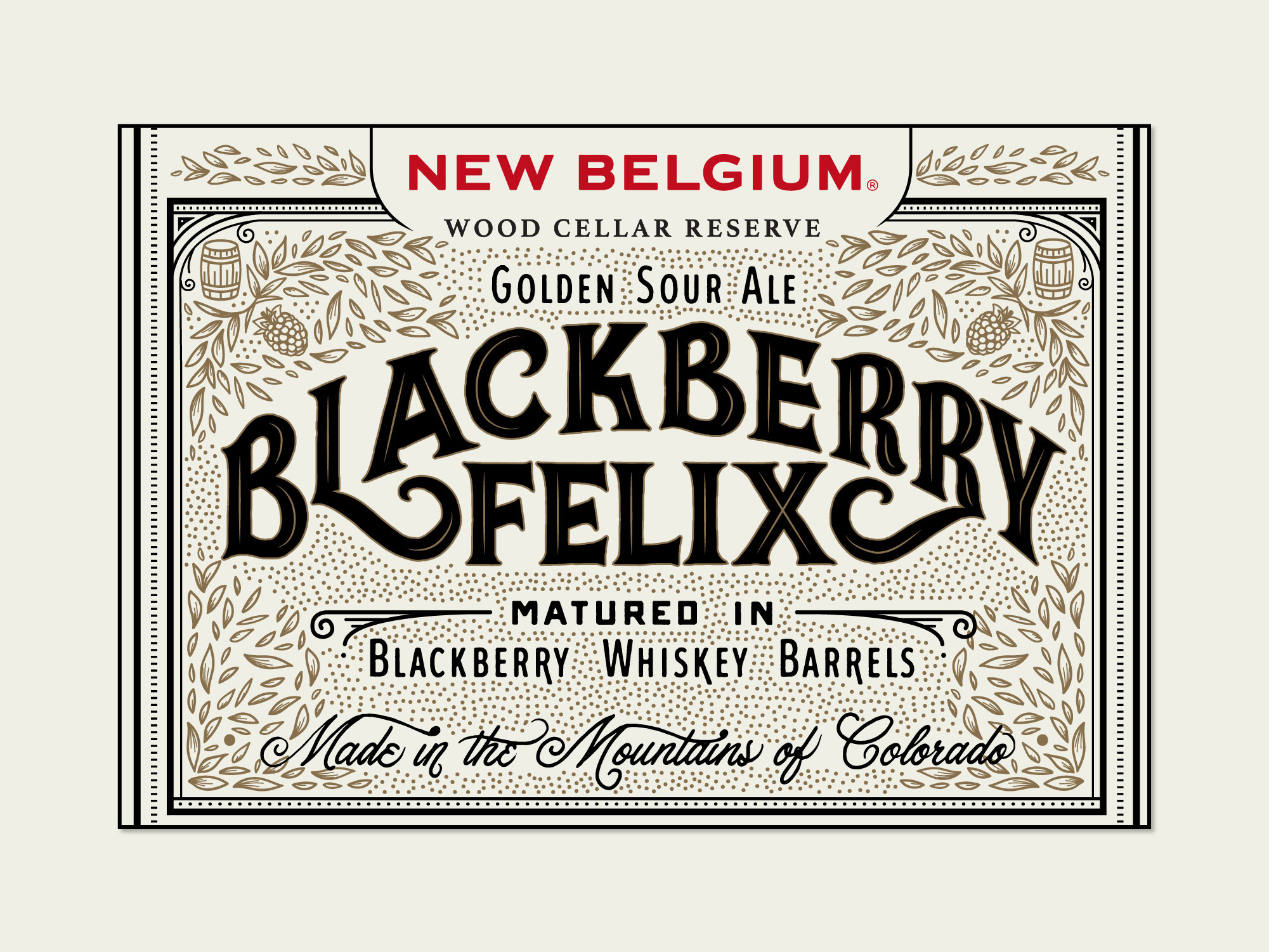
We teamed up with New Belgium Brewing not only to design a label, but also create hype around the release of Blackberry Felix, a golden sour ale matured in blackberry whiskey barrels from their collaborative partner, The Leopold Brothers. Our goal was to create a label that through both aesthetics and process, harkened to the artisanal processes of distilling and brewing. Leveraging the art of hand lettering, a heritage-craft itself, we documented our every move while creating the face for this small-batch sour ale to give a bit of insight into the brewery, the distillery and our own methods. Welcoming the viewer to “step behind the curtain” allowed us to not only capture this process, but to tell an intriguing story that helped market and promote this beer’s launch.
Our intention was to create social content that highlighted the entire process: not only our creative process, but that of the distillers and the brewers. Dripping this content out months before the label was officially completed, we not only built up anticipation of the product’s release, but we raised awareness of the true care and quality that went into Blackberry Felix’s production.
Documenting the entirety of this collaboration, we captured the story of the aging barrels, their migration from Denver to Fort Collins, how the beer was barreled and matured, and ultimately, the progression of hand-drawing the label design.
Once the label had been officially completed, we did one last teaser (our “press check”), showcasing the beautiful intricacies and the gold foil of the final design.
The typography and ornamentation are intentionally reminiscent of the blackberries and the blackberry bush itself — with juicy bulbous elements, sharper angular serifs and vine-like filigrees that represent the berries, thorns and blackberry bush vines respectively.
Representing the whiskey-infusion, the typographic hierarchy and composition (particularly the side and bottom labels) were inspired by vintage bourbon and whiskey labels.
Unused Direction:


