Nurture
Client: Nurture
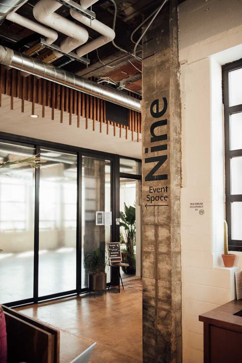
Services: Visual Identity Design, Signage and Way Finding, Collateral Design, Illustration, Mural
In Collaboration with: Rebecca Reitz
Plants: Rooney Bloom
Photos: Luke Gottlieb & Nurture
Establishing the visual language for the nation’s first wellcare marketplace.
THE OPPORTUNITY
Nurture is a community-based wellcare marketplace focused on self care offerings for everyone. With over 60 vetted, independent beauty, wellness, fitness, cafe, and retail businesses, Nurture provides a place for our community members to meet all of their wellcare needs under one roof, and they needed a brand that represents just that.
THE SOLUTION
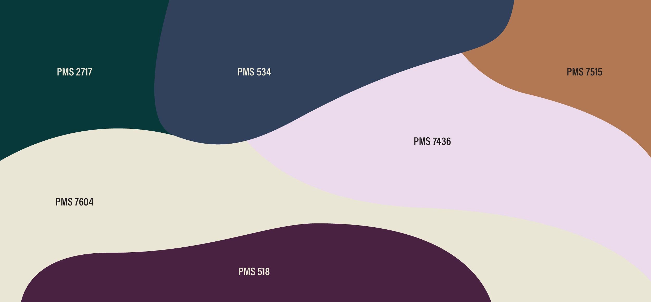
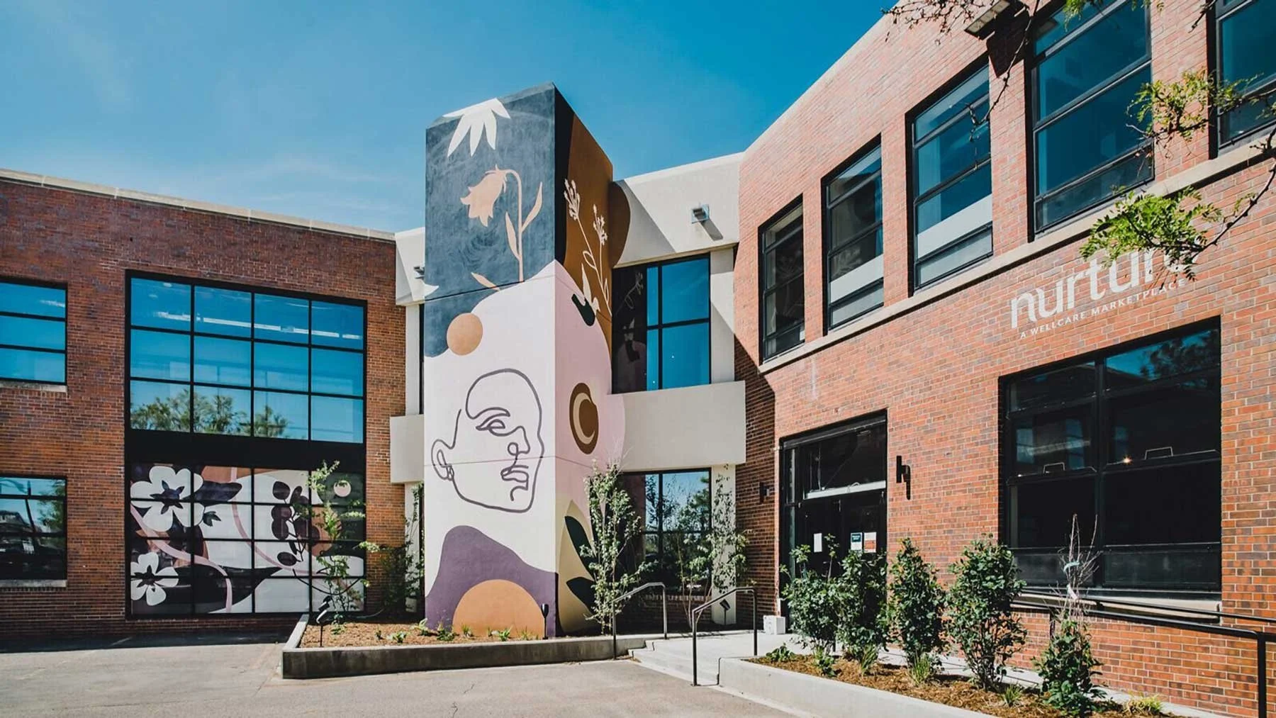
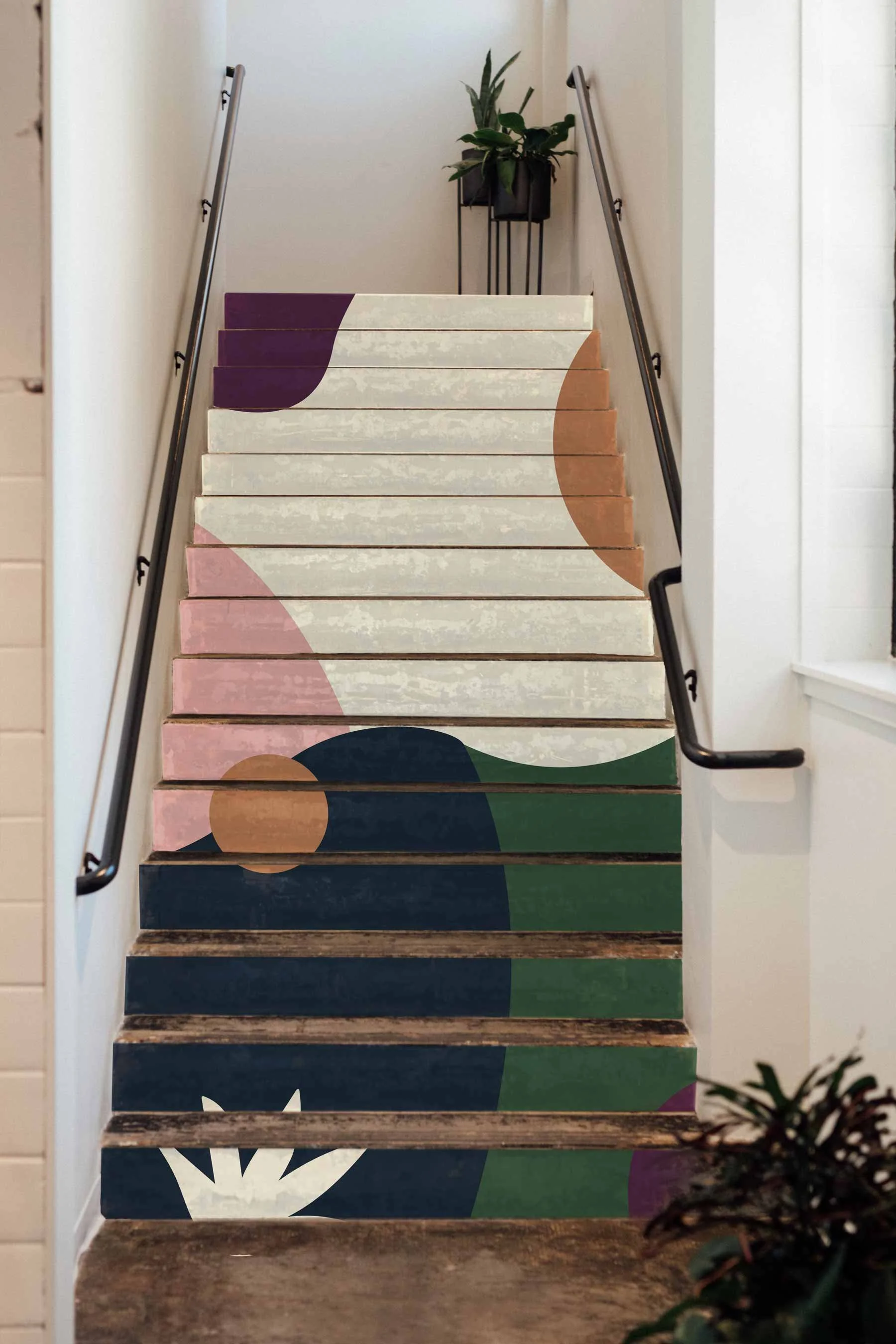
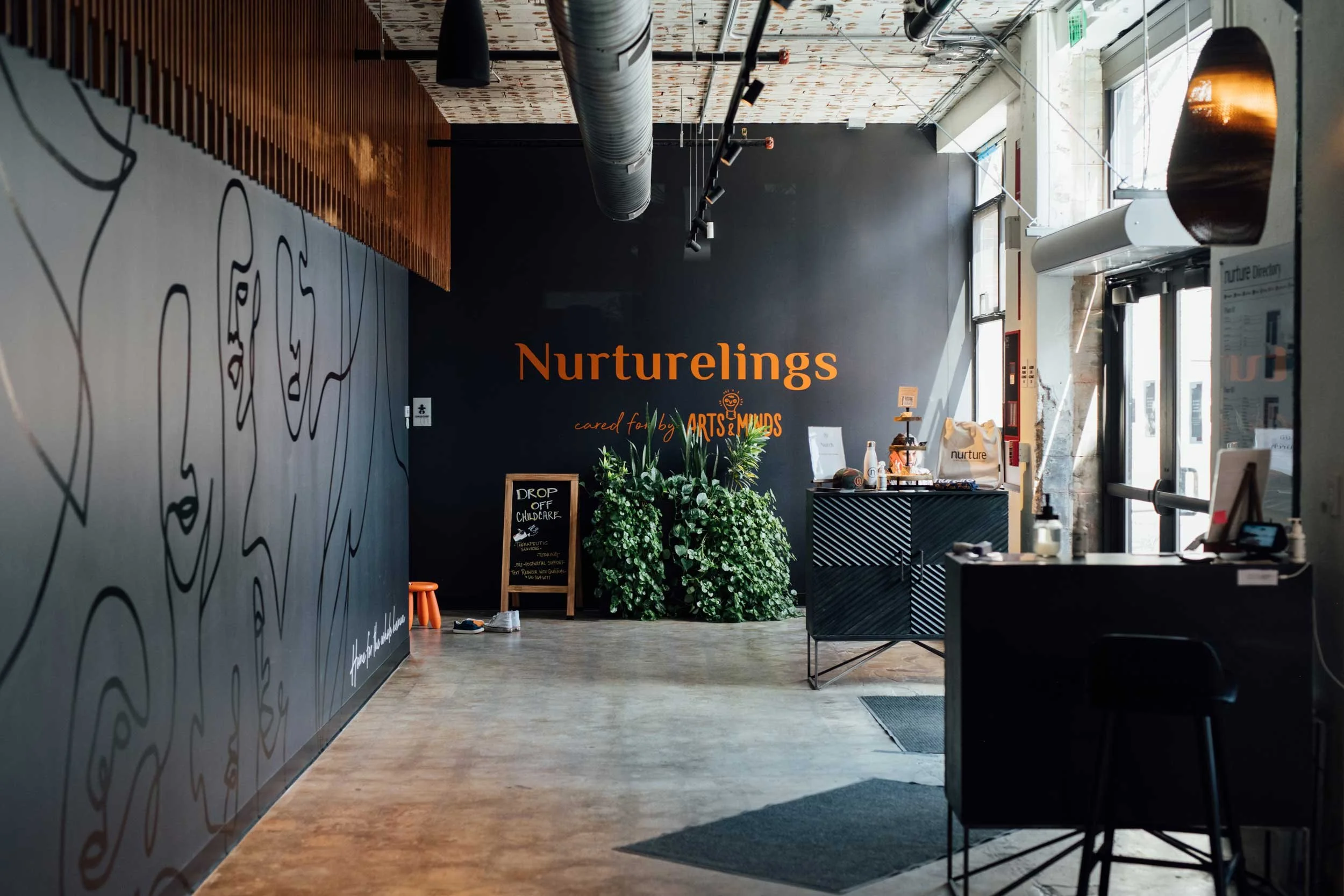
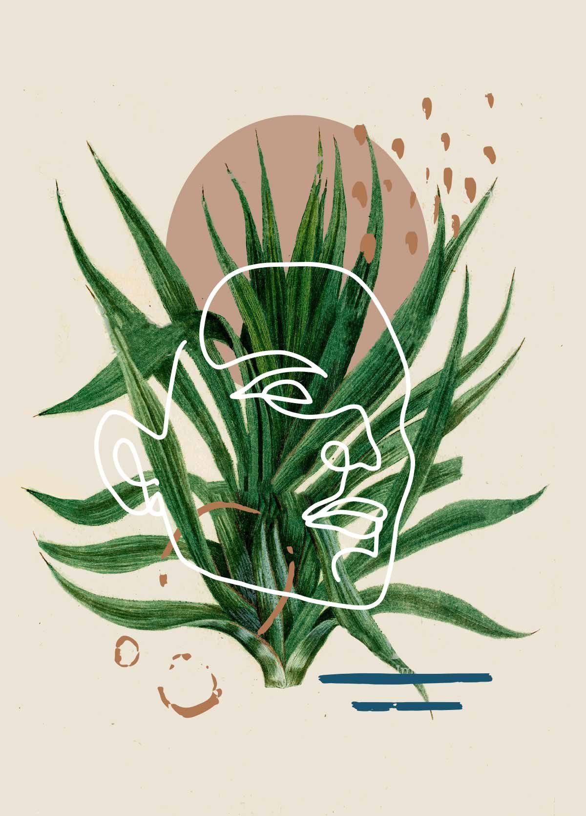
Nurture needed a brand that feels as human-centric as it does connected to nature. The colors, typography, layouts and brand elements were selected to help convey Nurture’s holistic and service-oriented offerings for all. With a largely female audience, and positioned as a location for wellness of all kinds, Nurture’s branding was rooted in themes of support, sacred geometry, golden ratios and the coalescence of nature and humanity.
The Visual Identity
The Wordmark
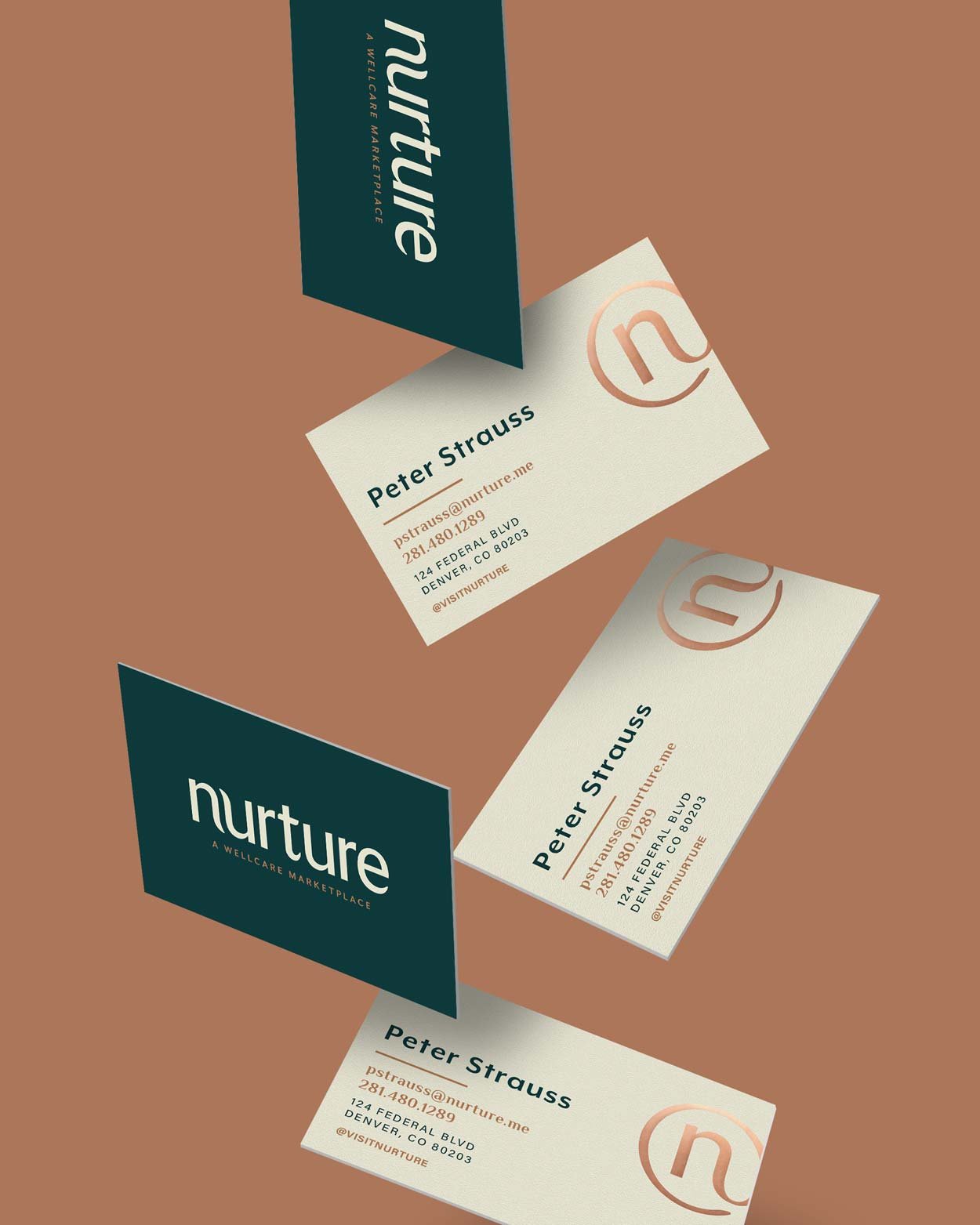
The strategy for the wordmark was rooted in the definition of the word nurture: “to care for and encourage the growth or development of.” We represented the “care and encouragement” through soft, approachable and nested letterforms (the “n” and “u” function as two arms cradling and holding each other.) To ensure the wordmark didn’t feel too feminine, we retained hard edges and corners on the serifs of the logotype.
The Logo
After exploring countless abstract and pictoral marks informed by nature, humanity, and sacred geometry, we landed on a very simple, clean solution.
The logo is inspired by the idea “at Nurture.” Nurture has positioned itself as a third place: home, work, Nurture. The mark represents a central community where all are welcome. It is modern, comforting, and memorable.
Typography
Nurture’s brand typography utilizes the quirky semi-serif, Philosopher, a clean, bold Mr. Eaves, the versatile Acumin, and Beyond Infinity for expressive accents and callouts.
Philosopher’s letterforms nicely matched some of the nurturing qualities of our wordmark, while also having a plant-like quality. This typeface is distinct, and when set with the brand’s iconic emerald green, the style is instantly recognizable. Mr. Eaves offered an alternative, sans serif headline or subhead typeface, and Acumin is a diverse neo-grotesque typeface that offers a approachable text for digital body copy. Lastly, Beyond Infinity is a handwritten script that captures the human-centric essence of the brand.
Photography
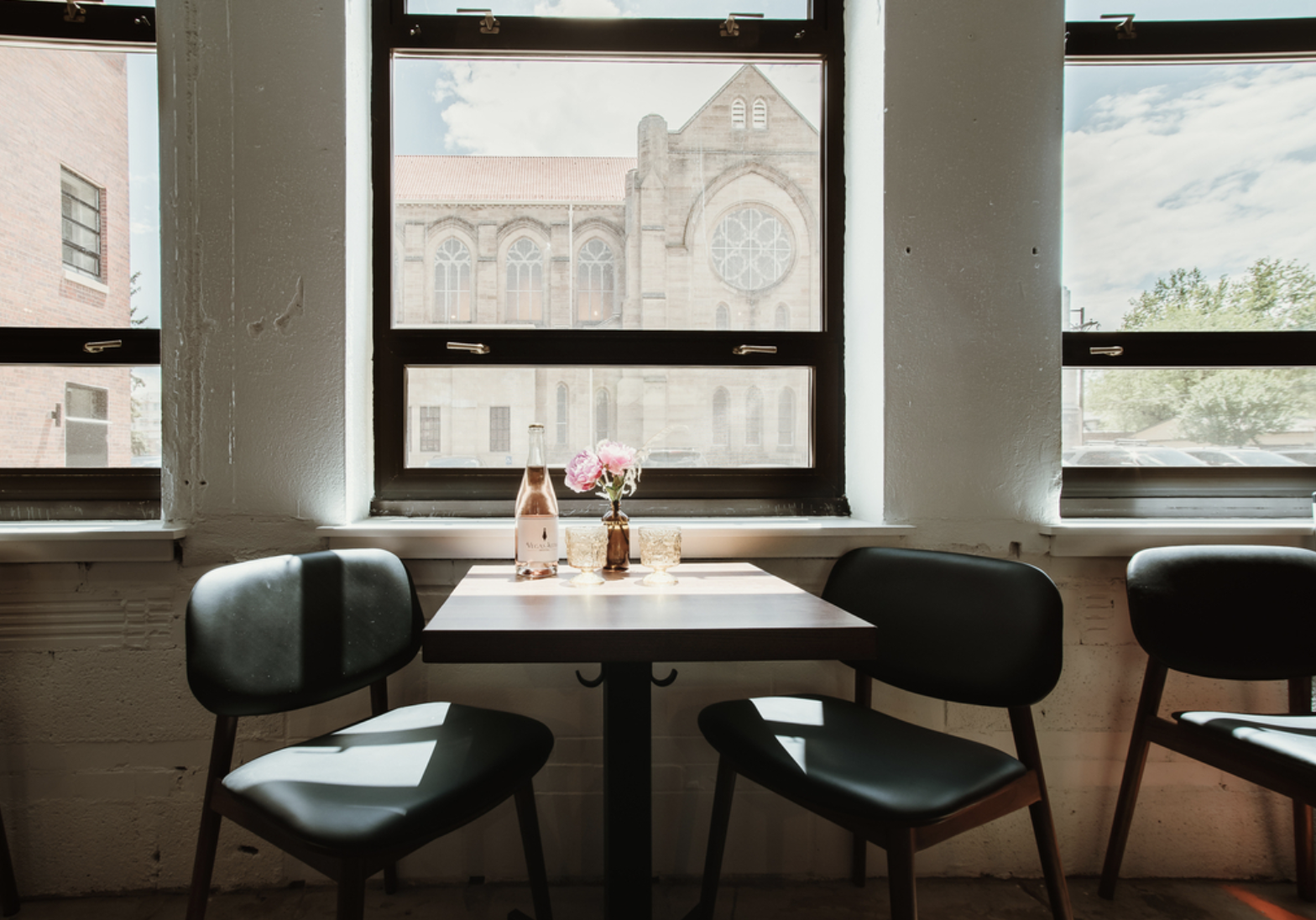
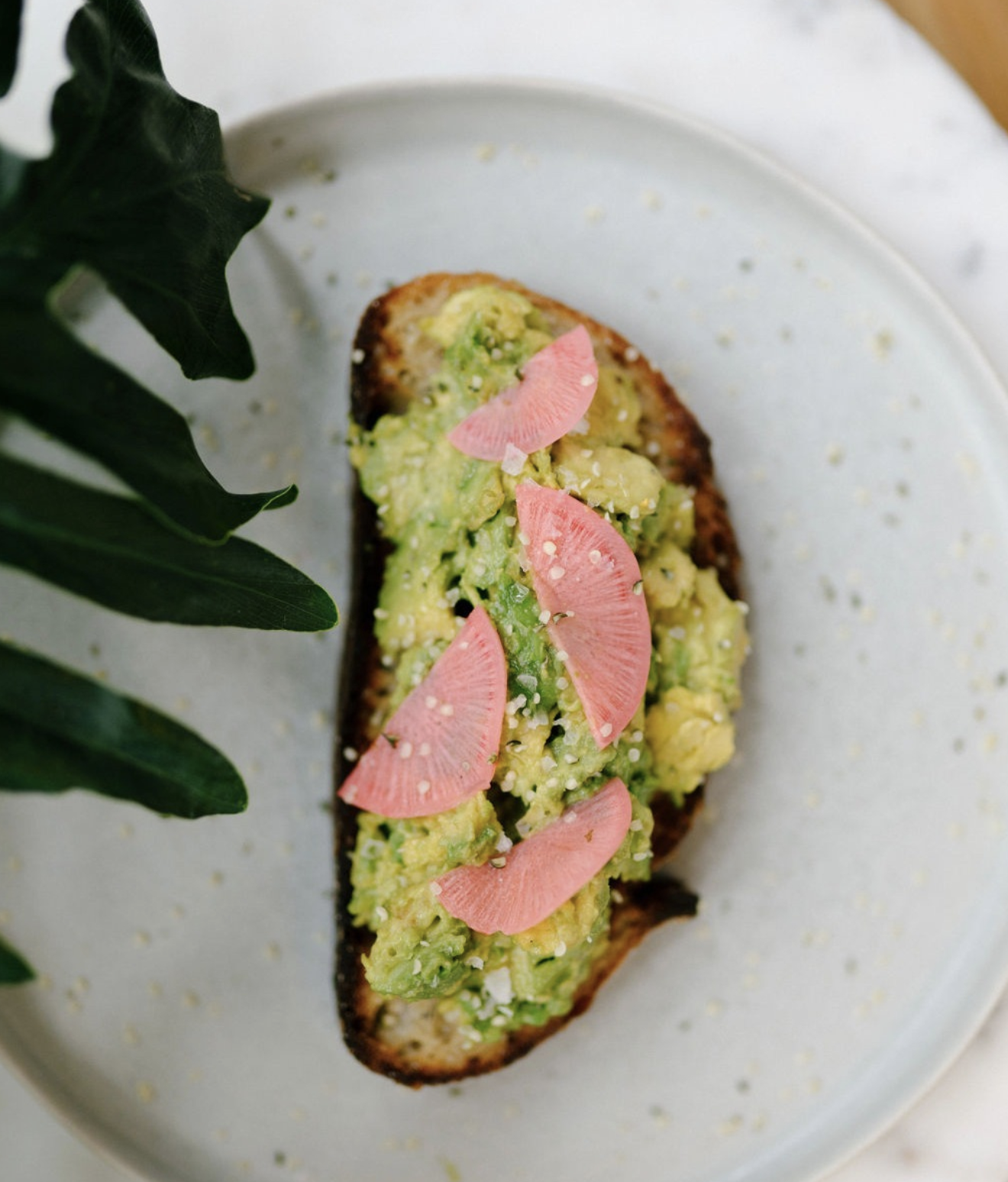
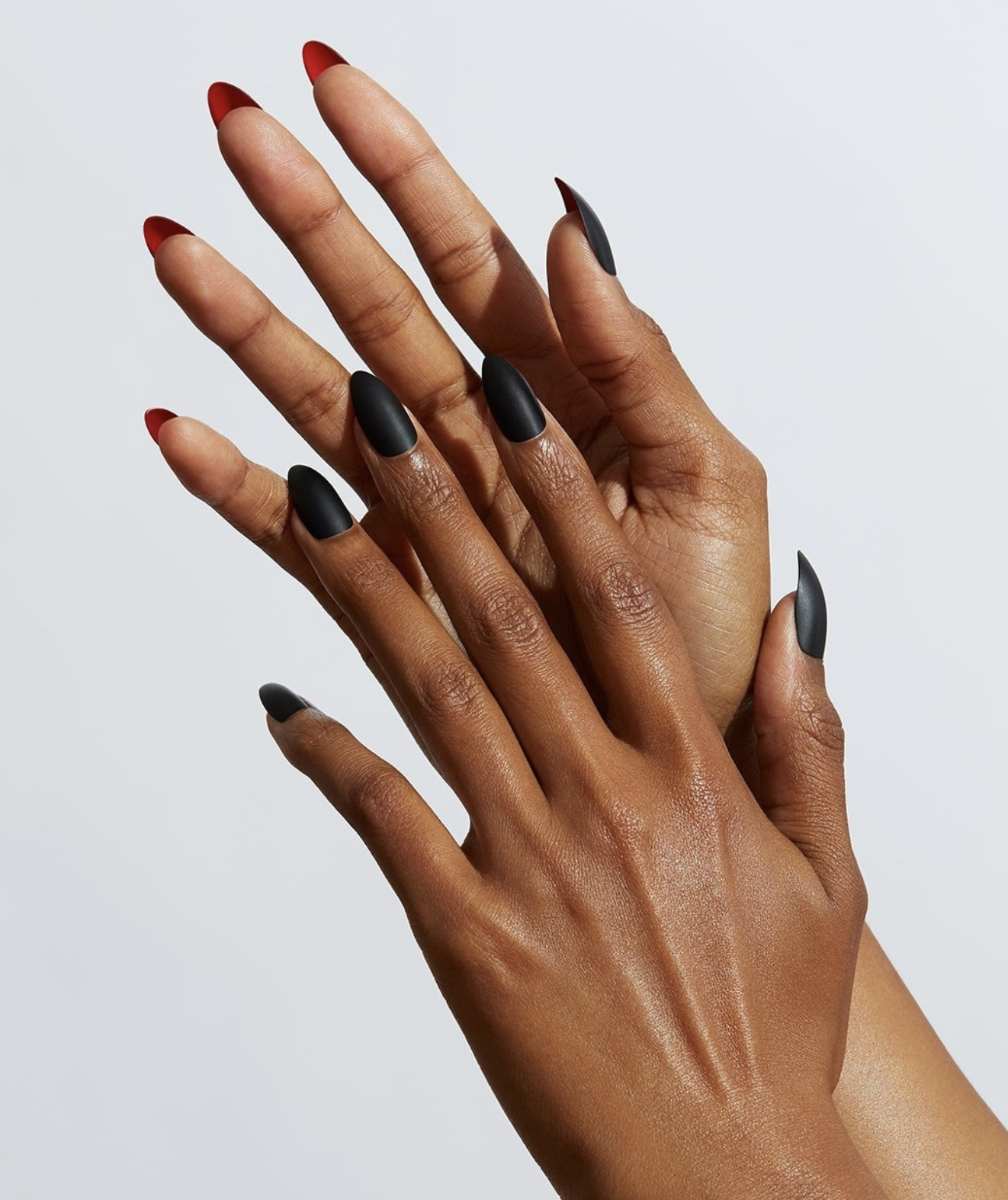
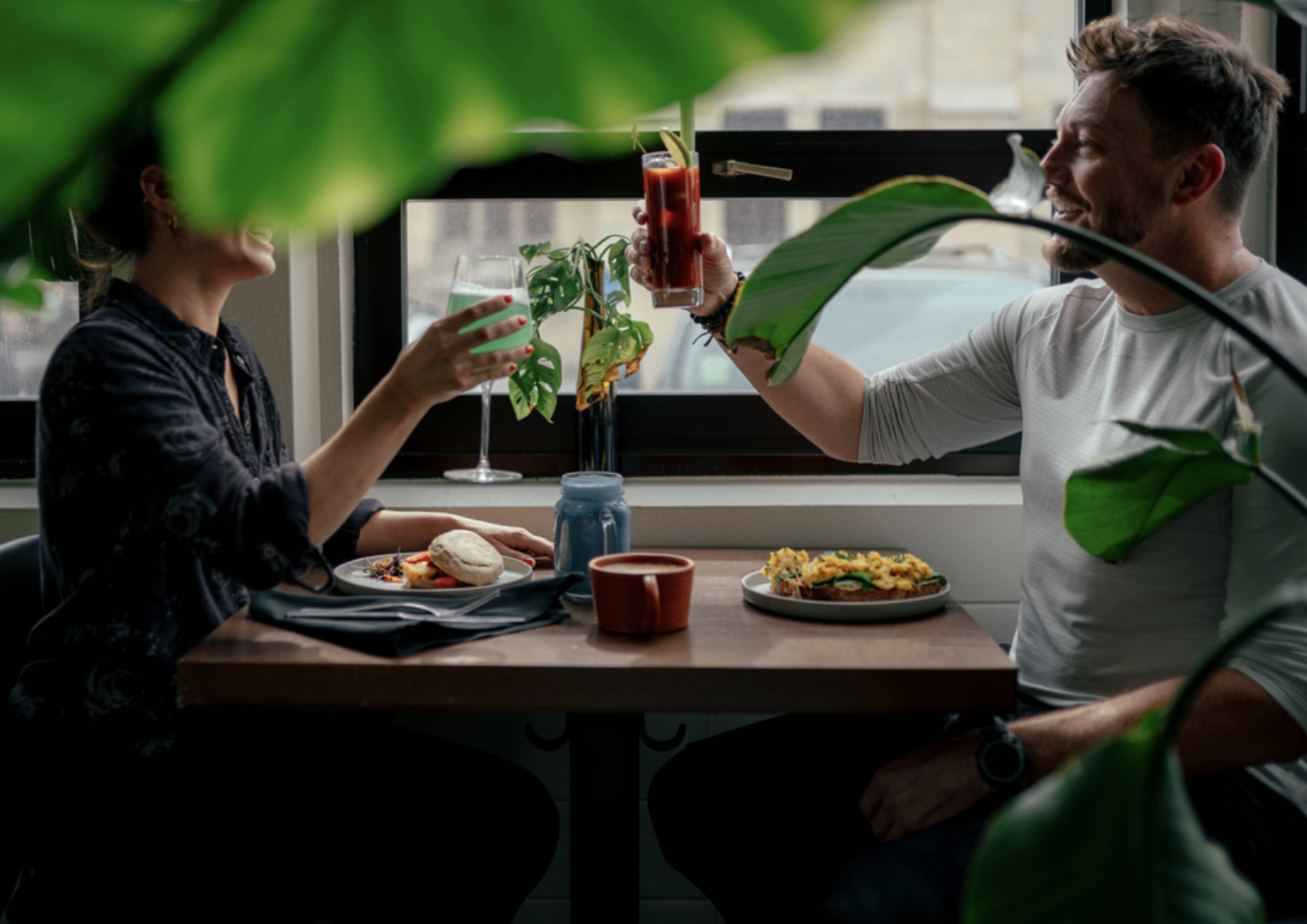
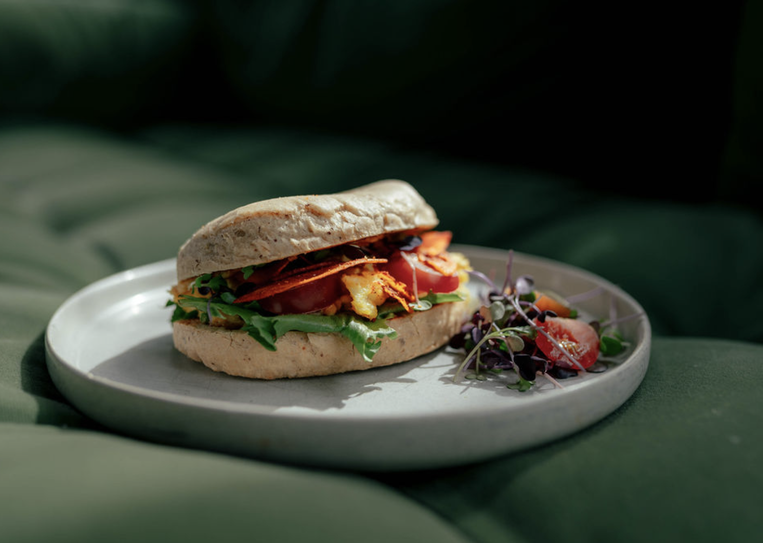
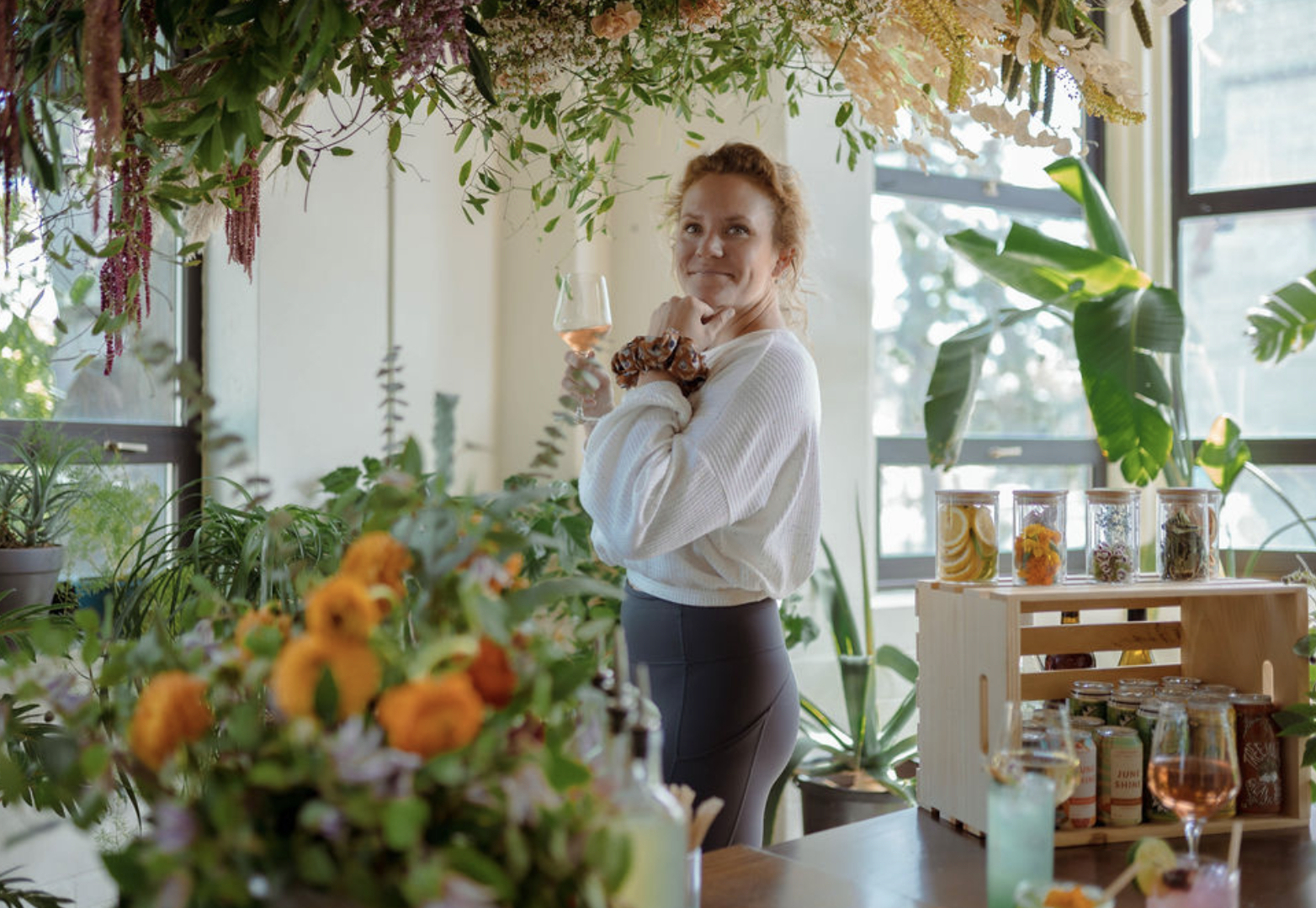
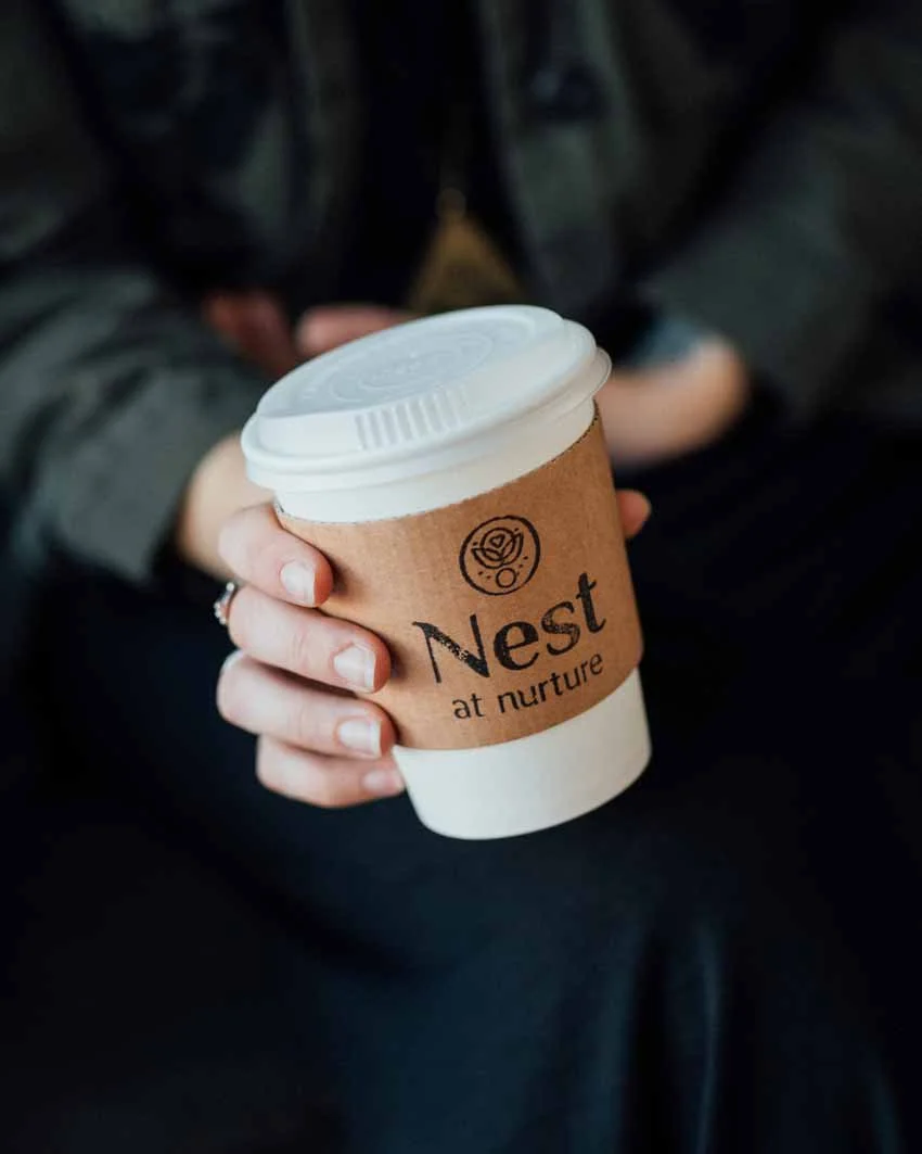
The bulk of Nurture’s photography needs fell into one of three categories: portraiture, food and bev, or environmental. A consistent thread through each of these categories was natural, soft lighting. Embracing the imperfections in us all, we suggested a wide range of natural lighting techniques can be embraced — from high to low contrast — allowing the humanity of the individual moment to inspire the final shot.
In the digital design application — particularly social media — treating the photography consistently enables the unification of the plethora of different businesses, service providers and messaging that Nurture has.


