Vanishing West Ciders
Client: Vanishing West Ciders
Services: Branding: Visual Identity, Art Direction, Logo Design, Label Design, Packaging, Tone of Voice, Copywriting
Typefaces in use: BN Lemonz by Brandon Nickerson, Espiritu by Sudtipos.
Featured: The Dieline
A vintage identity for a contemporary, western cidery.
Problem:
Vanishing West Ciders is a new cidery in Denver, CO. They wanted to make a splash with a contemporary take on a western-inspired brand. They wanted to look old, feel new, and evoke a sense of nostalgia with a dash of modern curiosity.
Solution:
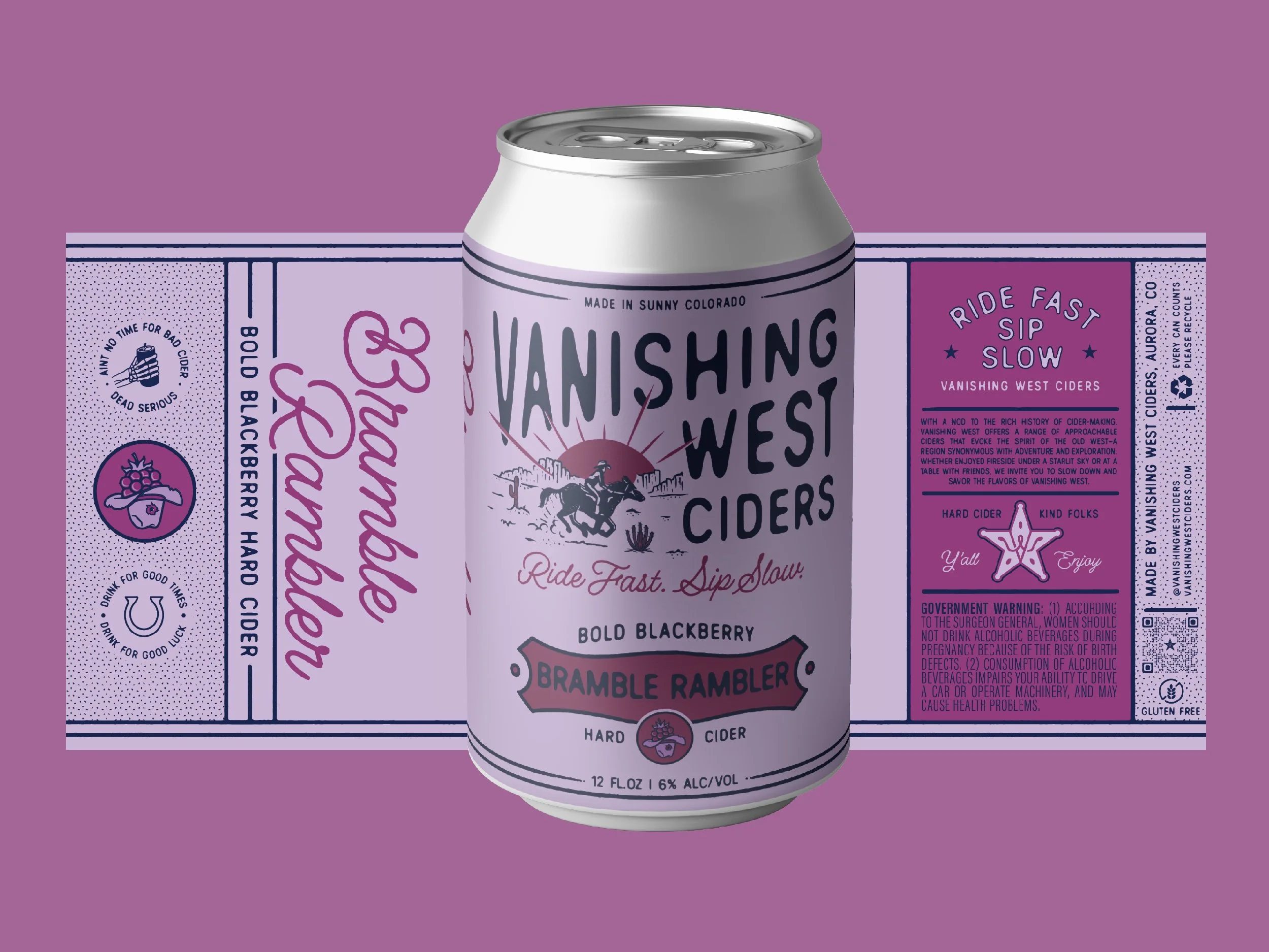
Through creating a series of fun illustrations, quippy taglines and using bright colors, we were able to achieve a western aesthetic with a contemporary and approachable flair.
Design Flexibility
Each unique cider has an illustrated badge that has a multitude of uses: on label, tap handles, in the taste-tester-flight, as well as digital applications.
Design Flexibility
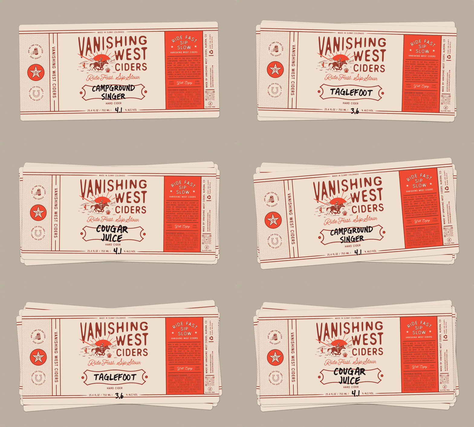
Prior to canning all of their products, VW needed a “general label” that was able to be used for any and all ciders. This temporary fix allowed them to sell any of their ciders in a 24oz crowler prior to canning all SKUs with unique labels.


