The Logo Design Process for Graphic Designers
Vol. 071
How do graphic designers make logos?
From client correspondence, to document sending, to asset creation and handoff: an in-depth look at the logo design process for graphic designers and brand designers.
A quick bite:
From client correspondence, to document sending, to asset creation and handoff: an indepth look at the logo design process for graphic designers and brand designers.
Continue reading below…
Because logo design is a “creative process” it sometimes feels vague, daunting or complicated.
As designers, we want our creative processes to feel unbound, explorative and unrestricted. We feel this “freeness” allows us to create our best and most compelling work, right? … Well, maybe not — let’s try to rethink this…
The reality is, having some structure and guardrails up throughout our creative processes actually lends itself to more successful outcomes.
In order to think outside the box, you need to start in the box.
All successful businesses use automation and systemization as much as possible to prevent inefficiencies in their business. We can do this in logo design too! Having a standardized workflow when it comes to logo design enables you to efficiently move the project forward while presenting your work to the client professionally and with confidence.
Over my 10+ years in the graphic design industry, 6+ years have been spent in logo design and branding, and I’ve had ample time to refine my process and approach, particularly for hand drawn logos.
The following steps are how I approach essentially all logo design and branding projects that come through Vicarel Studios. Whether that project is a simple mark, branding a product, or a comprehensive visual identity project, our logo design process is as follows:
Receive logo design inquiry email
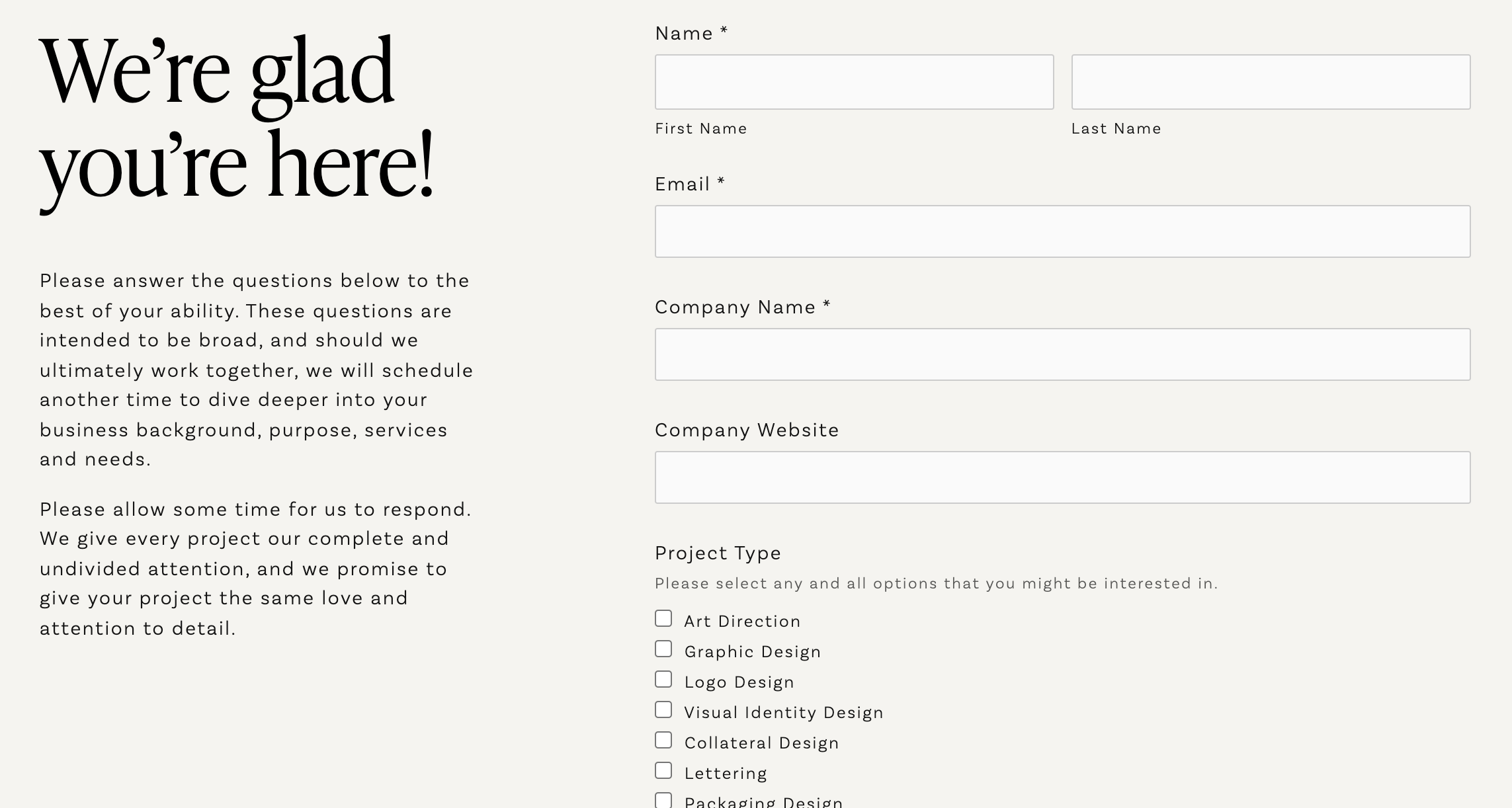
Project inquiry form
Initial call
Logo design proposal
Project kickoff email
Creative brief
Round 1 logo design presentation
Round 2 logo design presentation
Round 3 logo design presentation
Round 4 logo design presentation!?
Finalizing logo assets
Brand Guidelines
Review
Handoff
Followup
Whew!! It might seem like a lot, but if you systematize this process, it’s as fluid as can be! Let’s get into it…
The initial logo design inquiry email
The initial email inquiry is generally asking how much a logo costs or how much do branding services cost. Inquiries also often ask about availability and timeline.
The reality is: asking how much does a logo cost is like asking how much does a car cost?
There are too many variables, and there isn’t one set answer. I often respond to these emails with a project inquiry form to help gather some initial information about the project.
This allows my prospect to fill out this form on their own time, and forcing them to execute this additional step helps me weed out people who aren’t taking their job seriously.
At this point, my goal is to mitigate wasting time. I don’t want to exchange a bunch of emails about a project that isn’t a good fit, and I definitely don’t want to get on a 30min+ call for a project that isn’t a good fit.
The project inquiry form
Once the prospect has submitted this form, I have an opportunity to make an initial assessment of whether or not this prospect is a viable client.
The project inquiry form helps me qualify prospects and weed out projects that might not be a good fit for me, or for my client!
Remember, this isn’t all about whether the client is a good fit for me, but also a look at whether or not I am a good fit for this client. This is a business partnership.
The questions you ask on an inquiry form are up to you, but prior to hopping on a call about a logo design project, I like to understand things like the timeline, budget (even if this is just a budget range for a logo design project), and some basic background on the project or business.
These initial questions allow me to catch any immediate red flags about the project, and they help me formulate some additional questions for our potential first call.
Again, the main purpose of this form is to mitigate wasting your prospect's time or your own time.
If all looks good, I use an email template to follow up and have them schedule a call to connect further.
The initial call
The first call is an opportunity to quickly meet each other, talk about the logo design project details a bit more, and get a gut feeling for whether or not you’re a good fit for each other. Here are a few things that I do to ensure this call runs smoothly:
I like to keep the call to just 30mins. They’re brief, direct, and get straight into the meat and potatoes of the logo design project. I like to ask high level and broad questions at this point in time.
This call is also an opportunity for you as the logo designer or graphic designer to convey your professionalism, experience, and process.
As you begin to to have conversations with your client, I highly suggest that you start a master notes document so that you’re always on top of the project, where it’s been, and where it’s going.
On the initial call, my goal is to try to understand if the project is a good fit (based on industry, client expectations and SOW), general price range, how difficult the project (or client) might be to work with, and the timeline.
Project interest and viability
Does this logo design project interest me? Is Vicarel Studios a viable candidate for this branding project?
Let’s be real — logo design and branding projects should be enjoyable to work on! Ask questions to help you understand your prospect and how they might be to work with, and how their project might play out. Will this project be fun?
Gauge price range
Note that the price noted by the client in the inquiry form may not be accurate.
Not everyone understands how much logo design projects cost. The reality is, the range could be anywhere from $500 for an inexperienced logo designer to well over $120,000 for a larger logo design project and a big branding studio. Hell, Citi Bank paid graphic design and branding studio, Pentagram, $1.5 million dollars for just the logo! 😳 The full branding project was ~$10 million!
Level of complication
How difficult will this logo design project be? Is the request itself difficult? Will your client be difficult to work with? Have they worked with other graphic designers or logo designers in the past, meaning they may or may not understand the creative process? Work to understand your prospect’s expectations, factor your own expertise, and consider other factors that might pertain to this project.
Project timeline and availability (should you apply a rush fee?)
Remember, it is not your job to take on everything that your client requests. It is your job as a logo designer to have a logo design process.
You should (almost always) employ your own process to ensure you’re creating the best work possible in the way that you know best.
If a client needs you to change your process for them, you need to be sure that you’re comfortable with that. If not, push back—you’re allowed to say no!
You should have an understanding of how long logo design projects normally take. This understanding would be based on experience and tracking your time. (I use a ton of apps to help with my graphic design business — Toggl, a time tracking app, is probably my most used)
The logo design proposal
Depending on how the initial logo design call went, I approach sending a logo design proposal (here’s the design proposal template I use) in one of two ways:
1) SOW Doc:
A Google Drive Sheet document (basically, Excel) that line items the project cost and loose deliverable list.
2) Design Proposal:
Or a more comprehensive design proposal that conveys our understanding of the problem and project, shows relevant case studies, and has a scope of work document.
I generally straight up ask my client if it would be helpful to have a more comprehensive proposal. Oftentimes, cold leads, businesses who are receiving multiple quotes from other brand design studios or those who intend to share the proposal with other team members request a more comprehensive proposal.
Here again, I ask because I don’t want to waste an hour pulling together a proposal if they’re simply looking for how much a logo costs. I can provide that in a simple Google Drive Sheet in 5 mins.
Don’t waste time when you don’t have to, folks! Talk to your prospective client and ask them what their expectations are and what they need.
Like all creative presentations, it’s preferable to talk through your proposal; however, if you’ve already sold yourself on the initial call, the design proposal might really just be an opportunity for them to see some relevant work and review the numbers internally.
Assuming your proposal lands the logo design project, we move on to the kickoff email!
The project kickoff email
I like to send one email that has all of the elements we need to get a logo design project started. Before I start any logo design project, I get a contract signed, a questionnaire filled out, a Pinterest board populated and a deposit paid.
Contract: I send my contracts via Adobe Sign for ease, professionalism and tracking.
Questionnaire: An opportunity for further insight on the project, the questionnaire allows you to ask direct or abstract questions to understand your client, project, and their expectations on a deeper level. Download a version of my questionnaire document here.
*Important!: remember, these are questions that you need for your project. As a graphic designer, brand designer and muralist, you may find some of these helpful. If you’re using it for other purposes, adjust as you see fit!
Pinterest: This is an opportunity for both my client and myself to contribute to a moodboard. Here, I request my client pins, logos, colors, interiors, signage or just vibey photos that capture the essence of the brand as they see it.
I contribute to this too, but I let them start so that I can first get an understanding of their vision.
As a creative director, it is my job to establish and support the creative vision of a given branding project — if I feel their creative vision is off based on what they’re pinnning, I’ll talk them through my thoughts.
Deposit: the deposit invoice is normally 50% of the project total. I will NOT do anything until I have this deposit paid and the contract above signed. I send this via Quickbooks for easy tracking and documentation.
The creative brief
The Creative Brief is a multi-paged document that acts as a succinct distillation of all conversations, documents, inspiration, and the competitive landscape. Essentially, the Creative Brief is an opportunity for you to put all of your clients thoughts, words and inspiration in one spot, and then basically ask: “is this what you were saying?”
The primary purpose of this document is to function as the creative direction and brand strategy for this project moving forward.
Presenting a creative brief that your client approves gives you ground to stand on should things go awry later on. Because your creative brief is the foundation of all creative decisions moving forward, you have the opportunity to connect all creative decisions back to this brief. In that way, godforbid your client says “hey, none of these logos are right”, you’re able to explain how your work is connected to the creative brief that they agreed on. It’s an informal way to protect yourself and ensure you’re moving in the right direction.
Round 1 logo design presentation: what to show, how to show it.
The goal of round 1 is to go wide before you go deep. I like to show a broad range of ideas and concepts before we begin refining.
Round 1 is the most vague and complex (because it’s the beginning of the project), so I’ll go in more depth here than the other steps in this process.
You’ll find that the better your creative brief, the better R1 often goes.
Note: You should feel like you have an idea of what the logo design and overall brand design will look like before you ever start designing. Round 1 logo design should not feel like a full shot in the dark.
Here’s a mood board that is presented to clients before beginning the logo design process.
There has been a lot of talk amongst brand designers and logo designers about the “one concept method.” This is the idea of really understanding your client and project, and presenting just one direction. While I see value in this process, I haven’t seemed to figure out how to approach logo design in this way.
I personally enjoy the process of exploring multiple options and then showcasing to the client how these different brand directions could lean one way or the other with the positioning of their business. In round 1, I don’t actually state how many logos we will present, but it is almost always between 2-4.
Round 1 always starts with sketching. The most important thing you can do before you start on a computer is to process your ideas and your thoughts, and create as many quick thumbnail sketches as possible. This isn’t about making things “look good”, it’s about getting ideas out of your head and onto paper.
Before you present, you should prepare your client for what’s to come. Despite what you might think, people don’t like surprises when it comes to spending money. They want to feel like they’re in control… So, tell them what’s about to go down!
I will kick off my presentation by “reminding them” what the project is with a high level review of what the opportunity is at hand. I will then explain that “we are about to review 3 logo concepts that each explore a slightly different presentation of their business…etc.” I will then mention that each logo design has 7 pages: an intro, a logo presentation, and various mockups. Once I go through the first concept, and before I start presenting the next, I will pause and basically say: okay we have 2 more just like this — any questions before I keep moving forward?
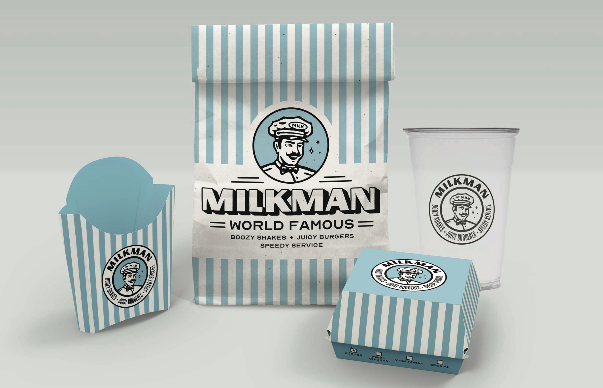
Mockups are absolutely crucial in trying to convey your concept and help your client understand how your logo design is a part of a larger brand vision. Don’t just show vector artwork on colored backgrounds and expect your client to understand how this logo applies to real life.
When presenting the work in Round 1, the presentation always has a similar flow: introduction, project framing (what’s the opportunity / problem we’re solving for with this logo design project), intro slide for each direction, various slides to present the concept: logos, type, colors, mockups, an appendix if relevant, and a closing slide.
You should always hop on a call and talk through your creative work. Don’t just send a presentation in an email.
Sending an email without talking through the logo designs and your creative strategy or process opens the door to misinterpretation. As Simon Sinek famously said, people don’t buy what you do, they buy why you do it.
When presenting (I often use Google Meet and share my screen to talk through the pdf) I let me clinet know that I don’t expect live or real-time feedback on the logo designs. I note that any and all feedback and conversation is welcomed, but I don’t want them to make off-the-cuff requests for changes — I want them to sit with these logos, review the presentation multiple times, and then follow up with consolidated feedback once they’ve really marinated in everything.
It’s crucial that you explain why all of your decisions were made and how they align with the project’s goals. If this is a presentation of an approachable cannabis dispensary logo design, explain how the colors, typography and iconography align with approachability and the industry at large.
Round 2 logo design presentation: refinement
Round 2 is an opportunity to refine your logo direction(s) based on the client’s feedback from Round 1.
My contract states that in R2 we’re supposed to move 1 or 2 logo designs forward. If they’re on the fence between two logos, we can evolve both concepts based on the feedback.
Oftentimes, there is one logo design that stands out as the favorite, and there are aspects from the other directions (typography, color choices, graphic elements) that we can potentially fold into the favored direction.
There’s a known concern as logo designers that our client will “Frankenstein” our logos—they’ll combine everything into a weird logo design that no longer has any story or strategy. Don’t make a monster!
You need to stand your ground and leverage your expertise to prevent this from happening. If you’re combining thoughts and ideas from other logo designs, do so in a way that works. Allow the directions to evolve as they coalesce.
Remember, your job is to be the expert logo designer, not the puppet. Leverage your expertise.
Present these refined directions in the same way as you did Round1 — as we discussed, we want our client to feel like they know what’s coming and they’re in control. Help set their expectations appropriately!
Round 3 logo design presentation: further refinement and finalizing.
The (mostly) final logo design presentation!
Similar to round 2, your round 3 logo design presentation is based on the feedback from the previous round.
More often than not, round 3 is small, nuanced updates: round 3 is oftentimes finessing colors, adjusting small parts of illustrations or icons, showing versioning or something else.
During both Round 2 and Round 3, we will sometimes present a multitude of variations of the same mark. This enables a comprehensive look at a variety of small changes, and allows the client to literally pick their favorite.
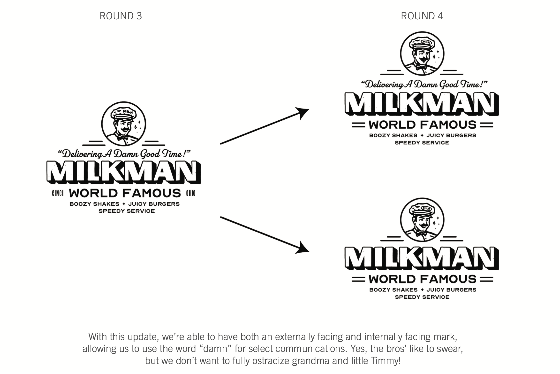
Round 4 logo design presentation: extra?
The dreaded round 4!? No, not dreaded. I want to reframe your mindset here…
Even though we state in the contract that logo design projects are 3 rounds, we price our projects in a way that accounts for a small 4th round or unexpected deviations in the project. After years of working in the graphic design industry, I've learned that almost every single project has an unexpected surprise. But, if you can expect the unexpected — is it really unexpected?
Plan to hit speed bumps, and price your logo design projects accordingly.
In this way, you are setting yourself up for the “under promise and over deliver'' mentality.” If a client needs a 4th round of logo design, you’ve already factored that into your pricing. You don’t need to charge them extra, and they absolutely love you for it. If they don’t need a 4th round, well, good for you! More cash in your pocket.
If a client needs a 4th round of small adjustments, and the process in the first few rounds weren’t abnormally difficult, I will note that “this is technically out of scope but we’re happy to accommodate it.” This not only puts you in good standing with your client, but enables them to get exactly what they want. Win win.
Finalizing logo assets
Once your final logo presentation is approved, it’s time to finalize your logo and other brand assets.
This is your opportunity to go back through with a fine tooth comb and perfect all the tiny details. Here, you have the chance to ensure constancy in your colors, adjust any weird corners or edges in your logos or illustration, perfect your kerning, etc.
Frankly, many of these are small changes that only the meticulous or critical eye would really notice. You might even be able to argue that this isn’t fully necessary; however, when putting something out into the world like branding, I want it to be as dialed as possible. The extra push at the very end is worth it in my opinion.
I personally don’t do this fine-toothed-comb pass until the logo has been officially approved by my client. I don’t want to waste the time perfecting everything if there’s still a chance that they might change something still.
Final Assets
When saving out your final logo assets, you’re saving out all of the color variations of all of their logo variations. These would be things like the full crest logo lockup, the horizontal and vertical logo versions, various glyphs, logotypes, wordmarks, illustrations and icons. Save out anything and everything your client might need.
Final File Naming
I like to organize all of these assets on individual artboards within the same Illustrator document. I then name each artboard based on the asset. From there, I export each asset as a 300dpi png with a transparent background, a 300dpi jpeg and an eps. I will also give them the Illustrator file (with outlined type) and a pdf of all logo assets.
Brand guidelines
A brand guidelines is an add-on to a logo design project.
This document is a single source of truth for your client, their vendors and their partners to reference for any questions they might have about the logos, the brand color palette, typography, layout or graphic elements or treatments.
When creating these, think to yourself: “what would be helpful for me as a graphic designer to know?” Create the rules and notes in your brand guidelines around those answers.
Brand guidelines range massively in regards to their size based on the client's needs and budget. We’ve done single page brand guidelines up to 75pg brand guidelines. Make what your client needs — no reason to create crap that doesn’t make sense.
Handoff
I personally use Dropbox for all file management. I have a Vicarel Studios folder with all clients and projects in their own folders, and then I have a Shared Client folder where I share/send assets directly with my clients.
Once I’ve saved out all final logo assets, I will copy them into the shared client folder (organized in their own jpeg, big, eps sub folders) along with folders for fonts, illustrations, icons, brand guidelines and any additional brand elements created for this project.
When I share all of this with my client I explain what each file type is used for, and I implore them to save everything in TWO locations.
Godforbid something goes wrong on my computer and I lose the work created, I want them to have it backed up.
Review
After sending over all logo design assets and elements, I like to follow up with them in about a week and be sure all is good.
In that same email (or one shortly thereafter) I like to send a 3-5 question survey asking how their experience was working with Vicarel Studios. Herein I ask if they’re okay with my sharing their responses on my website as a testimonial.
Even if you don’t use testimonials now, start gathering them! You may find them invaluable in the future.
Follow up
I like to send a calendar or Gmail snooze reminder to follow up about 6-8 weeks later and check in with my client.
At this time you can ensure that everything is running smoothly, and you can check in to see if there are any additional services that you could provide to support your client: other graphic design services, further branding services, etc.
Staying top of mind is hugely beneficial, and doing so in a way that feels supportive as opposed to salesy is a huge win!
And that’s that: that’s my logo design process. There’s a lot of stuff here that’s tough to explain in writing in this way — a lot of this stuff is simply just practice — but I’m hopeful that this insight is helpful for your next logo design or branding project!
Cheers,
Adam


