John Muir Sans: The Perfect National Parks Poster Font
John Muir Sans: The Perfect National Parks Poster Font.
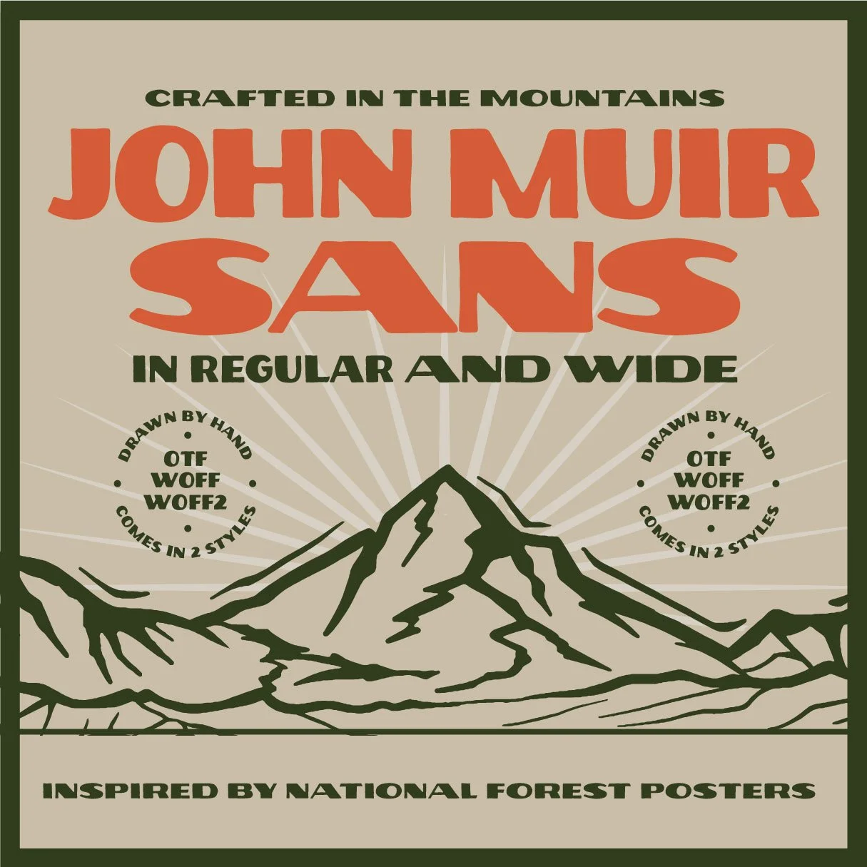
A Sans Serif Display Font Inspired By Vintage National Park Poster fonts.
The National Parks have always been a source of inspiration for creatives. The beauty of nature and the sense of adventure that the parks represent can be felt in the artwork created to promote them, and these posters are an iconic representation of what it means to be “adventurous.”
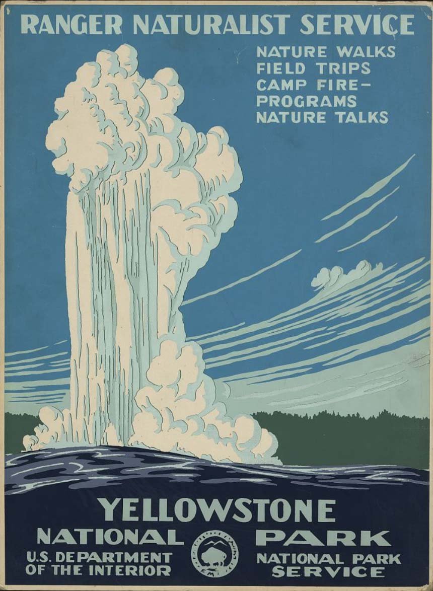
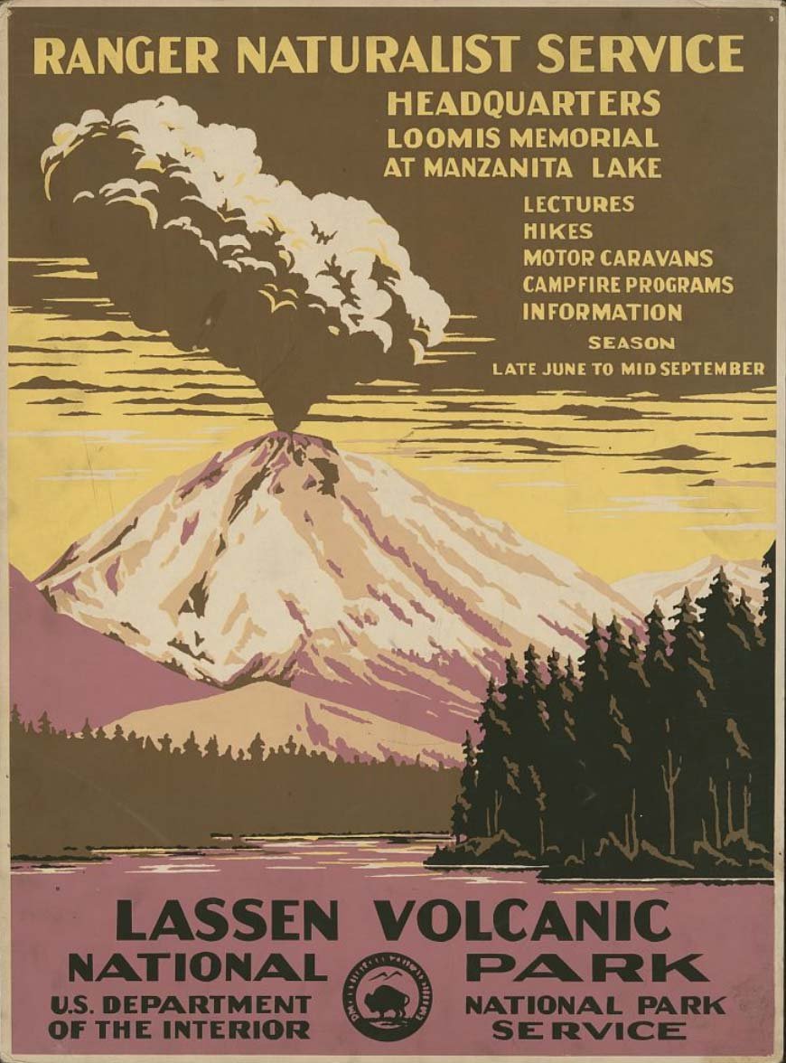
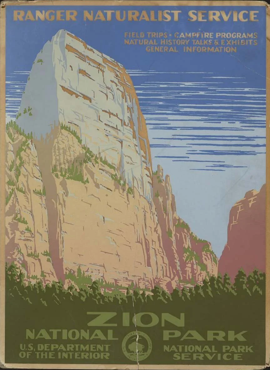
As an avid outdoorsman myself, this is why I decided to create a font inspired by vintage National Park poster fonts: John Muir Sans, a font created to honor of the “Father of the National Parks.”
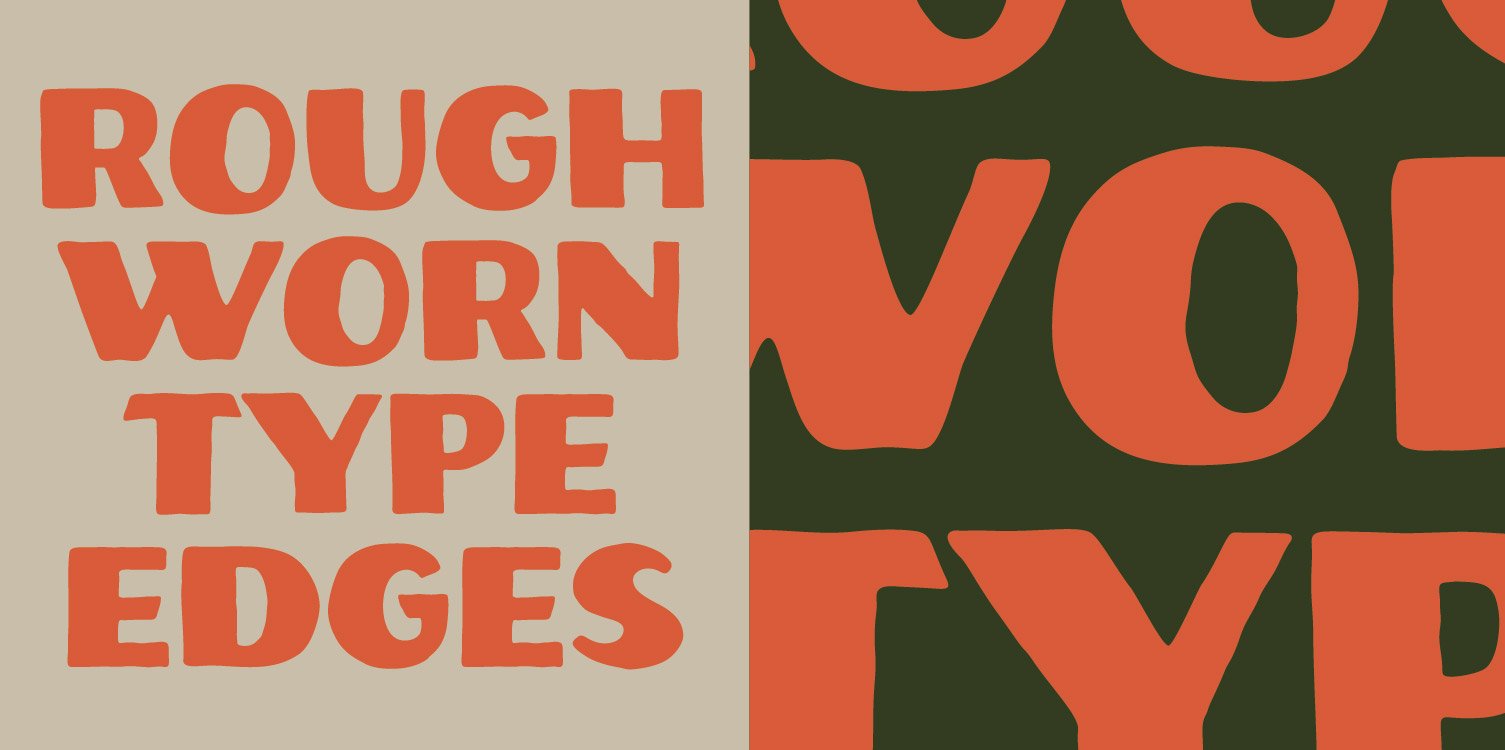
John Muir Sans is a display font that perfectly captures the essence of the hand drawn lettering on the National Park posters. It is rough, worn, and perfectly imperfect. The individual letterforms do not strictly abide by all typographic rules, but this intentional imperfection adds to its charm. This typeface feels as if it was drawn by hand, just like the hand lettering in the vintage National Park posters.


The original lettering that we created for “Zeal Optics” that inspired the John Muir Sans font.
