10 Graphic Design Tips for Beginners to Elevate Your Skills
Vol. 101
10 Graphic Design Tips for Beginners to Elevate Your Skills
Learn the Fundamentals of Graphic Design – Or Just Refresh Your Knowledge — and Improve Your Craft Using These Simple Tips
More and more I’m meeting graphic designers who don’t have formal training or education in the field of graphic design.
And, I think it’s amazing! The fact that people can learn how to design through Youtube, Skillshare and Tik Tok speaks volumes to the evolution of this industry. With so many free resources out there, you no longer have to rack up $40k-$80k in higher education debt in order to pickup the skills needed to be a successful graphic designer.
However, with a more lazzie fair style of learning, using free resources and doing so on your own terms, I think some fundamentals of design can easily be overlooked.
Whether you’re a seasoned designer, or new to the game, these 10 graphic design tips will ground you back in what’s important and help you elevate your design skills and thinking.
1. Keep it simple
One of the biggest mistakes beginner designers make is trying to do too much in a single design. Remember, less is often more. Try to simplify your designs by removing unnecessary elements and focusing on the key message you want to convey.
It’s easy to get caught up in the maximalist trends or over-designing something. Stripping something back as far as possible while still being able to communicate what you want is an important step to take.
Additionally, keeping your business practices and graphic design process simple can help alleviate a lot of stress. You can always evolve, expand or add on more in the future. But, start simple.
2. Use negative space
Negative space, the area around and between design elements, is often more important than the design elements themselves.
Using negative space effectively can help your designs look more polished and professional. Think of Apple, for example. Their use of negative space helps their packaging look premium, high end and expensive.
Experiment with different levels of negative space to explore how premium your designs can feel, but also use negative space to help with balance.
3. Understand color theory
Color can have a powerful impact on the mood and tone of a design. It's important to understand how different colors work together and how certain colors triggers certain human responses . Use color to evoke emotion and create contrast in your designs.
For example: think about the color yellow. Is yellow fast or slow? … that’s right, you said fast. And we’re able to unanimously acknowledge that a color can have a speed. Now, think of a deep indigo color…fast or slow?
Understanding how color affects behavior psychology is a huge advantage when it comes to your design thinking.
4. Choose the right font
It’s no surprise that we love typography over here. Choosing the right fonts for a project can make or break a design; the sooner you understand typography, the better your designs will be.
Make sure to choose fonts based on your intended usage. For example, display fonts (fonts meant to be used for headlines) oftentimes are terrible choices for body copy. Alternatively, body copy fonts may not be as impactful or unique as display fonts.
The fonts you choose need to not only be legible, but stylistically they need to be appropriate for the message you're trying to convey. If your brands tone of voice is serious vs fun or whimsical, you would likely be entertaining very different font options.
5. Create a visual hierarchy
A visual hierarchy is the arrangement of design elements in order of importance.
An intentional visual hierarchy helps guide the viewer's eye and makes it easier to understand the message of the design. Use size, color, negative space, contrast, balance and placement to create a clear visual hierarchy in your designs.
6. Pay attention to alignment
Nothing ruins a design faster than poor alignment. Make sure all elements are properly aligned and balanced to create a polished and professional look.
It’s important to align things optically as opposed to just metrically. For example, when aligning something that is italicized, the metric center will actually feel misaligned. We prefer to start with metric alignment, and then make optical adjustments thereafter.
Certain shapes or letters will be a bit more problematic than others. Remember to trust your eye. If it looks right, it is right.
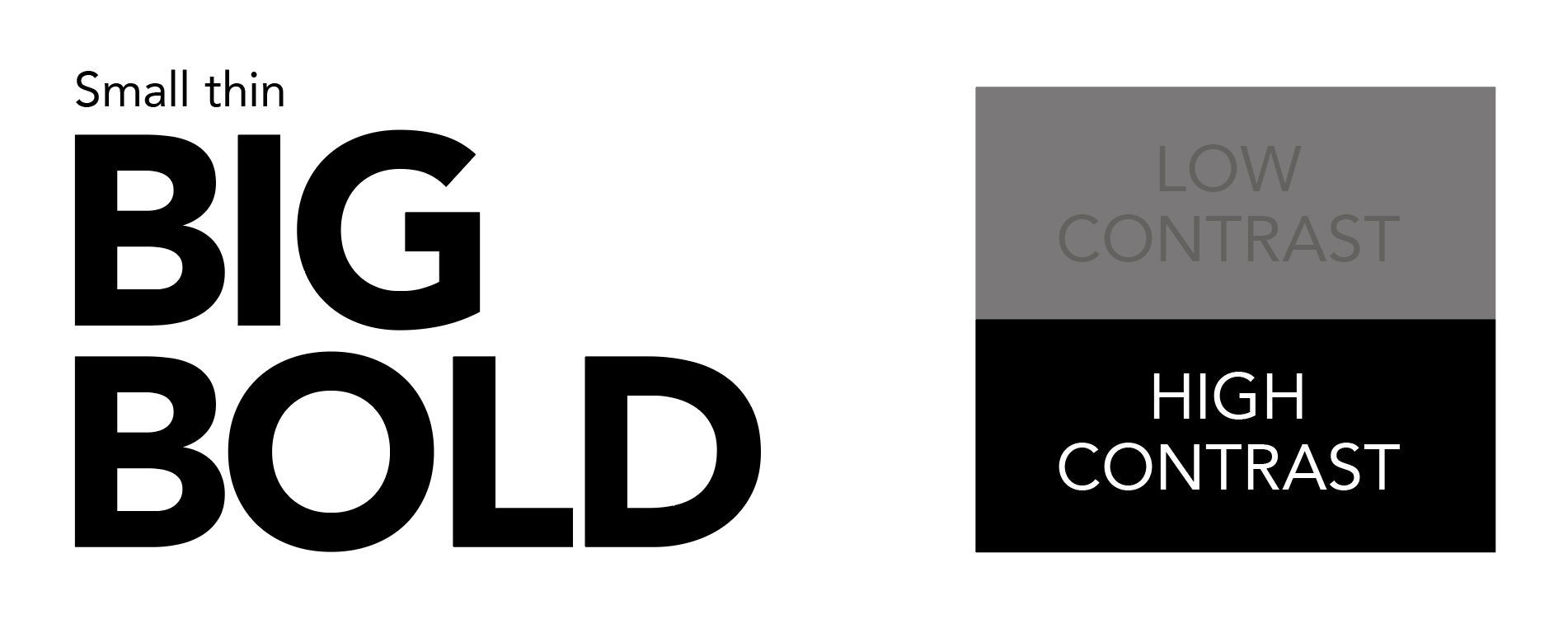
7. Don't forget about contrast
Contrast refers to the disparity between different elements.
Contrast can refer to scale (big vs small), color (dark vs light), weight (light vs bold) and numerous other design considerations.
Use contrast to create interest and draw attention to important elements.
Embracing this concept allows you to easily control a viewer’s visual journey through a design.
8. Experiment with different layouts
Don't get too stuck on design trends.
Experiment with different layouts and compositions to create unique and interesting designs.
Oftentimes the most interesting layouts are those that draw from multiple inspiration sources.
9. Get feedback
It’s easy to design in a vacuum when you’re self employed.
Whenever possible, it’s super helpful to ask for feedback from other designers. Whether you send it to friends or a mastermind group, or you receive critiques from other designers on platforms like Dribbble, Instagram or Behance, constructive criticism is super helpful.
There’s substantial value in receiving feedback even after a design is completed. You can always apply your learnings to the next project.
10. Practice, practice, practice
Obviously, the more you practice, the better you'll get. Keep designing and practicing your craft, even if they're not perfect. And, even if they’re not for a client.
Experimenting, failing, and learning from your mistakes is a crucial part of growing as a designer and finding your own creative style.
Bonus!
When you present your graphic design work, be sure to discuss these elements above with your clients. Invite them along the journey of your process, explaining the ins and outs of your decision making.
This will help you position yourself as an expert in the eyes of your customers, helping them trust you, and ultimately enabling you to make more money!
These 10 graphic design tips are a great start for beginners and good refresher for more experienced designers.
Remember to keep it simple, use negative space, understand color theory, choose the right font, create a visual hierarchy, pay attention to alignment, don't forget about contrast, experiment with different layouts, get feedback, and practice, practice, practice.
Good luck out there!
Cheers,
Adam


