New Work: Traverse Fitness Mural


Traverse Fitness Mural

Client: Traverse Fitness
Support: Carly Salzman
Photos: Kyle Kennedy, Carly Salzman
Mountain Photo Inspiration: Kris Peters
Location: Denver, Colorado


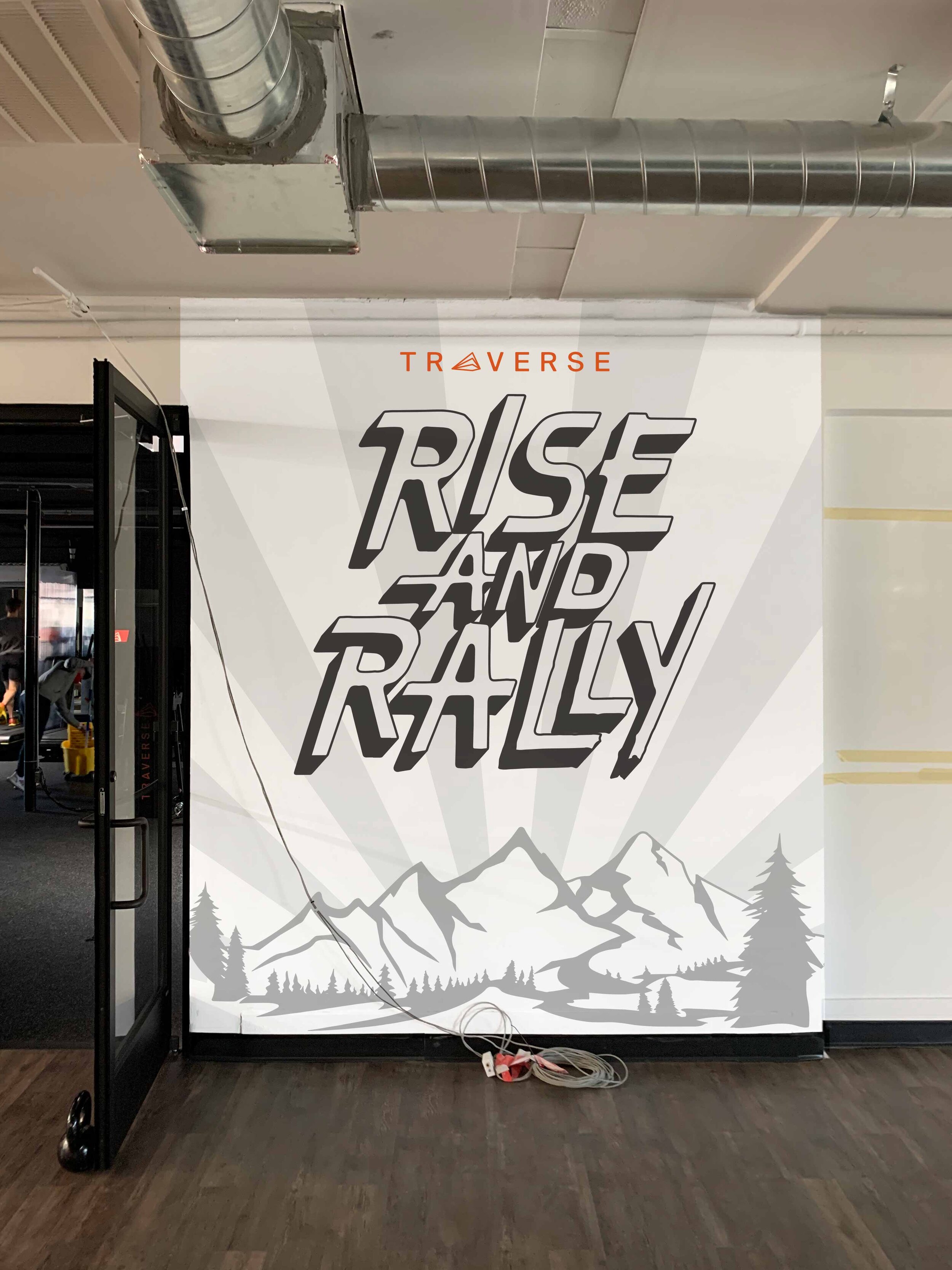
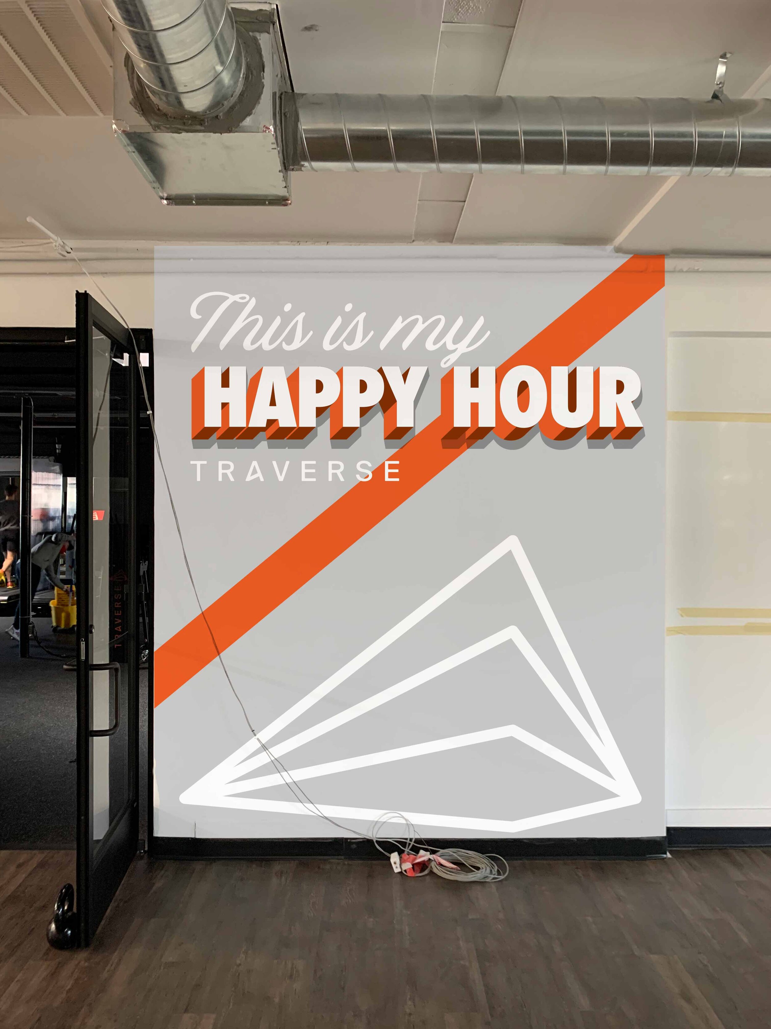
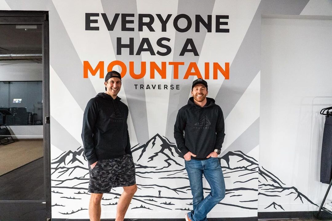
We recently had the opportunity to paint a mural at Traverse Fitness, one of Denver’s best gyms (personal opinion, but if you went, I’m sure you’d agree). The Traverse Fitness interior is sleek, clean and modern, and we worked to explore a few different instagrammable wall mural designs that aligned with their aesthetic.


Traverse-Fitness-lettering-mural-three-guys.jpg
 

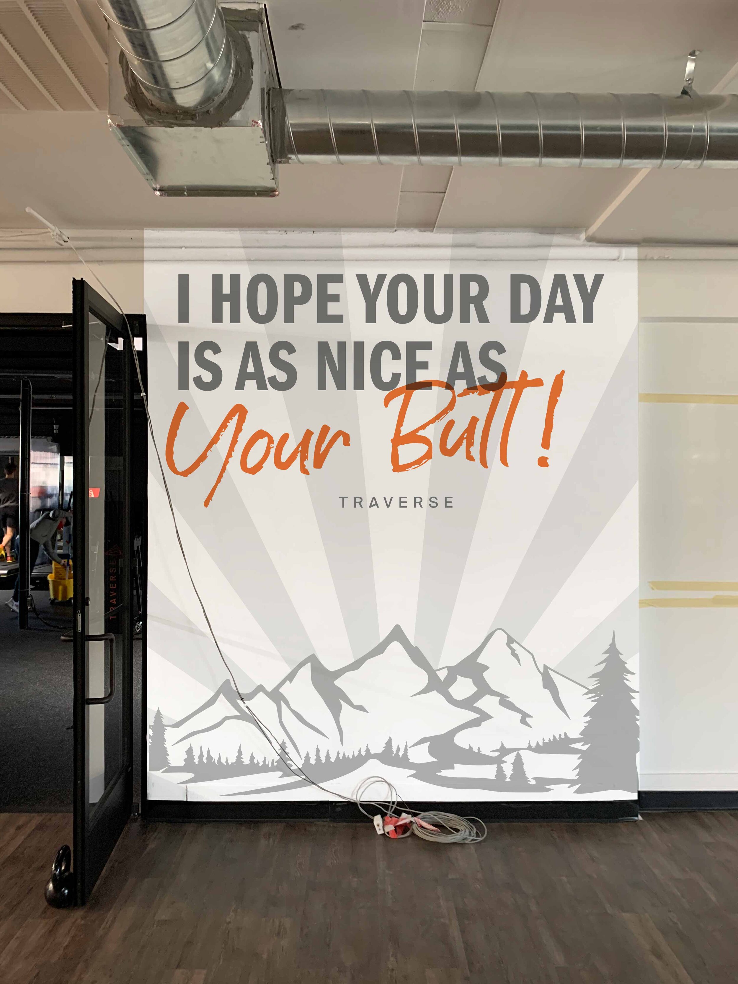
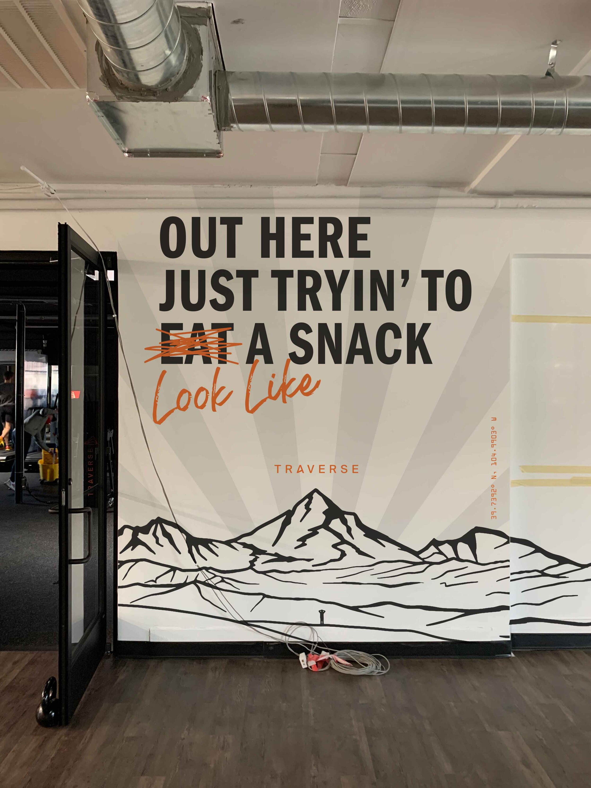
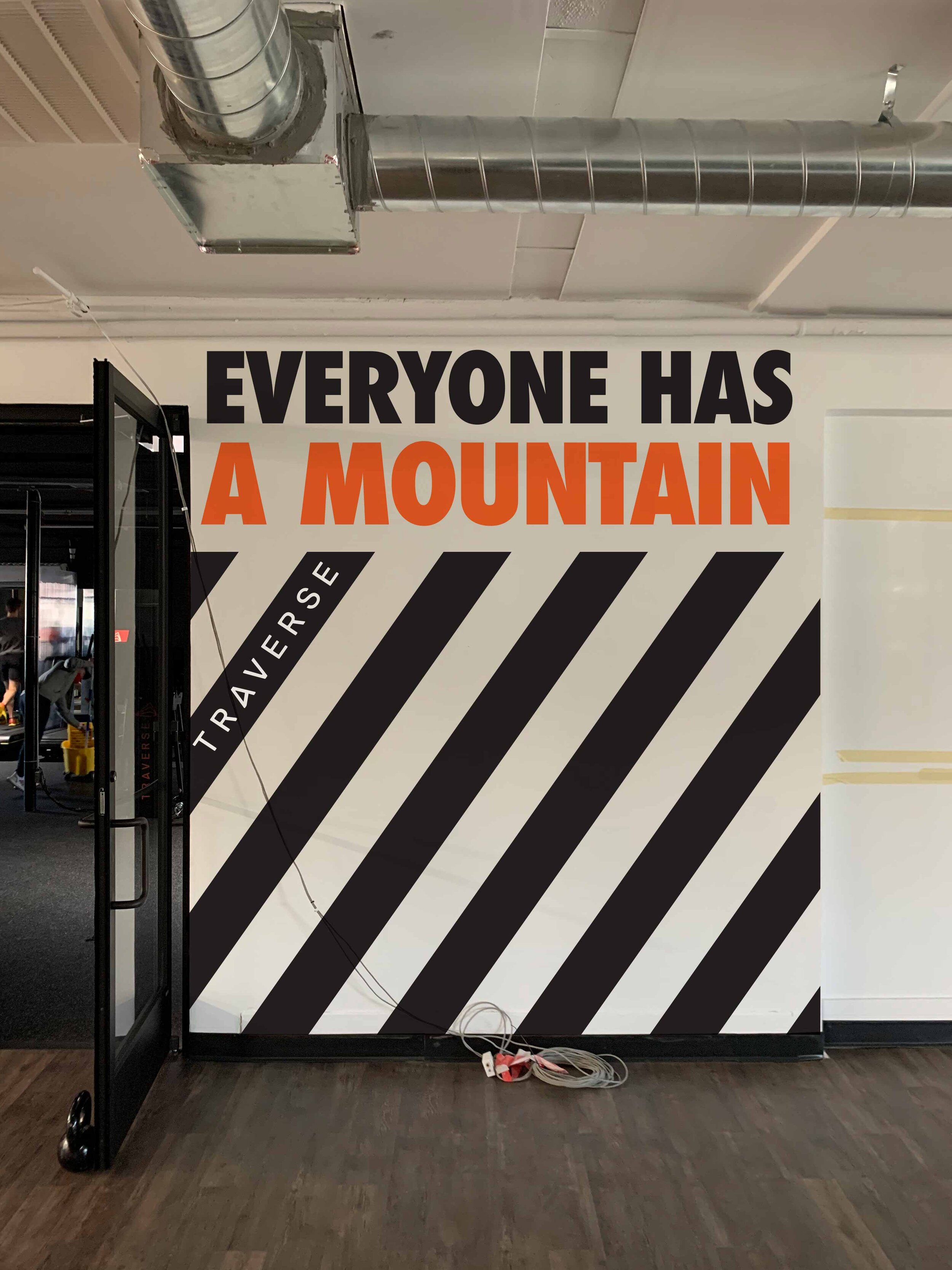
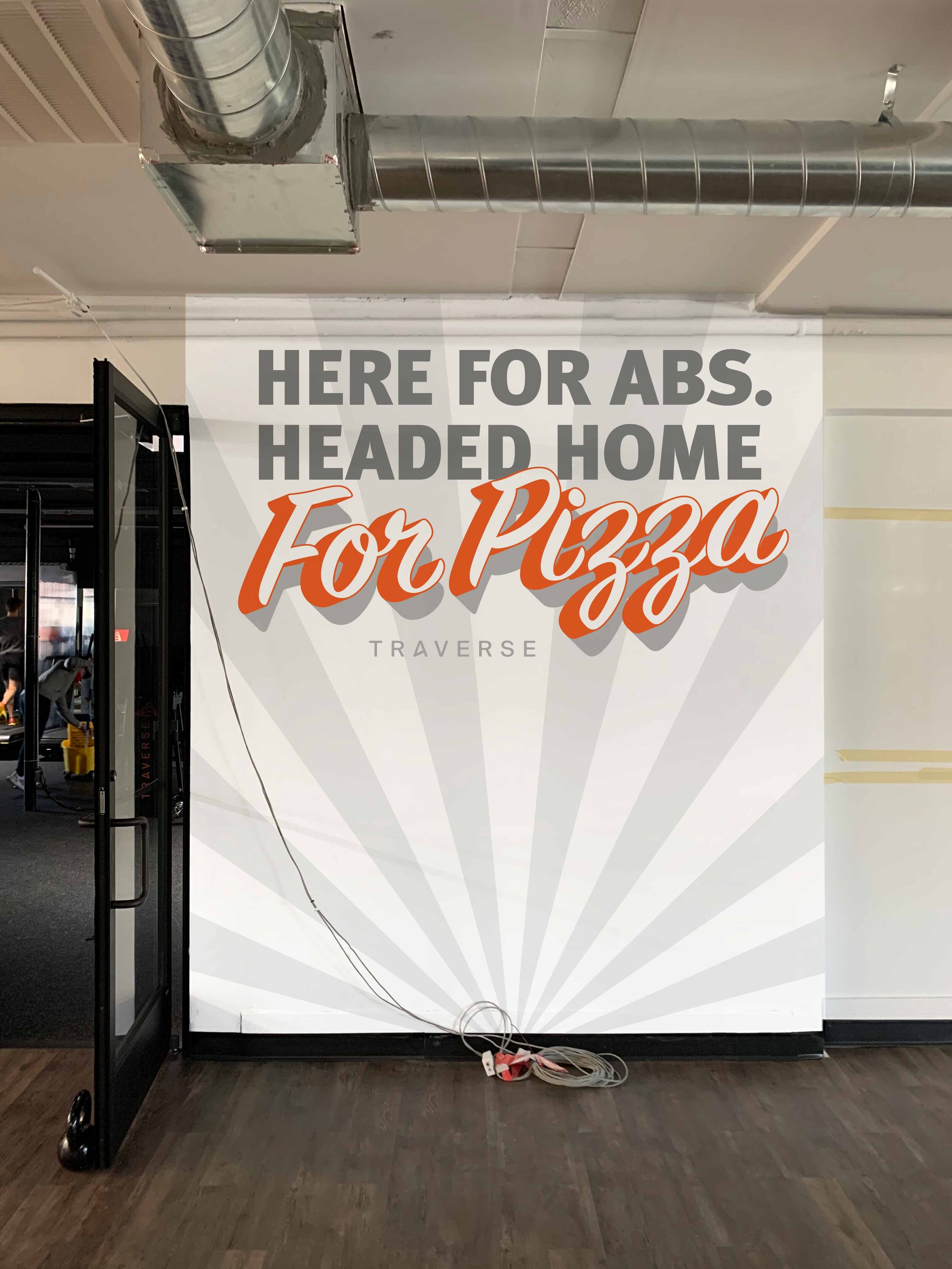
Our initial mural design exploration started with slightly more quirky quotes such as “I just want to look like a snack” and “here for abs, home for pizza” and ultimately landed on the Traverse Fitness brand tagline: “everyone has a mountain”.


Initial mural design exploration and mockups.


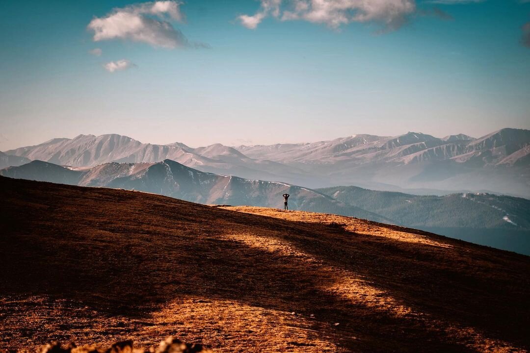
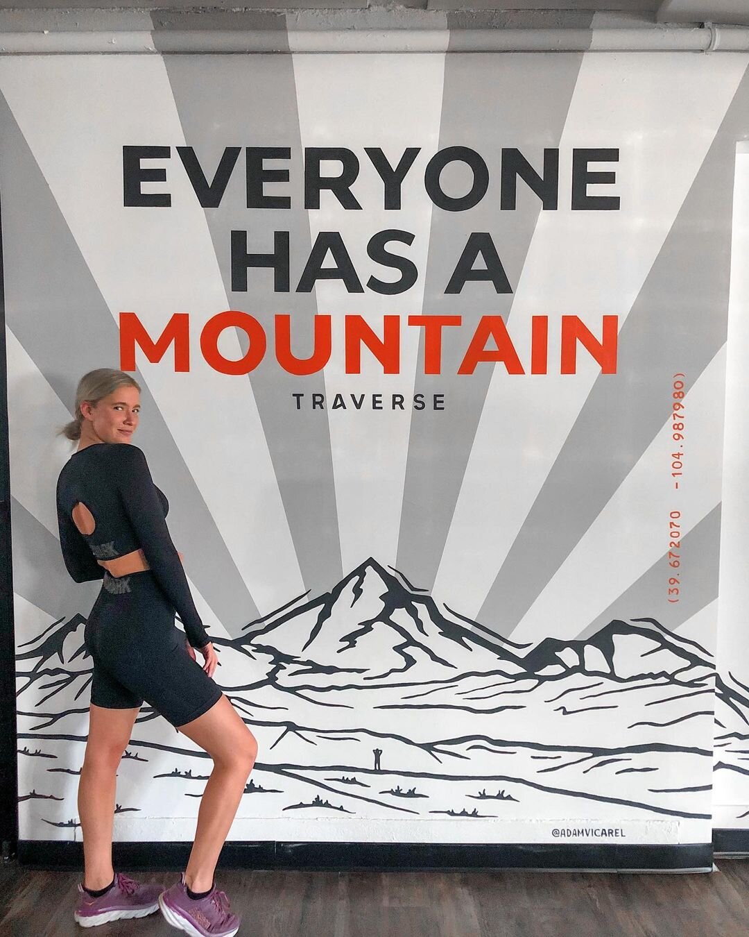
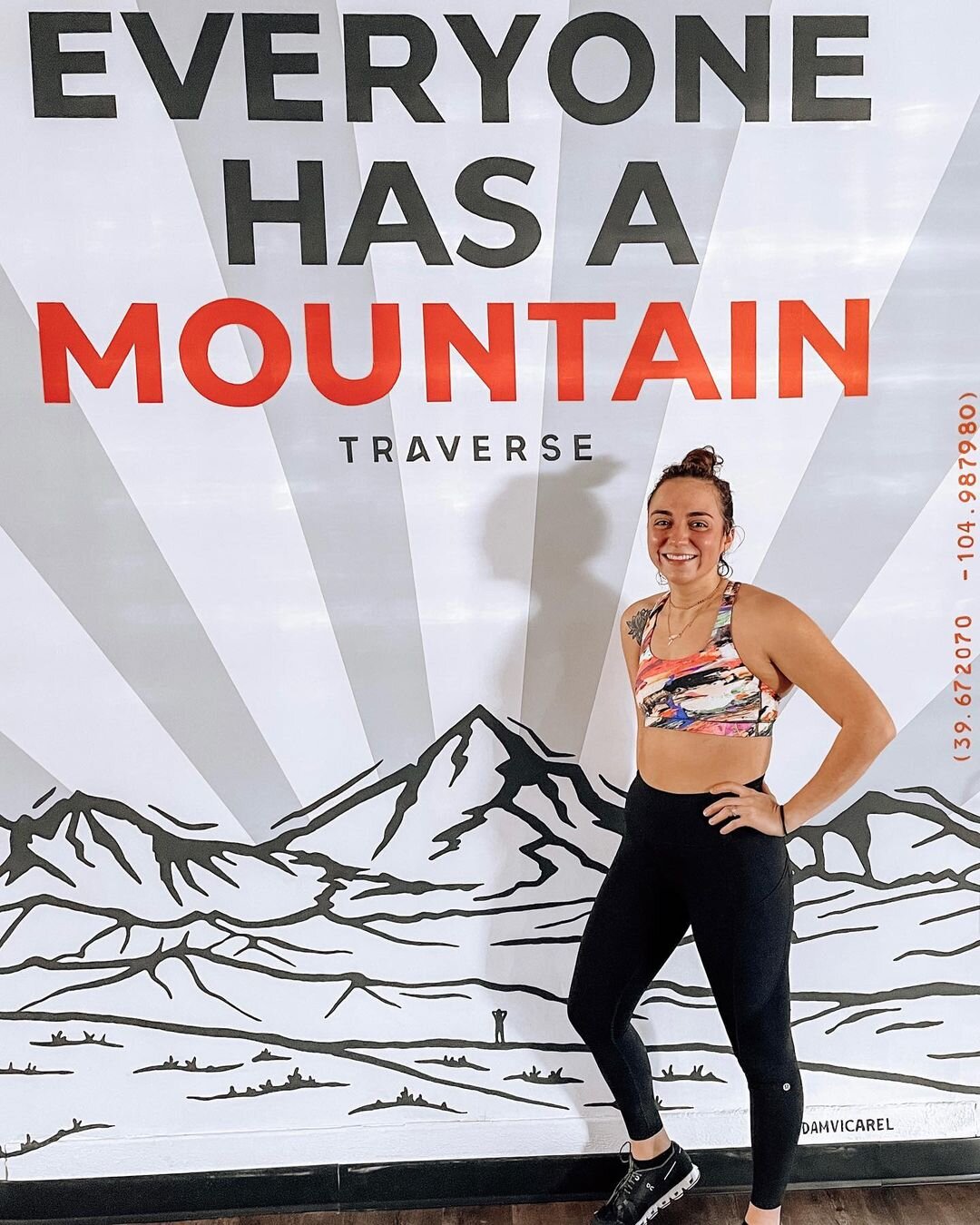
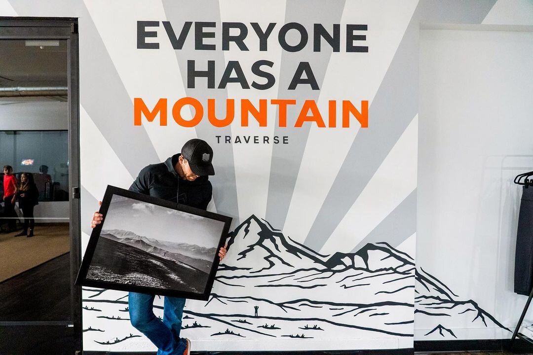
The tagline and logo were painted in Traverse Fitness’ brand colors, and the mountain illustration (selected for obvious reasons) was an artistic interpretation of a photo originally snapped by Kris Peters, one of Traverse’s co-founders.

 
Traverse-Fitness-mural-mountain-photo-inspiration.jpg


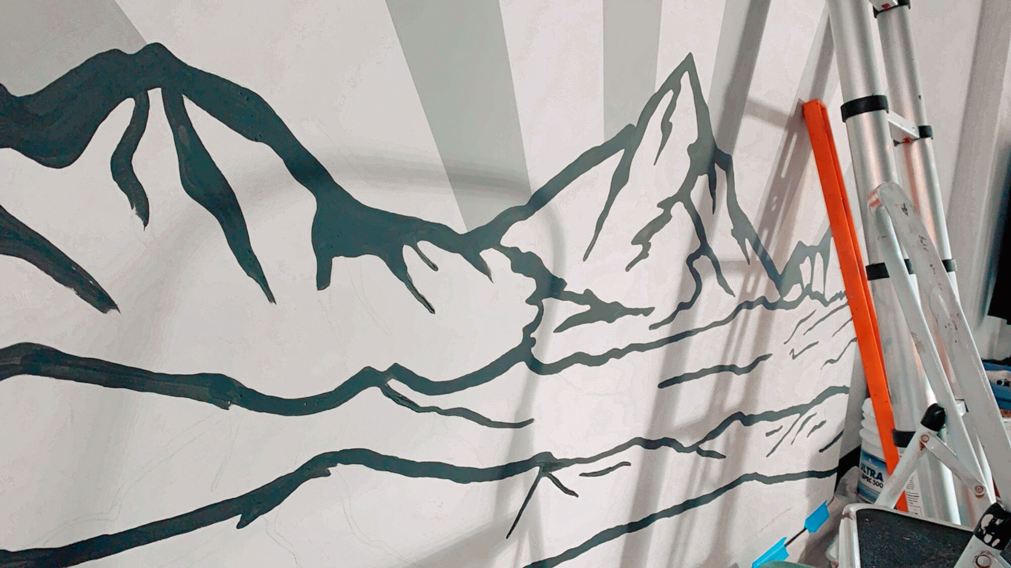
The radial sun rays painted behind the mountain help give the mural a bit of additional depth and energy, and they also help ground the viewer’s eye.


Traverse-Fitness-lettering-mural-supplies.jpg
Traverse-Fitness-lettering-mural-sunrays.jpg
 

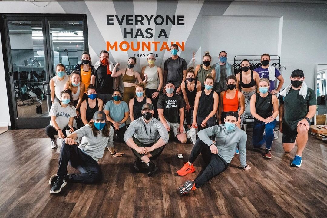
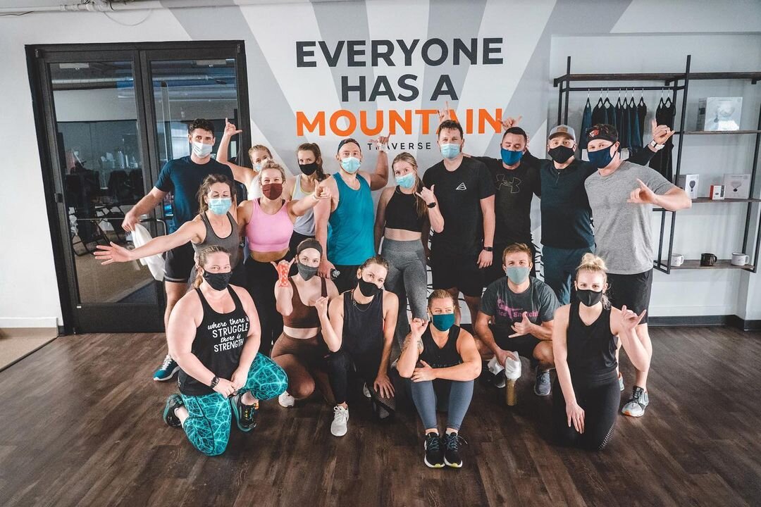
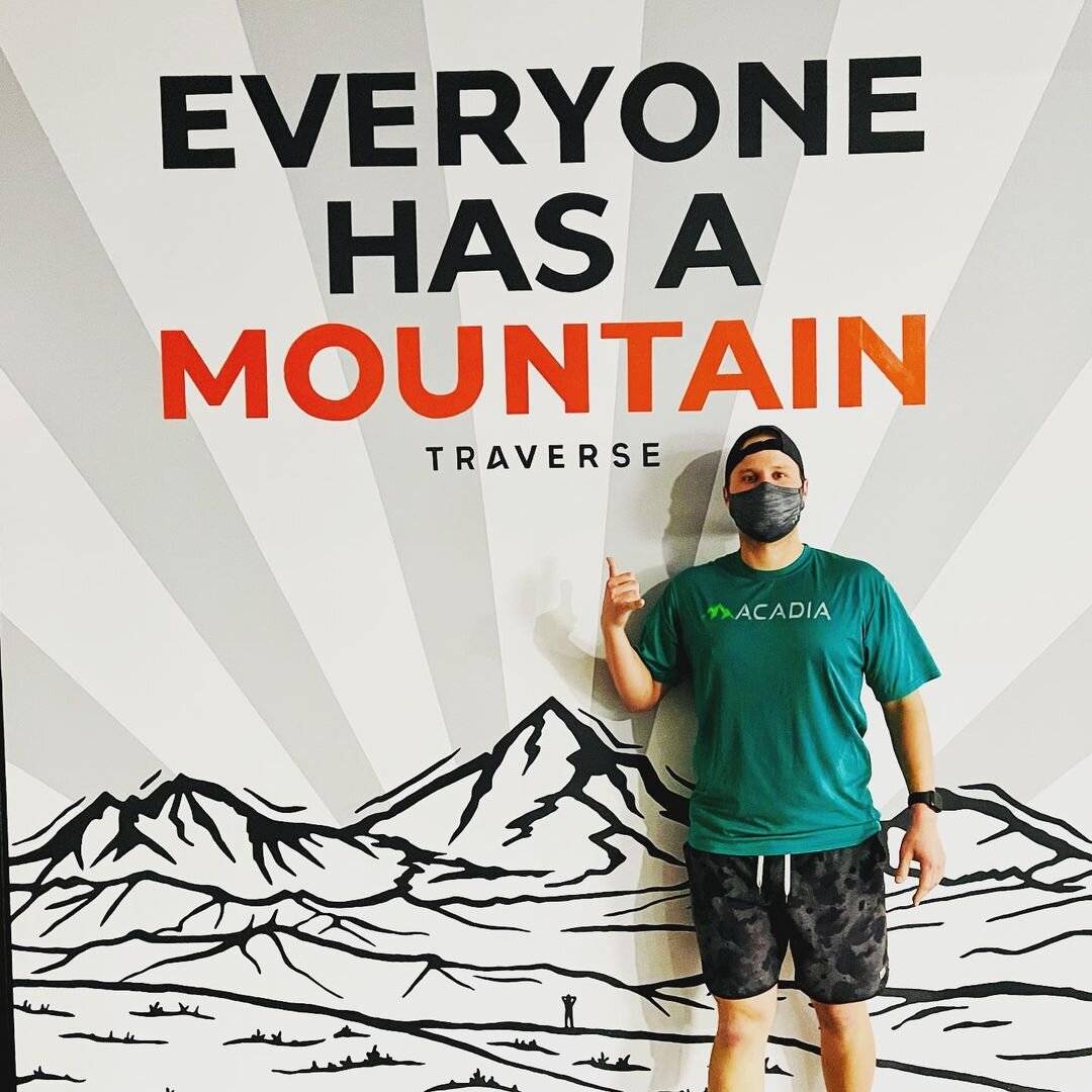
What was particularly fun about designing this mural was problem solving their request to not only create a beautiful piece of artwork that aligned with the aesthetic of the space, but this mural design was also created with the intention of provoking gym patron selfies. That’s right, folks: a selfie wall! Or, an instagrammable mural, as the case may be.


Traverse-Fitness-lettering-mural-tape-ladder.jpg
Traverse-Fitness-lettering-mural-typography-progress.jpg
Traverse-Fitness-lettering-mural-sign-painter.jpg
Traverse-Fitness-mural-mountain-illustration.jpg
Traverse-Fitness-lettering-mural-mountain-painting.jpg
Traverse-Fitness-lettering-mural-typography-painting.jpg
 

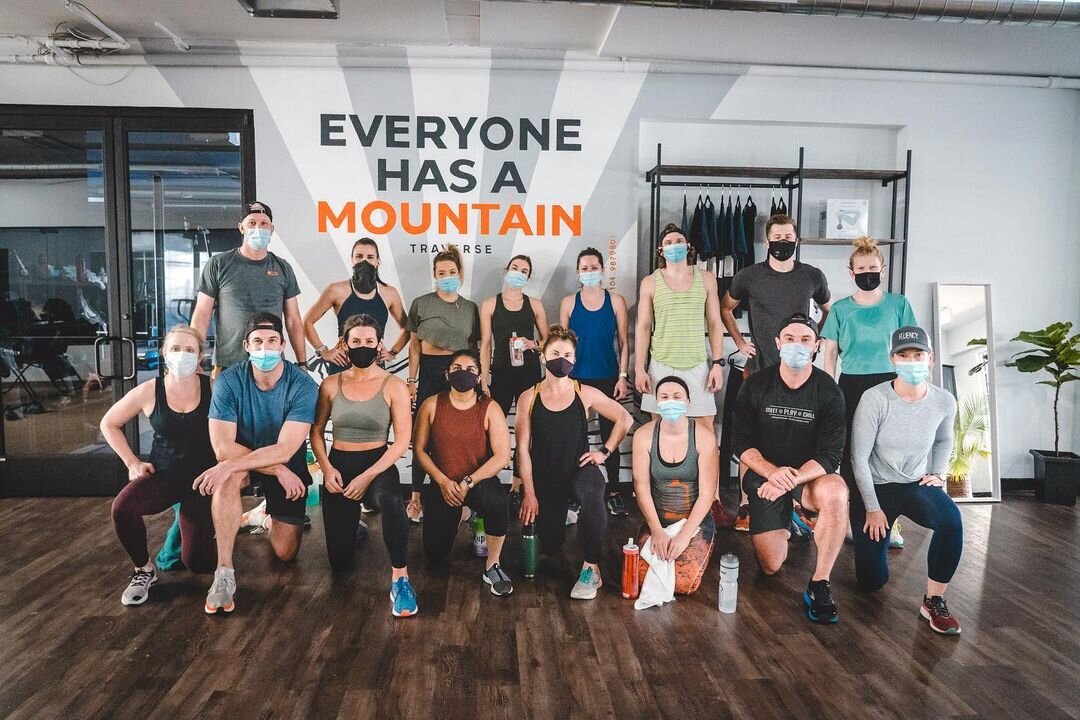
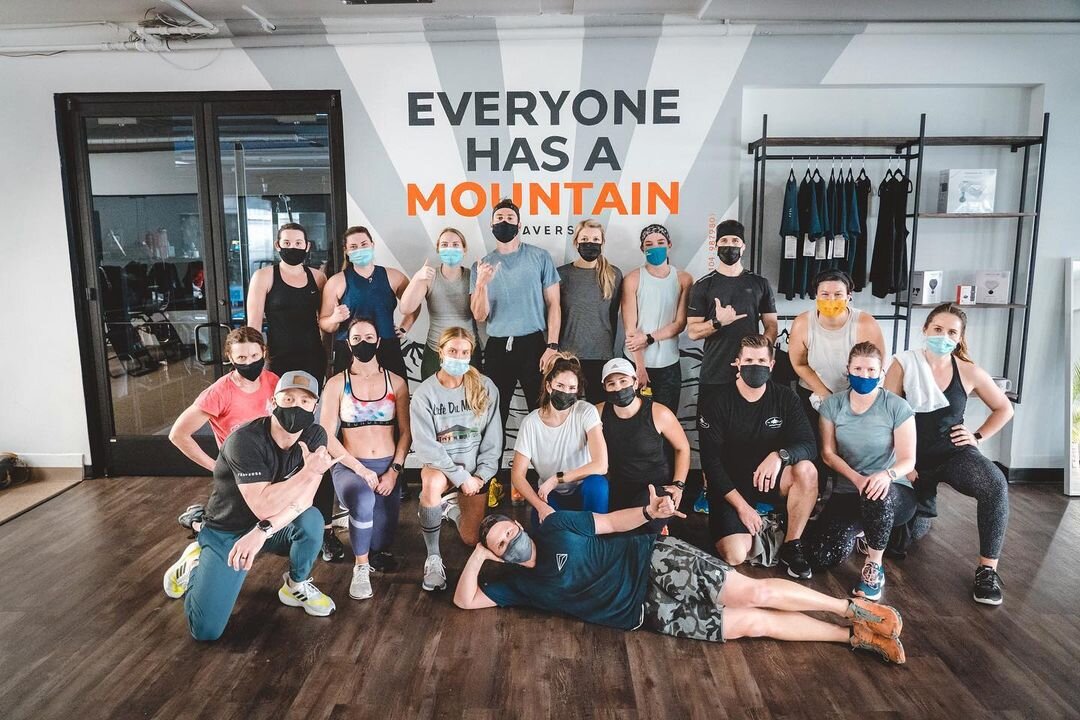
With this selfie wall idea in mind, mural art such as this can be seen not only as a visual enhancement of the space, but the mural double-purposes as a long term organic marketing tactic. As newcomers and gym-regulars alike come to Traverse, snapping a photo in front of the wall mural and tagging the Traverse Fitness Instagram is part of the experience. 


Traverse-Fitness-lettering-mural-sign-painting.jpg


When painting murals, Vicarel Studios takes a slightly different approach than many mural artists. Because our studio is deeply rooted in graphic design and branding, we have a more brand-forward design process when painting mural art. Prior to starting any mural painting, we first focus on understanding the business or brand, their mission and their target demographic. As art directors and graphic designers, we then focus on creating mural designs that align with those findings. Our intention is to not only create a mural that matches the aesthetic of a brand and its space, but also to create a mural that inspires conversation, provokes photographs and encourages social sharing.

 
Traverse-Fitness-lettering-mural-handstand.jpg
Traverse-Fitness-lettering-mural-adam-carly.jpg
Traverse-Fitness-lettering-mural-artists.jpg
 

Thanks again for having us, Traverse Fitness — we’re stoked to be adding this new mural to our portfolio!