Carhartt Uses National Park Font, John Muir Sans, for Graphic T Series
Carhartt Uses our National Park-inspired Font, John Muir Sans, for Graphic T Series
When a timeless brand like Carhartt uses one of your typefaces, it’s worth celebrating.
If you needed the brief context: Carhartt is an American clothing company founded in 1889 and is known for their rugged workwear and timeless designs.
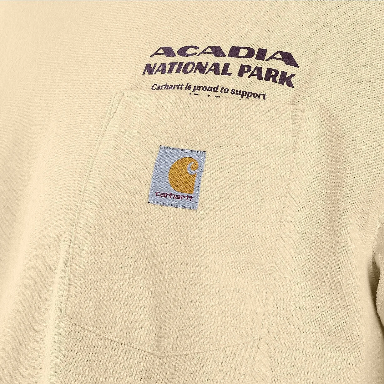
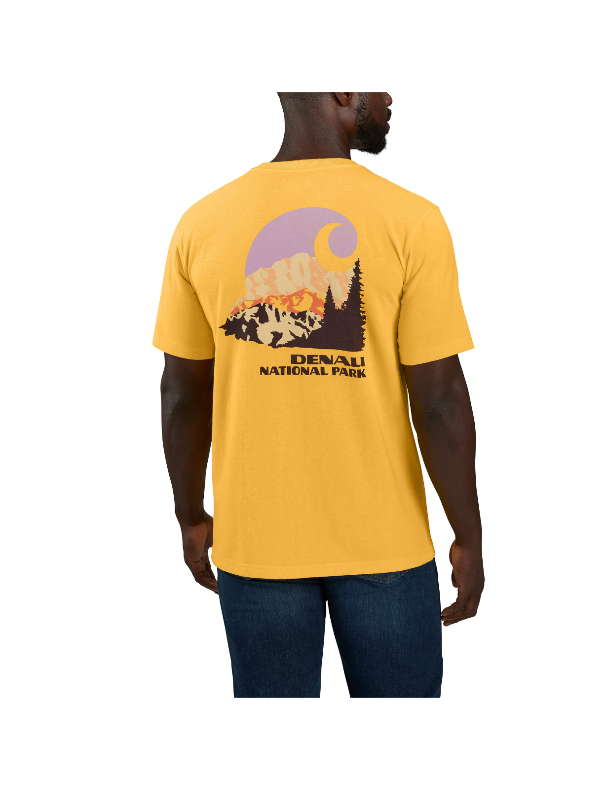
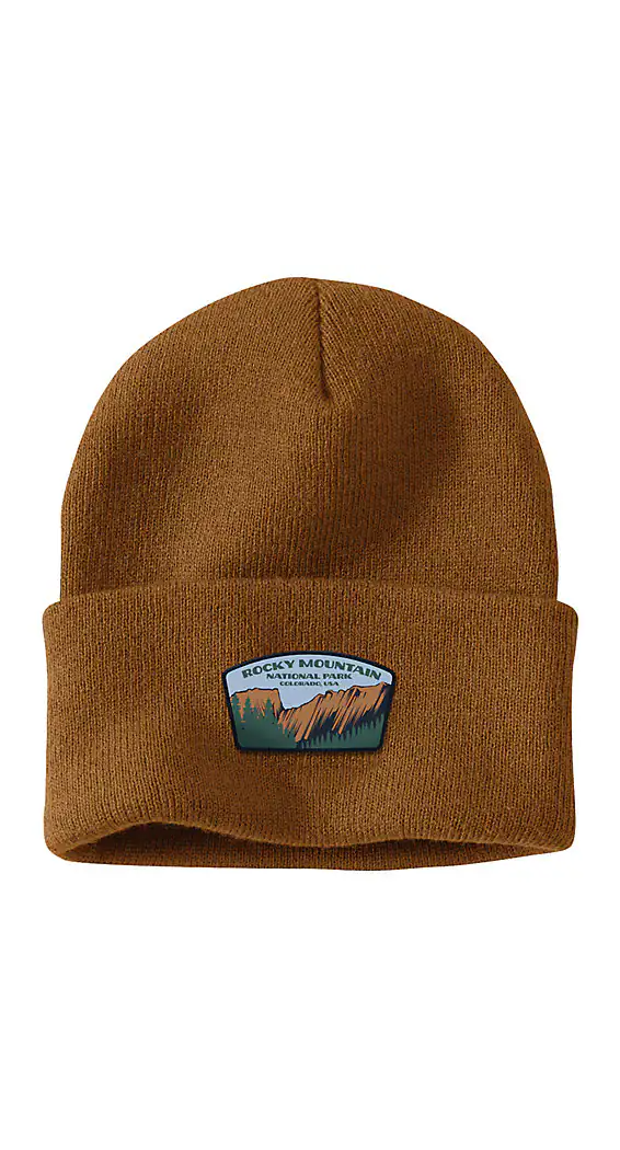
We created John Muir Sans with a deep respect for national park poster fonts and their bold, adventurous spirit, and Carhartt’s recent series of 4 National Park-inspired designs is the perfect usage of this font. To see the first non-exclusive font we ever made fit seamlessly into the world of iconic brands is pretty cool for us.
John Muir Sans brings the rugged, outdoorsy vibe of national parks into modern design, making it an excellent choice for anything from apparel to posters, logos, and beyond. The hand drawn style of John Muir Sans is inspired by vintage national park poster fonts, offering that timeless, bold feel while still being approachable and soft.
Whether you're designing a national park poster for yourself or you’re a global apparel brand like Carhartt, this font gives off that nostalgic yet modern vibe that we all know and love.
Seeing John Muir Sans on Carhartt’s National Park t-shirts is definitely a fun little win. It’s not just about the font getting attention; it’s about how seamlessly it fits within a brand that’s built on authenticity and craftsmanship.
Try John Muir Sans, one of our best selling typefaces inspired by National Park poster fonts.


